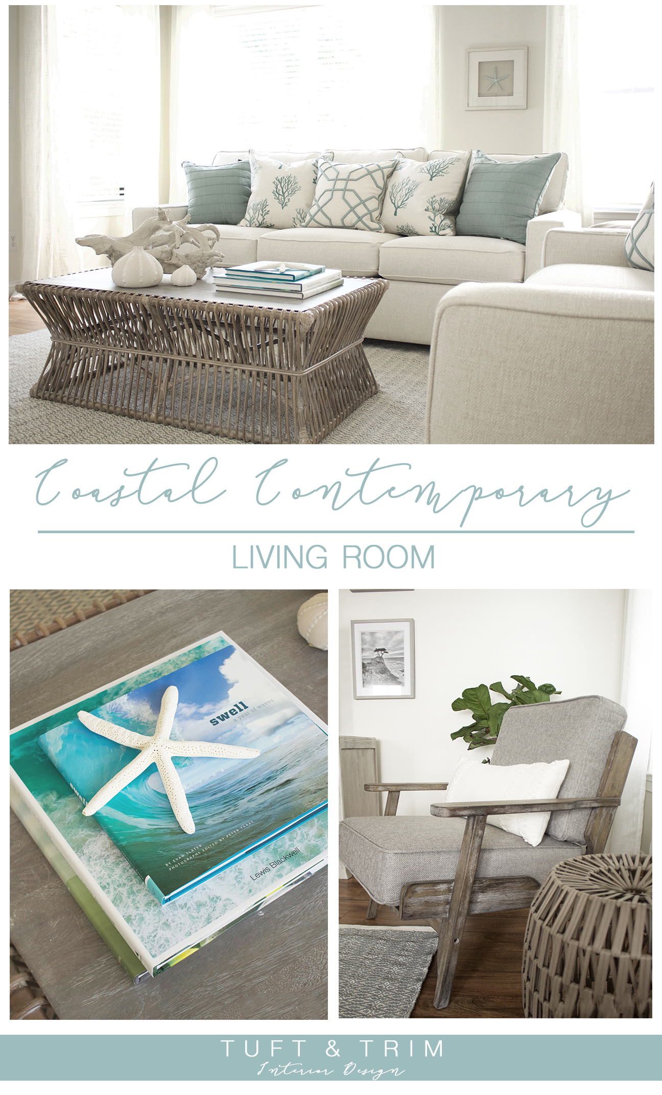
The sofas finally arrived, making this coastal chic living room now complete. I’ve had so much fun decorating this space and can’t wait for you to see how it all came together. A while back I shared my design scheme and plans in a blog post. If you haven’t already checked it out, you can get caught up here. I try to share the design phase for each project so that you can learn how the process works. And today is my favorite part of the process, the reveal.
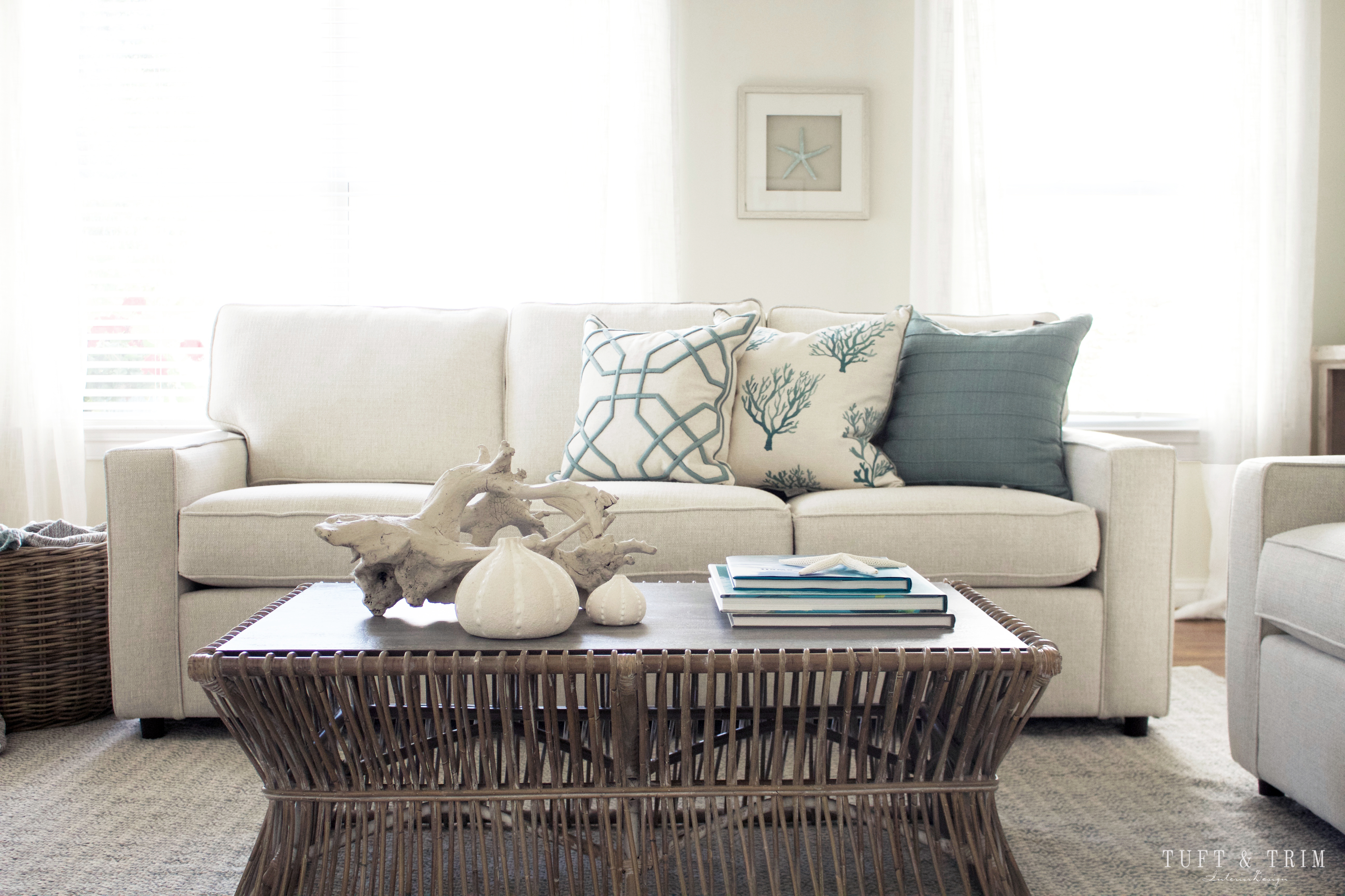
The goal for this room was to create a calm, coastal feel with contemporary elements. We tried to keep it light and soothing, but also incorporated pops of blue and bold pieces to create a statement. My client loves the beach influence, but wanted to move away from the themed and sometimes tacky beach decor. By using the right amount of coastal accents, we were able to achieve the perfect balance. See for yourself as you tour the before and after pictures, and if you see something you like, make sure to shop the look!

*This post contains affiliate links

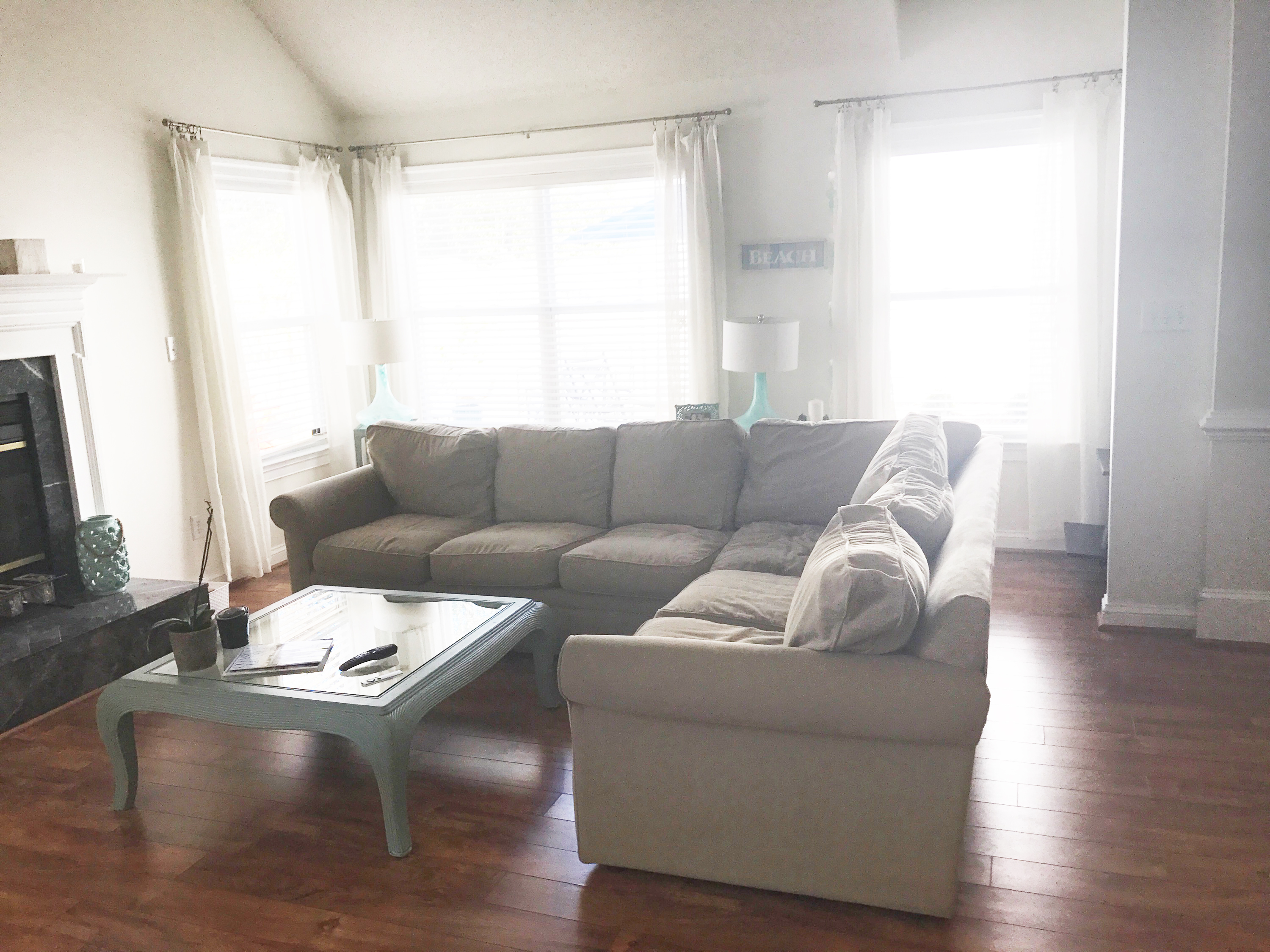
Here’s a little glimpse of the room before the transformation. My client has great taste and had already painted the room what I would have chosen myself. So all we really needed to do was update the furniture and add some style. 
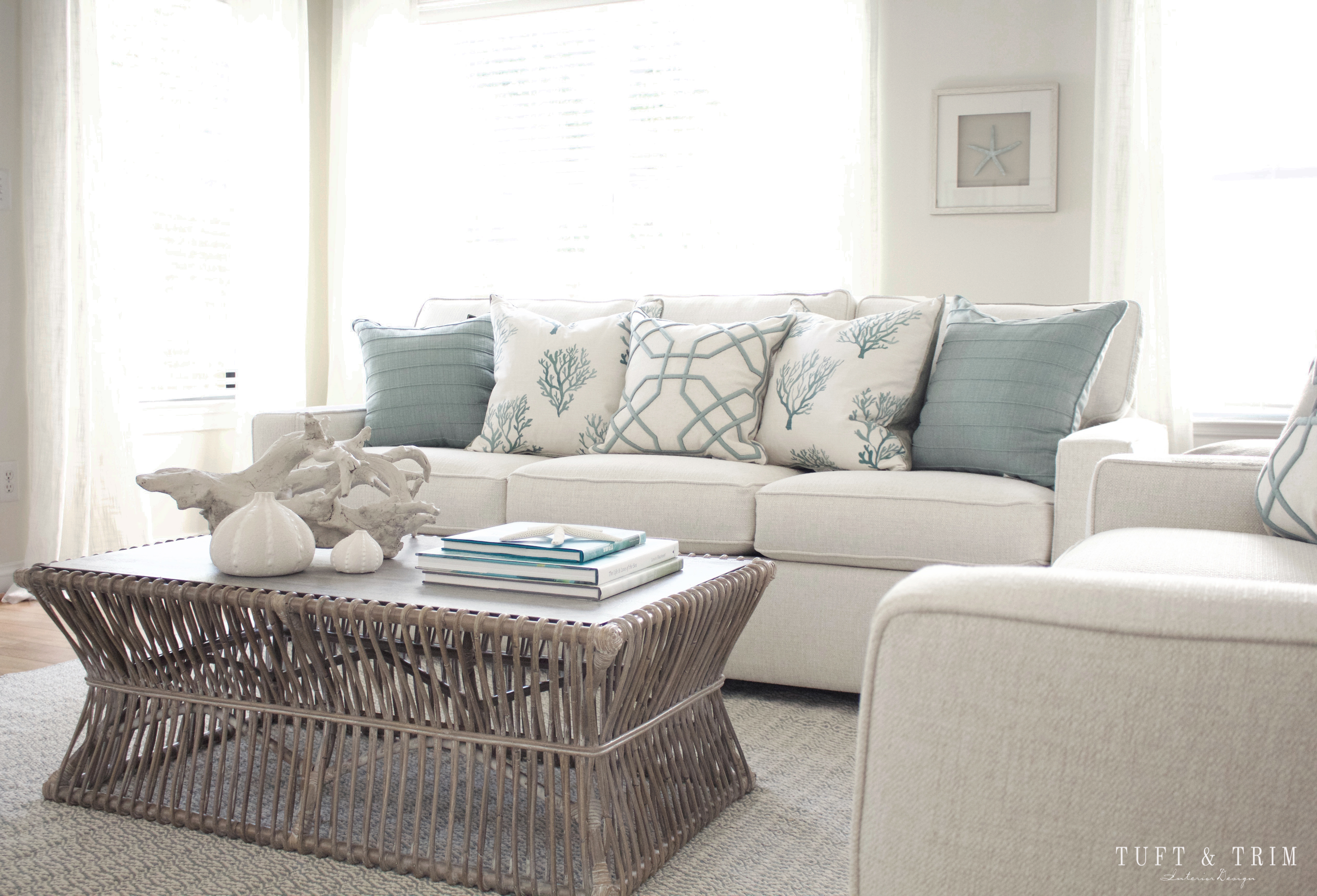
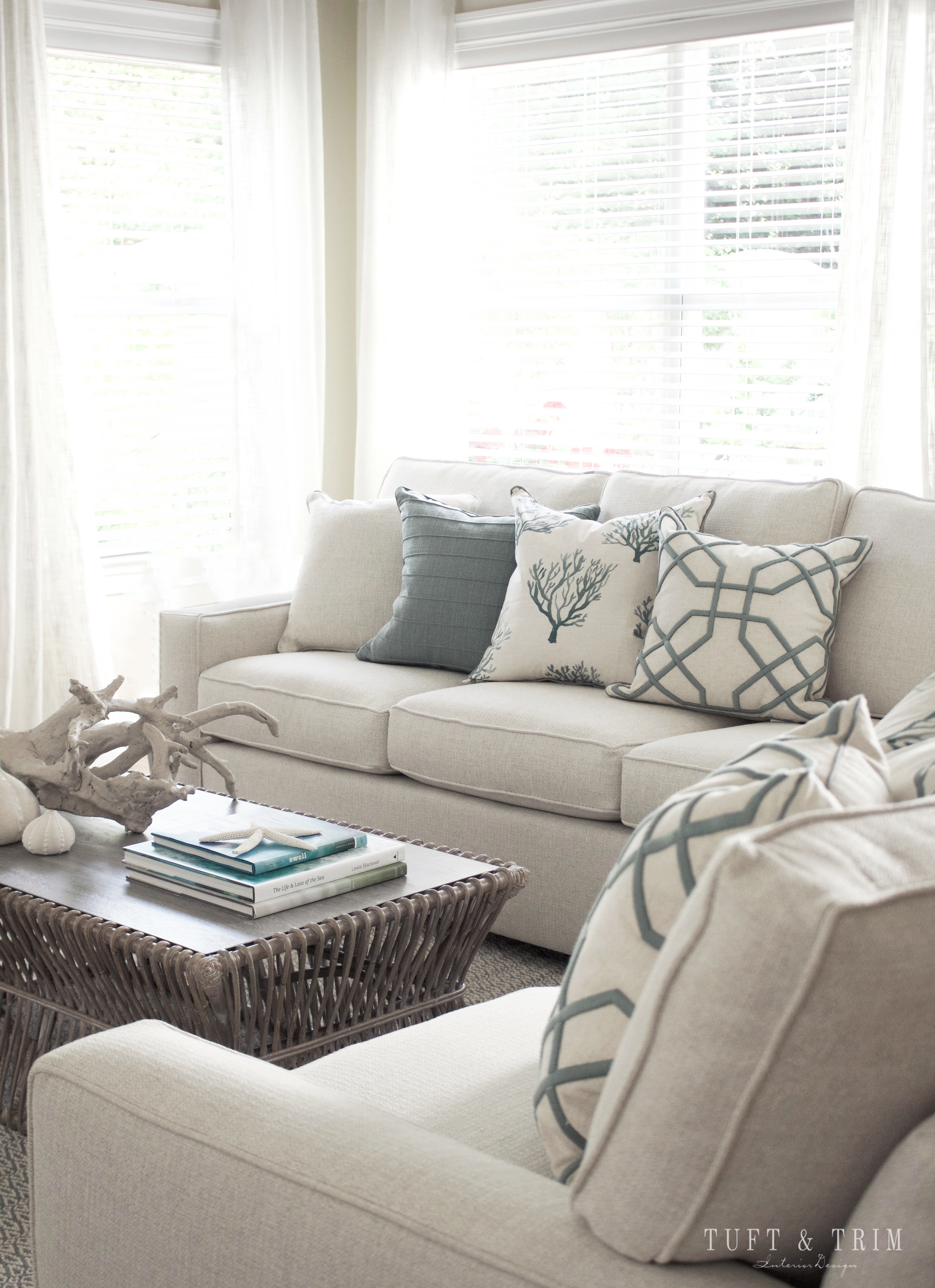
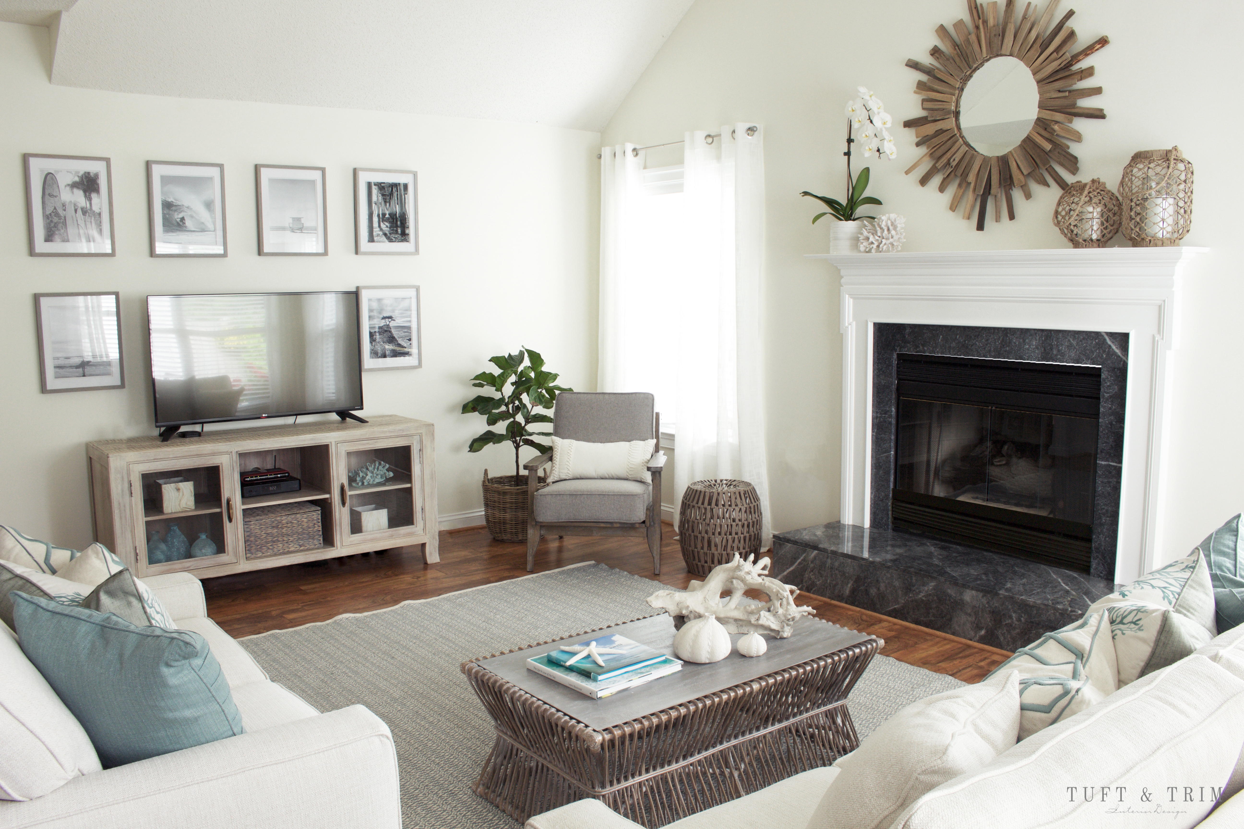
We decided the sectional wasn’t right for the space so we went with a sofa and love seat. We both fell in love with this contemporary track arm sofa by Rowe furniture and were thrilled to find that the soft cream fabric we wanted was spill proof! The coastal blue pillows bring in color that coordinate with the blue and cream patterned rug by Dash and Albert. My personal favorite is the coffee table. It’s unique shape and white washed gray creates a soft contrast keeping the room light and serene.

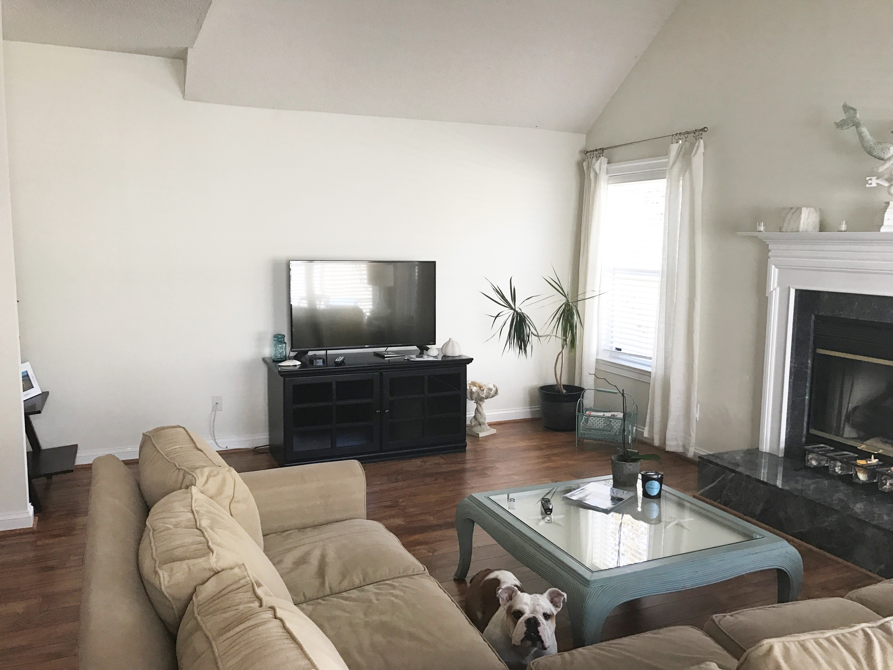
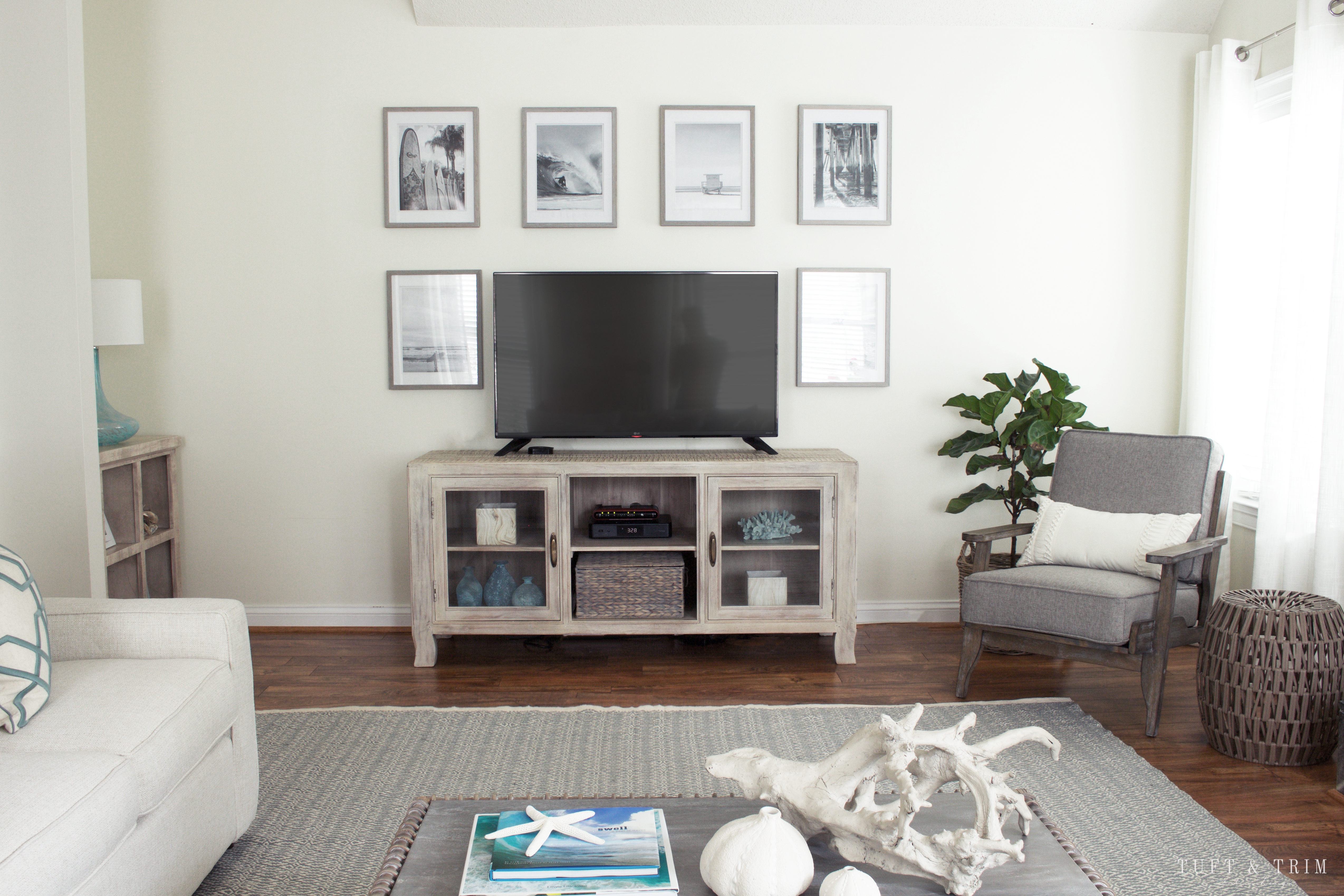
The TV wall needed some work. We wanted to fill the space, but without being too overbearing with a tall media cabinet. Oh, and that adorable face you see poking up beside the sectional is Lola. 
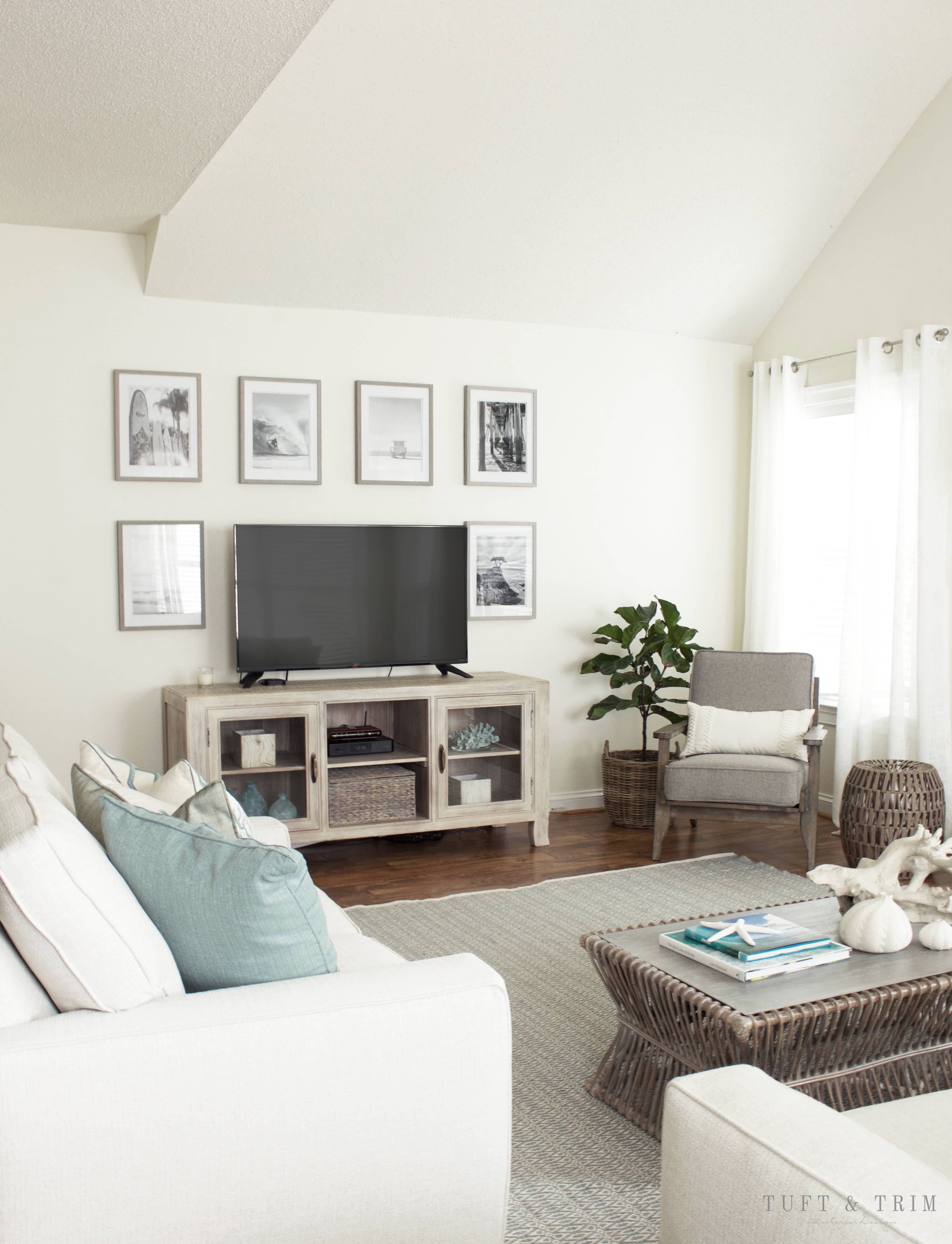
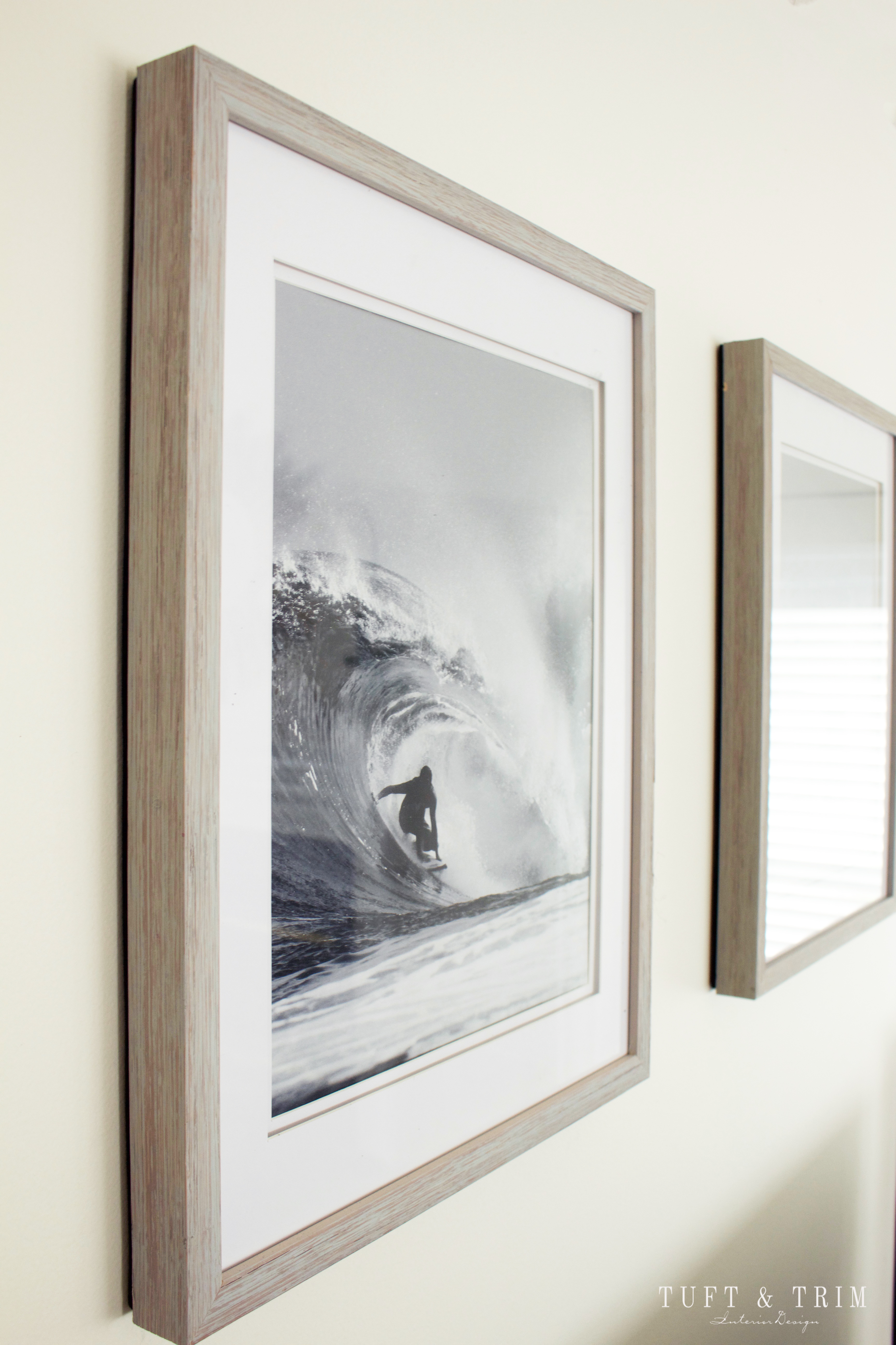
This wall completely transformed once we updating the media console to something lighter and more size appropriate. Surrounding the tv are black and white photographs of California beaches, waves, a pier, and surf boards. All the photos were found on etsy, including one of a certain tree that my clients parents got engaged under. Adding those personal touches are so fun and create a special and unique space.
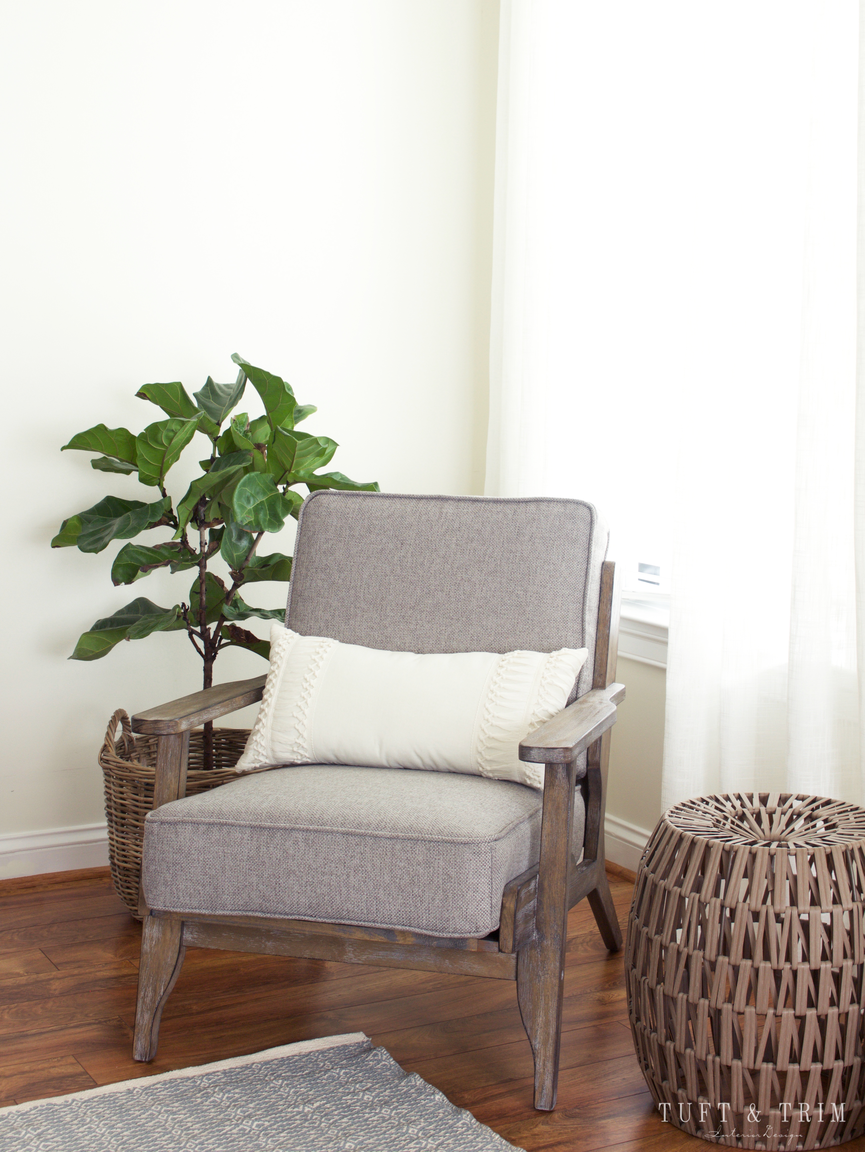
This chair. When I first spotted this chair I knew it was perfect for this room. It accents the coffee table with its gray washed wood, and looks like it was made for this corner.

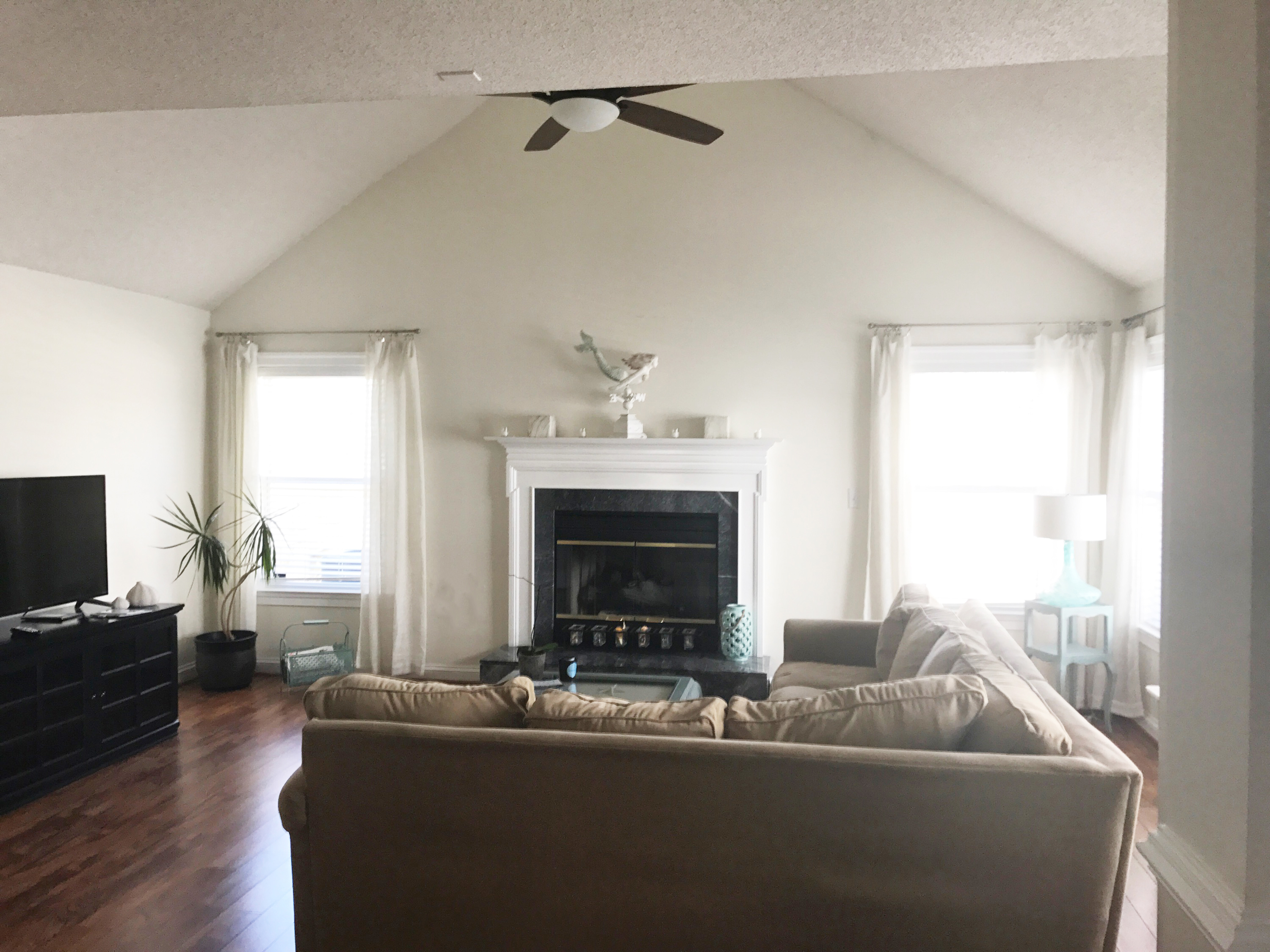
When I first stepped into this room, I knew I wanted to create a focal point above the fireplace. It looked so bare and needed something, and I had just the thing in mind.

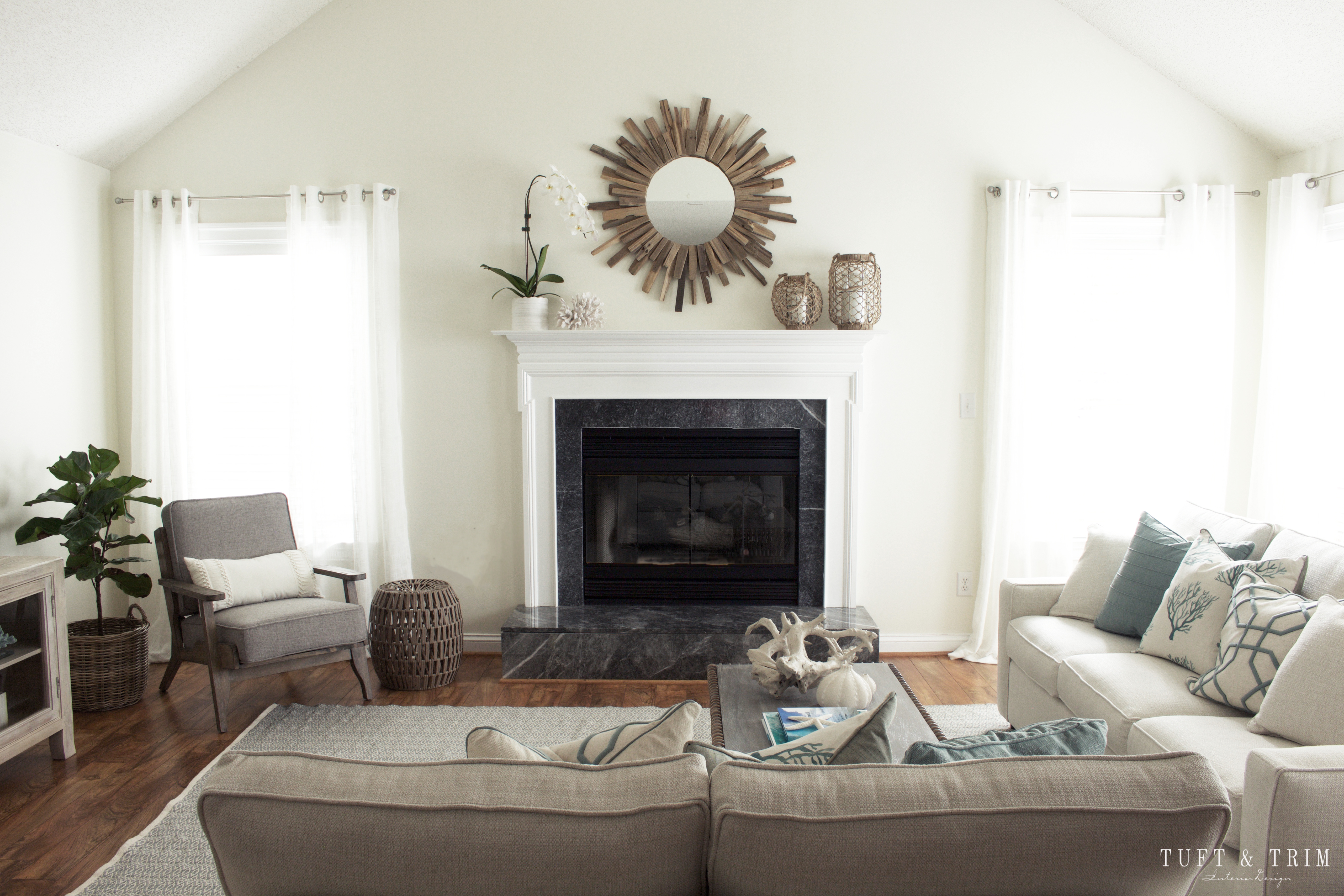
This sunburst mirror made out of driftwood creates the focal point the room needed. We also added the accessories around the mirror to frame it.
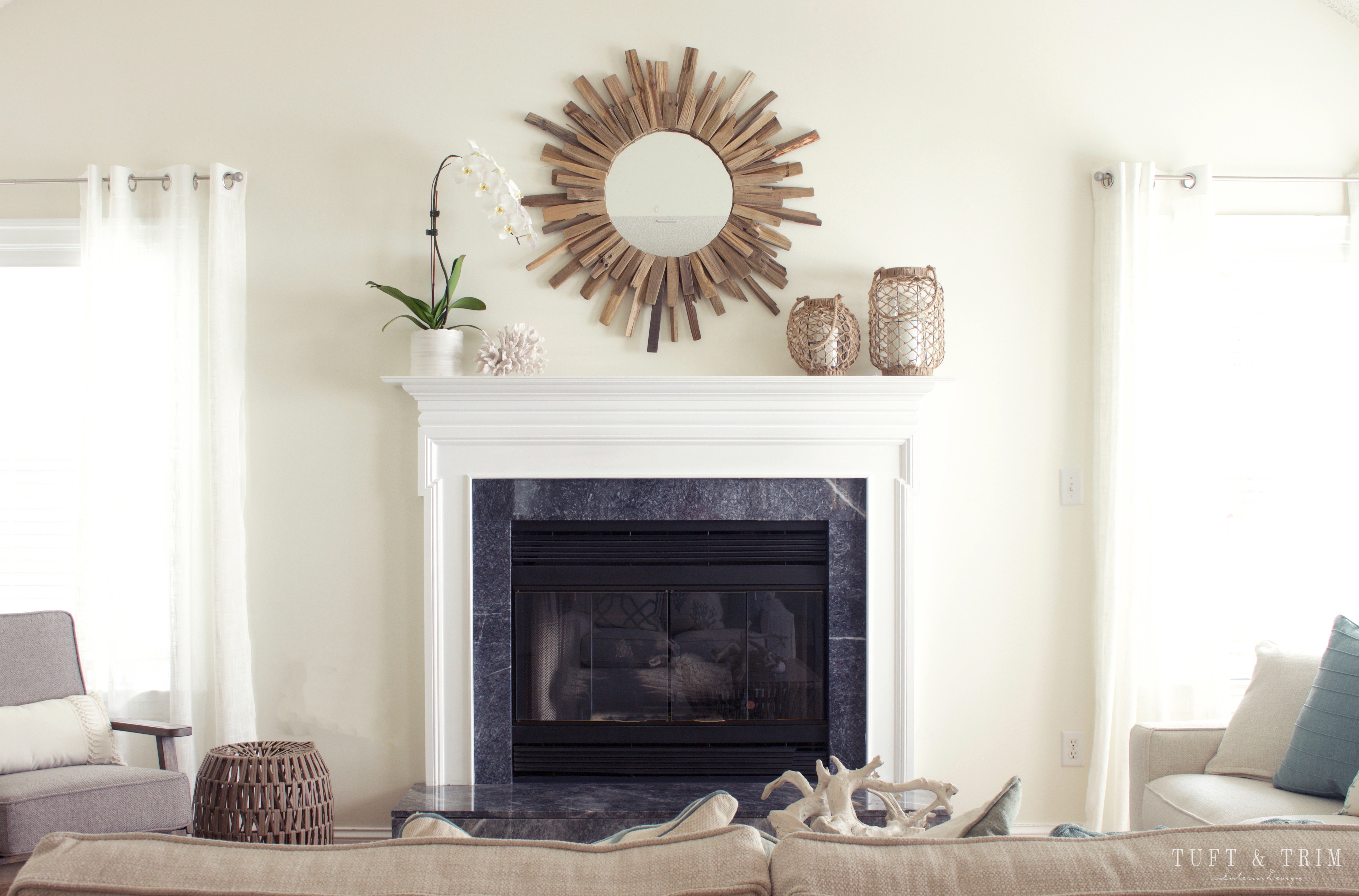
Another change we made were the drapes. Because previous ones weren’t long enough, we found some cream linen panels that touch the floor. My biggest pet peeve are drapes that don’t reach the floor so the change was a must.
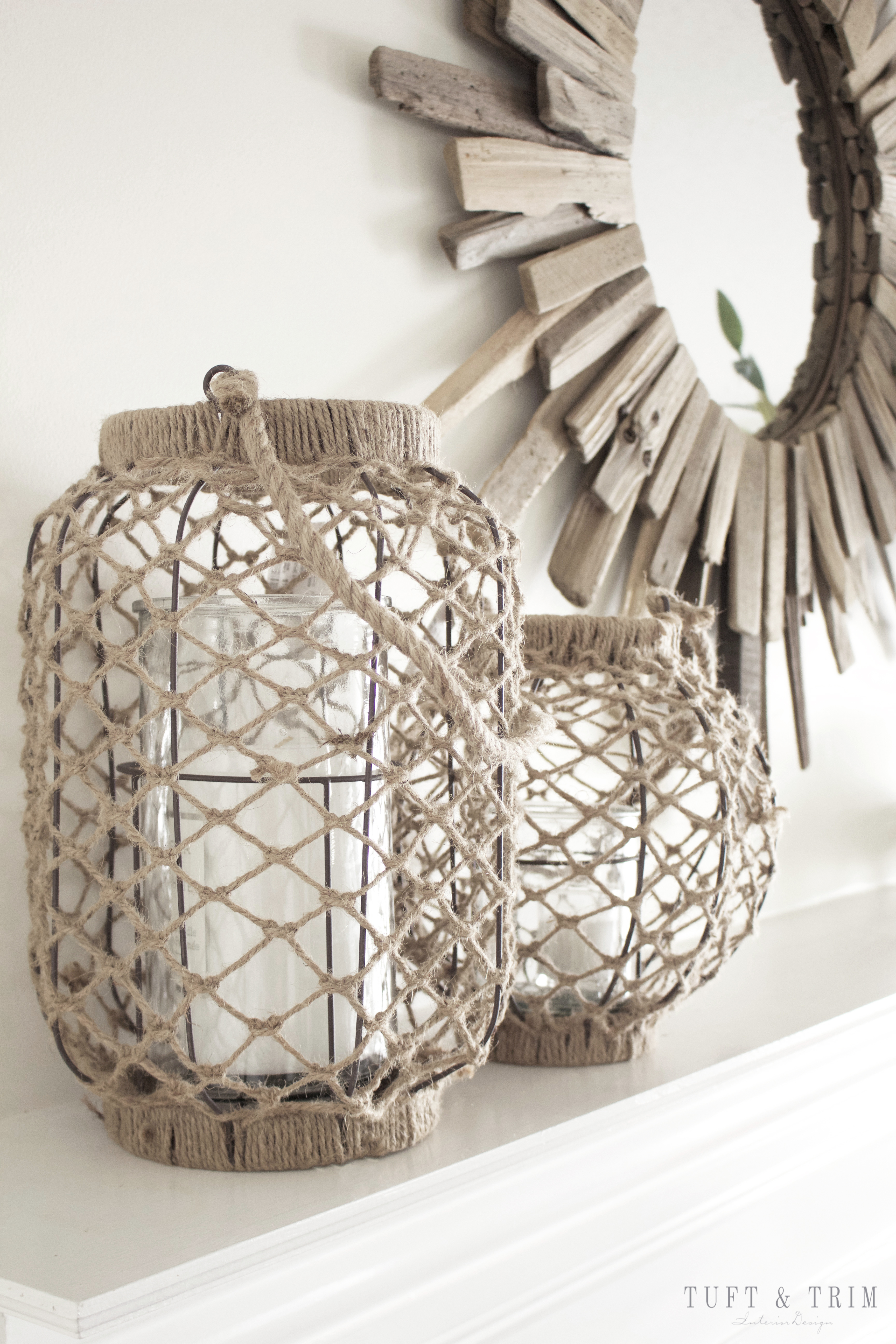
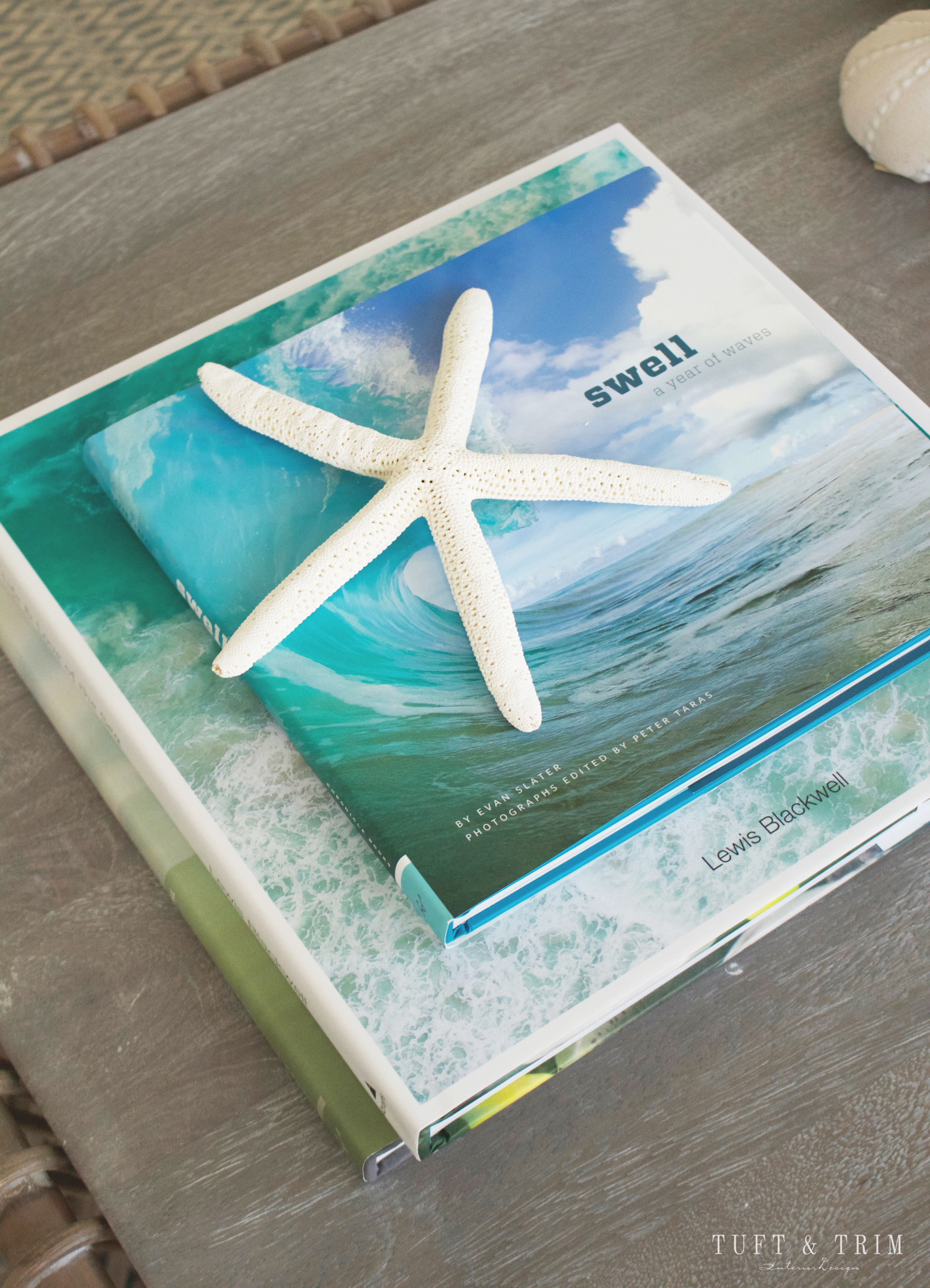
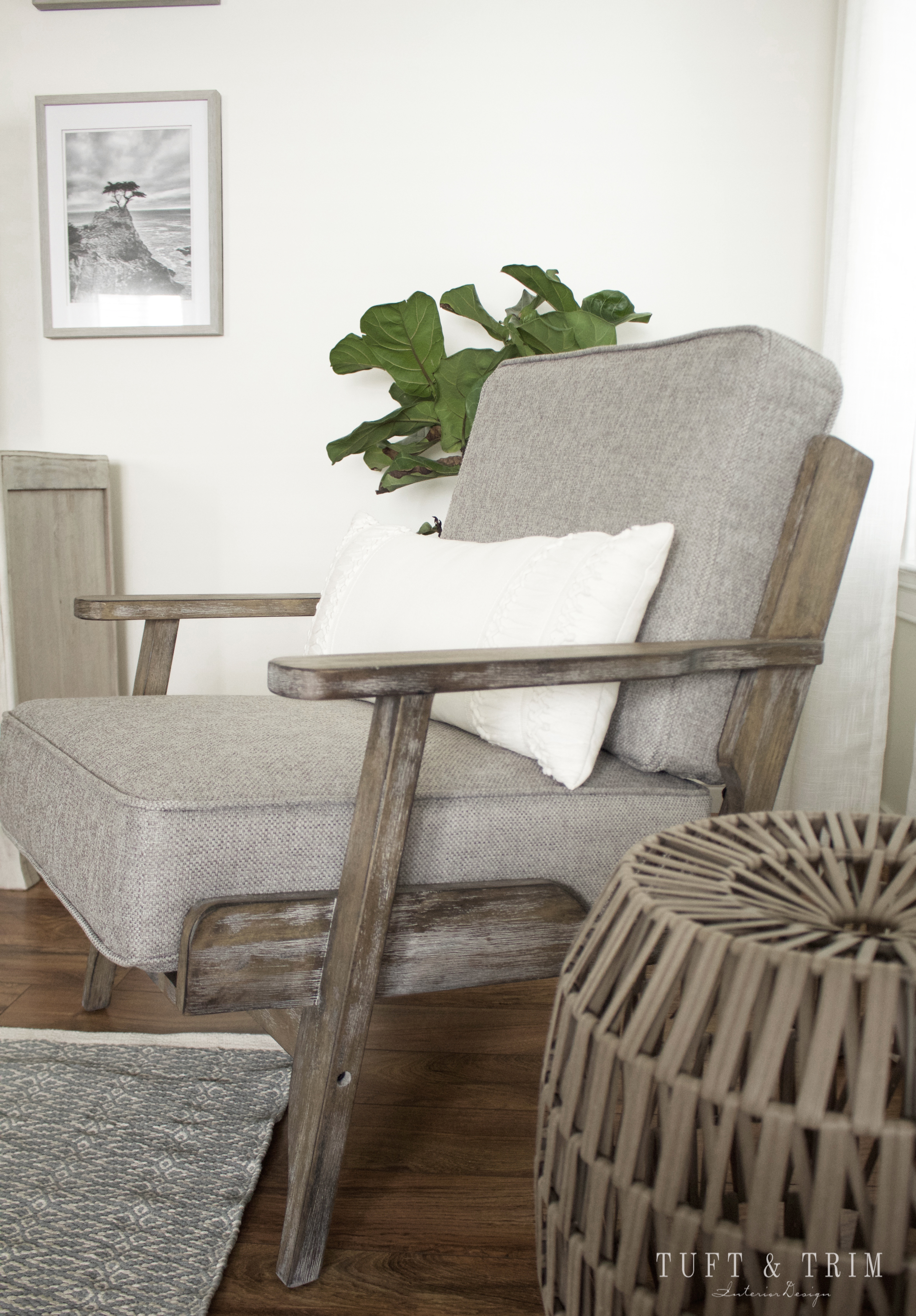
Overall, my client is thrilled with the final outcome, and so am I! Now on to the dining room…
Thank you so much for stopping by! I hope you’ve enjoyed todays tour and feel inspired to tackle some design projects of your own. Feel free to subscribe so you don’t miss out on my latest designs. Until next time!


What’s the paint color on the walls?