Left picture: Source Right picture: Source
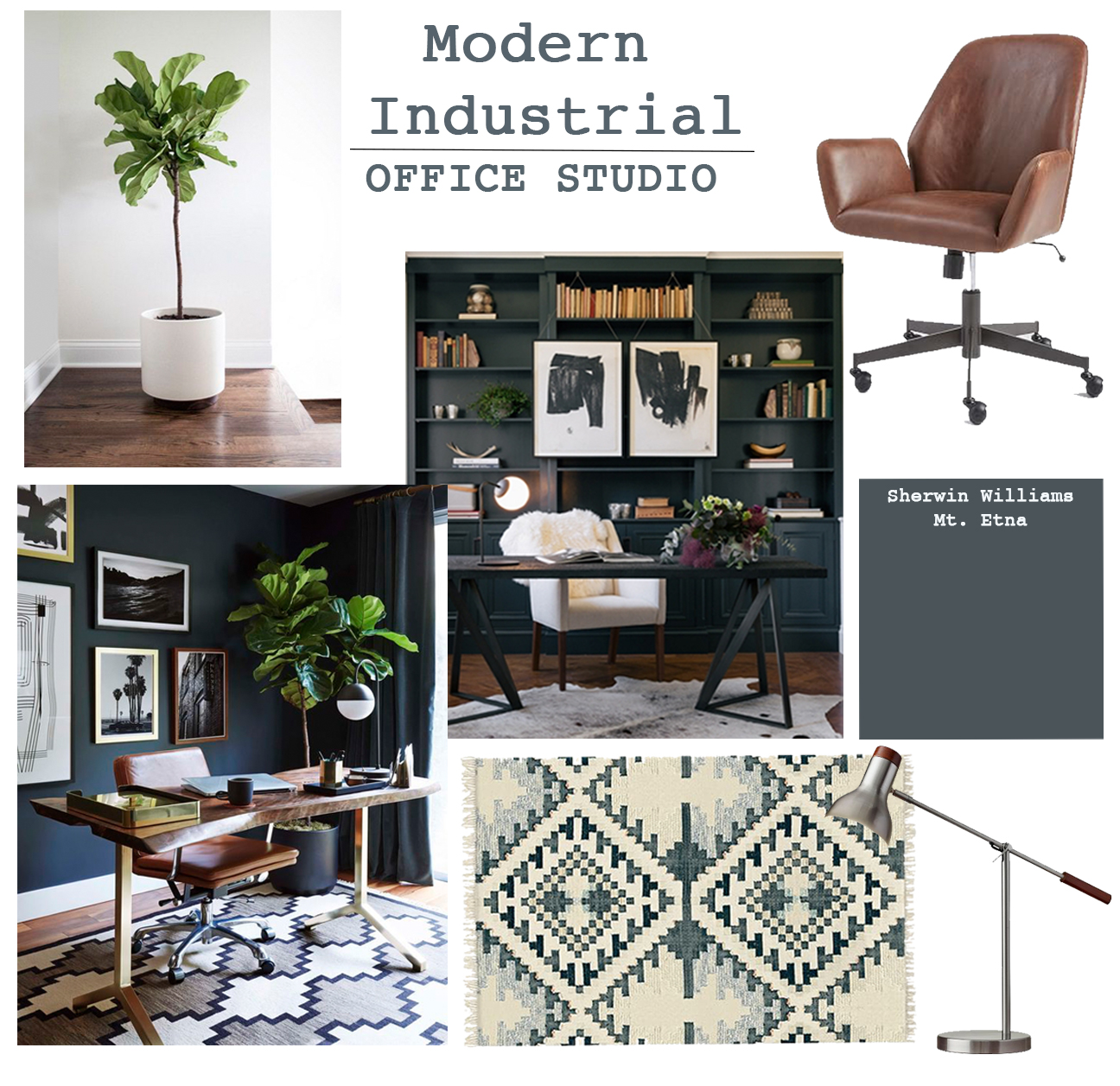
For the past two weeks I have been working on transforming a client’s studio loft to a modern office and living space. One of the many things I love about being an Interior Designer is that I get to design spaces in all types of styles. As I try to capture each look, I grow to love it even if it’s not my personal taste. I’ve wondered if I should share some of these contrasting looks on my blog, since they clash with the consistency of my designs I typically share. But I guess that’s part of being a designer. You design around client’s tastes and wants, so you’re bound to have a wide variety of projects. That’s what makes it so much fun. So why not share it all?
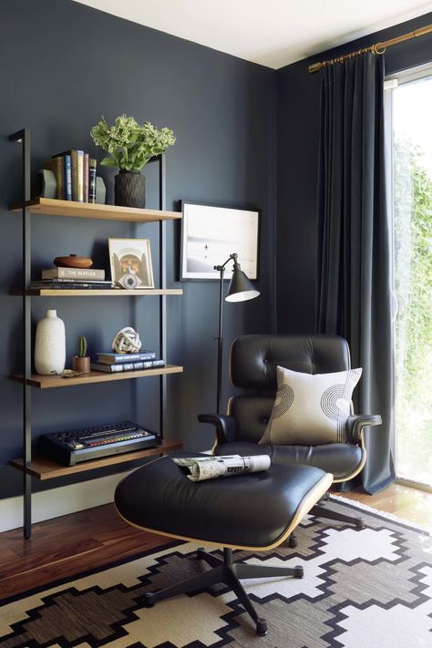
This design concept begin to form as I fell in love with this modern and moody office by Emily Henderson. I was so inspired by her combination of patterns, finishes, and pieces and the way they all worked together. In my clients’ loft there are exposed pipes, beams and high ceilings making it the perfect setting for an industrial theme. The exterior wall is lined with large windows and a sliding glass door, bringing in plenty of natural light which allowed me to go dark on the walls.
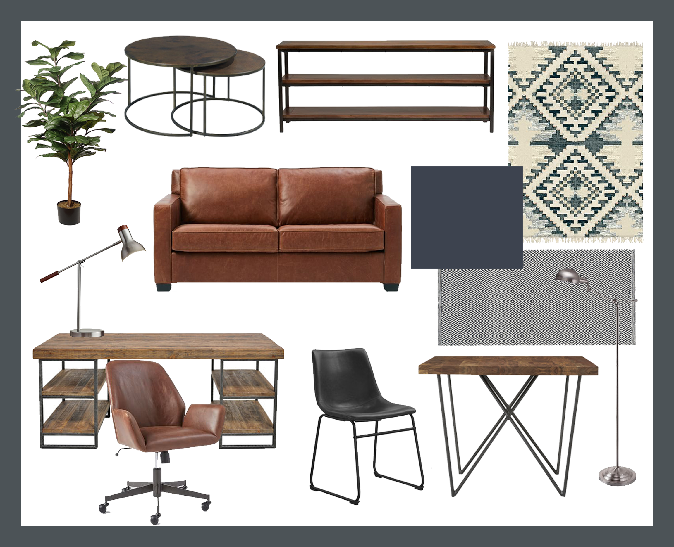
Here are some of the pieces I initially chose for the design. My client requested silver finishes and liked clean and modern lines. Before starting the project, I drew up some illustrations on what I had planned for the space. Starting with the office area.
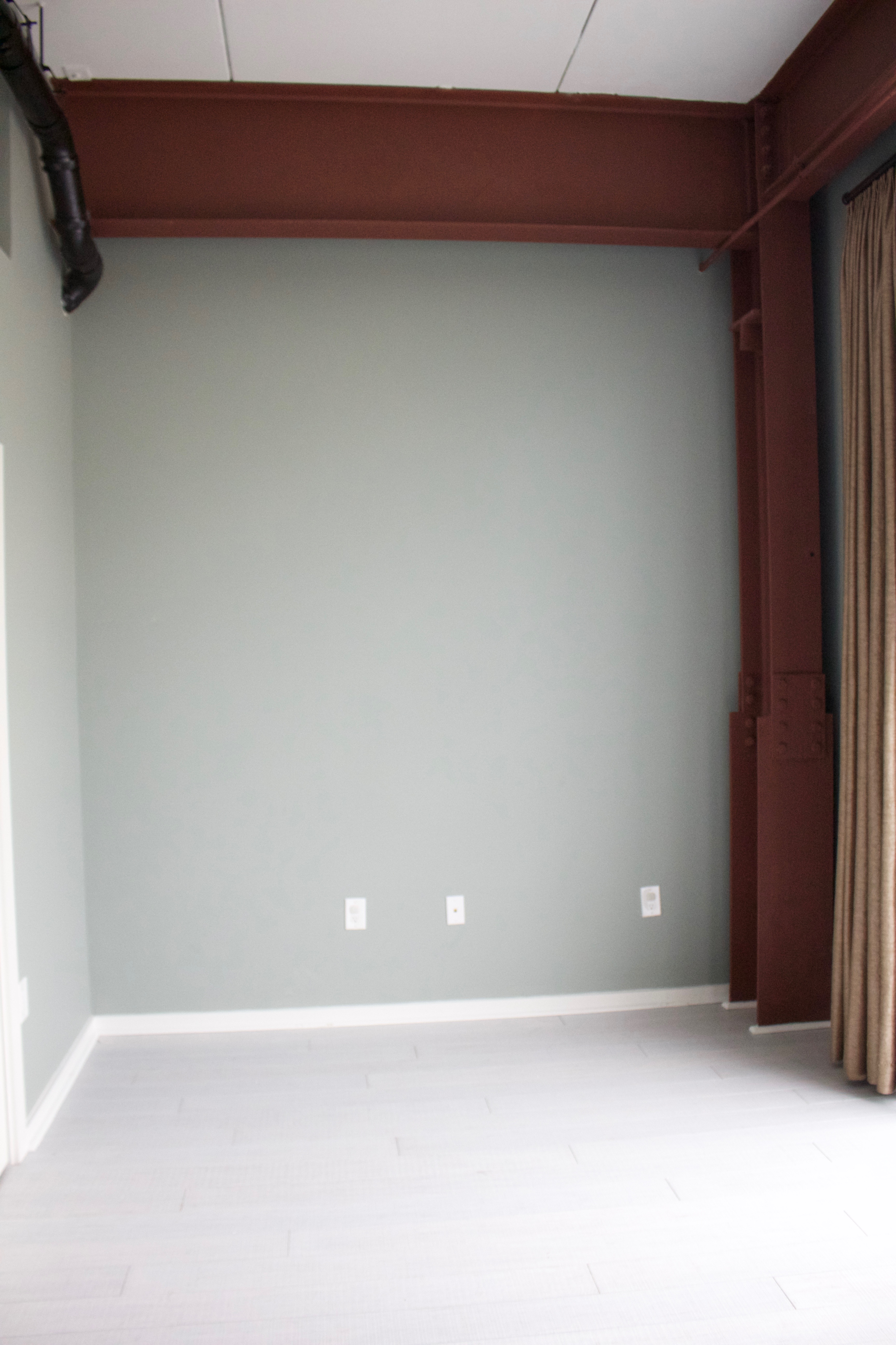
Before
I liked the existing wall color, but it didn’t align with the look I wanted to achieve. I also didn’t like the color combination with the dark red beams. Because of limited time and budget, I decided to keep the beams, trim, and doors the same color and paint the walls a charcoal navy. I actually liked the charcoal with the dark red and thought it complemented each other nicely.
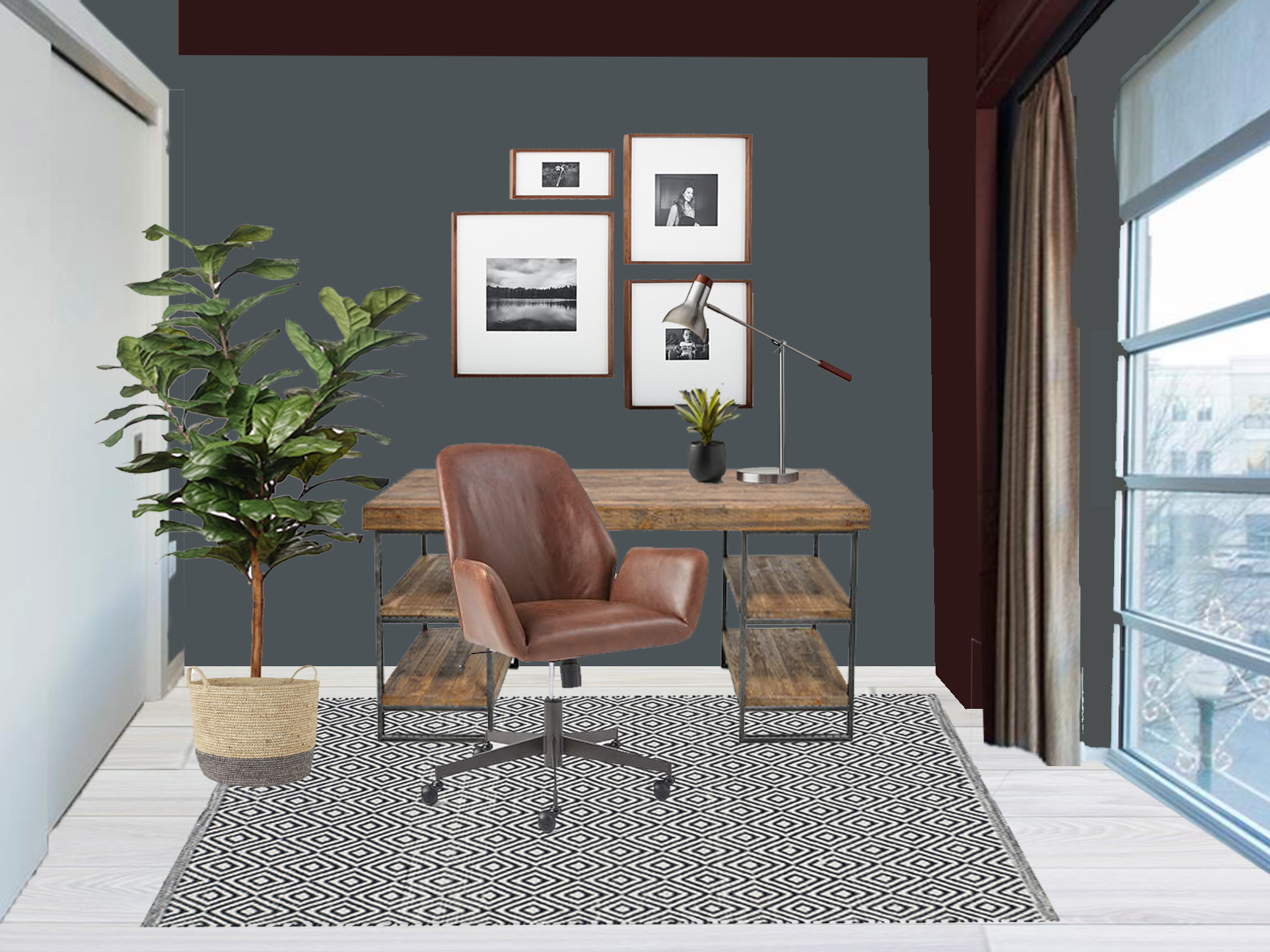
Proposed Desk Area
In the corner of the loft there’s a small space that is the perfect setting for a desk area. I wanted to find a modern industrial style desk and thought the clean lines along with rustic wood accomplished the look.
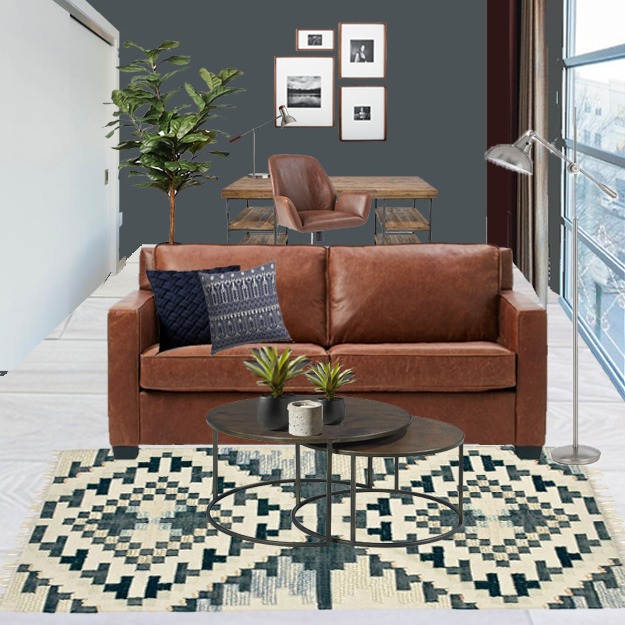
Proposed Seating Area
The rich leather sofa is a pull out sleeper so it can accommodate over night guests. The leather of sofa and office chair coordinate and create a warmth that contrasts the dark and moody wall color.
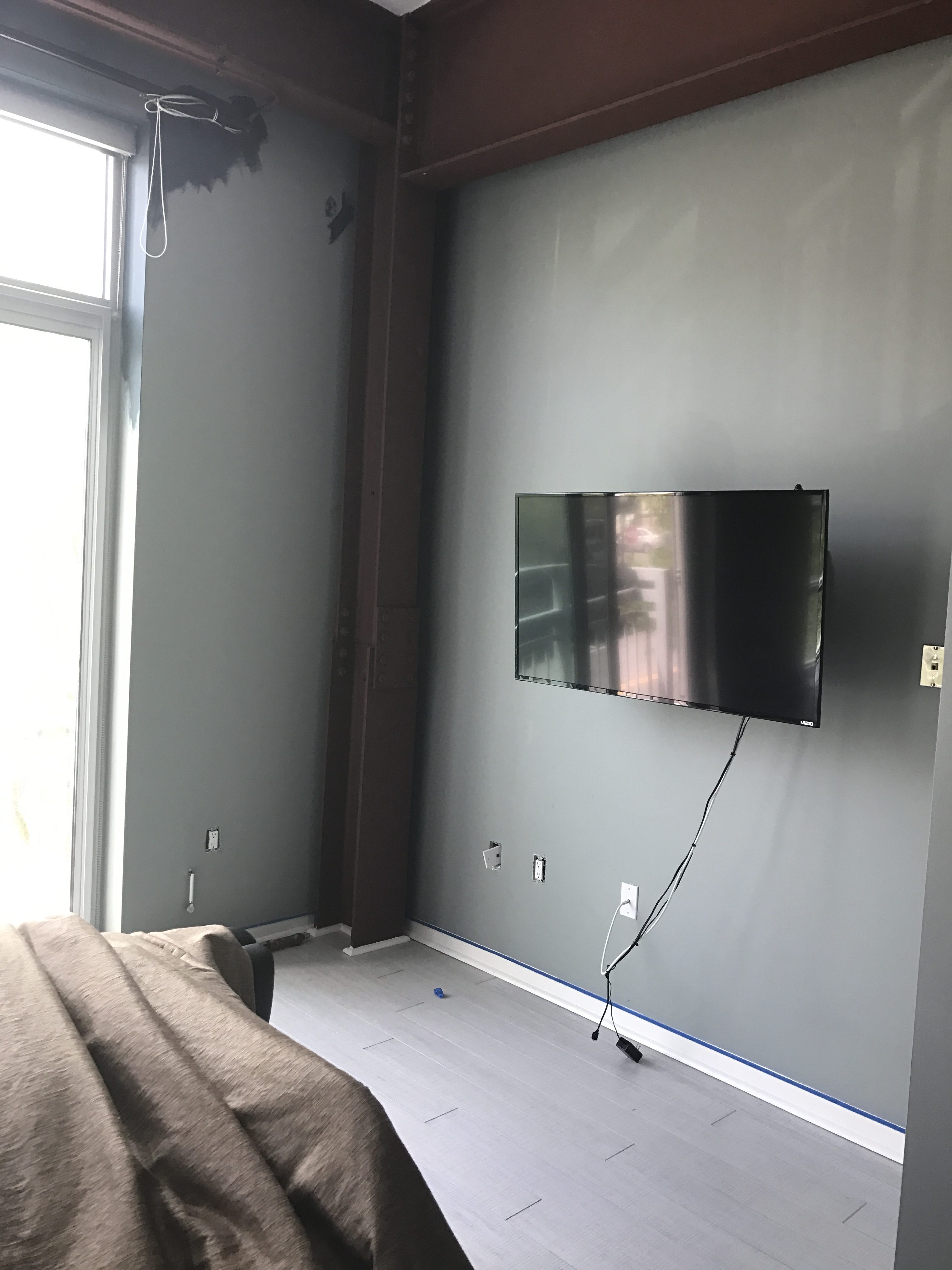
Before
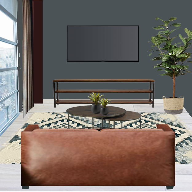
Proposed TV Wall
This rug from West Elm is the perfect combination of texture and color for this space. I wanted something bold to show personality, but also wanted to bring in the wall color. This rug accomplished all that and more! Can’t wait to see how it pulls together!
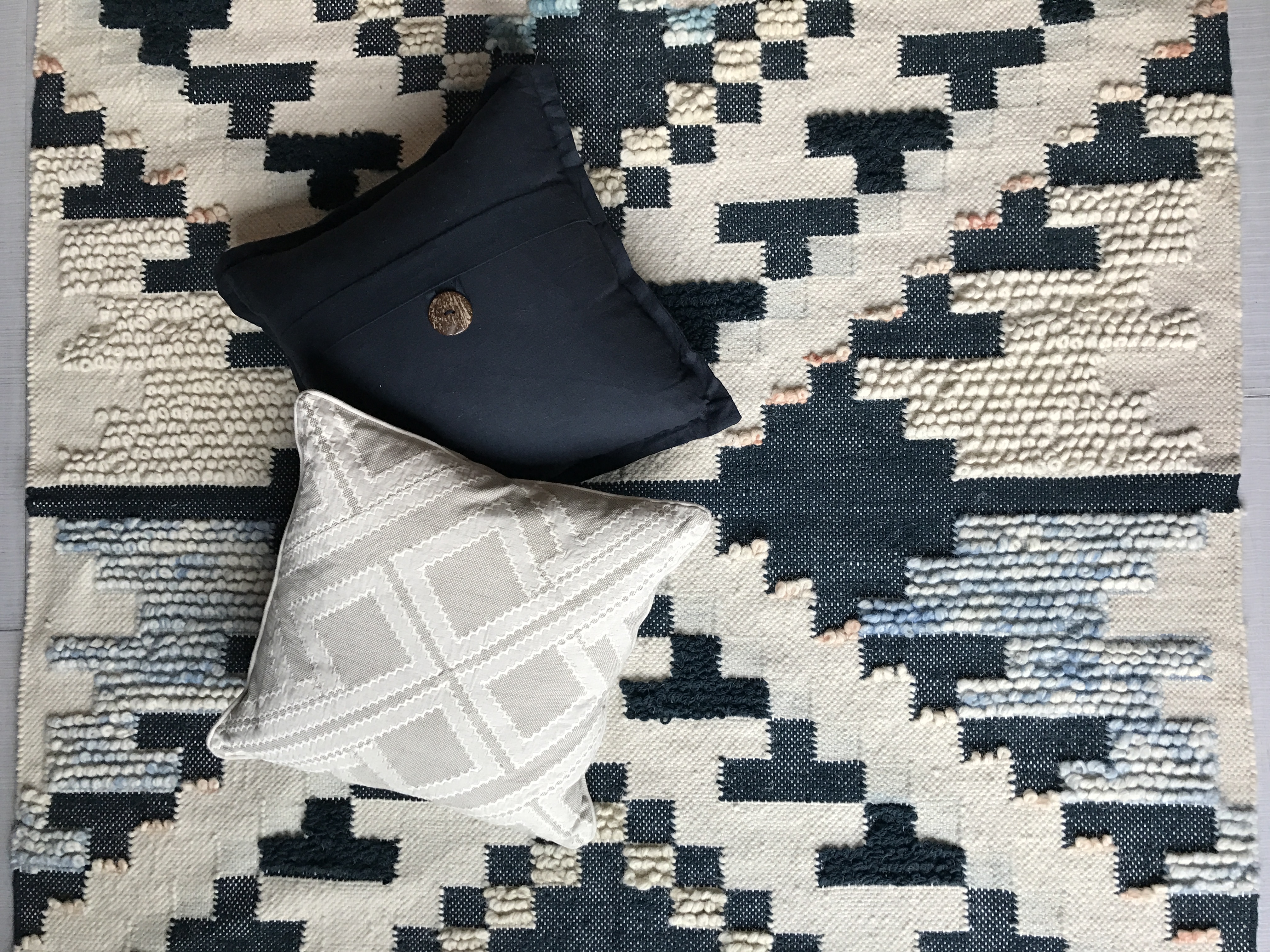
So there you have the beginning stages of the design, starting with the concept, furniture selections, and design perspectives. The painting has just wrapped up and the pieces are slowly trickling in. Can’t wait to share the final result. If you like the style of this project, feel free to shop the items in the link below!

[carousel_slide id=’3194′]
[do_widget id=text-15]
*This post contains affiliate links

Thanks for sharing your thoughts on office design. Regards
You’re welcome! Thank you so much for stopping by!
Where can I find that couch and computer chair at?