My bedroom update is complete, and it’s about time! Today I’m sharing a tour of the space, along with the sources so you can shop the look! I’ll also be sharing my designer hacks on how to get an expensive and chic look for less. Come see how a little DIY can transform a space!
*This post contains affiliate links.
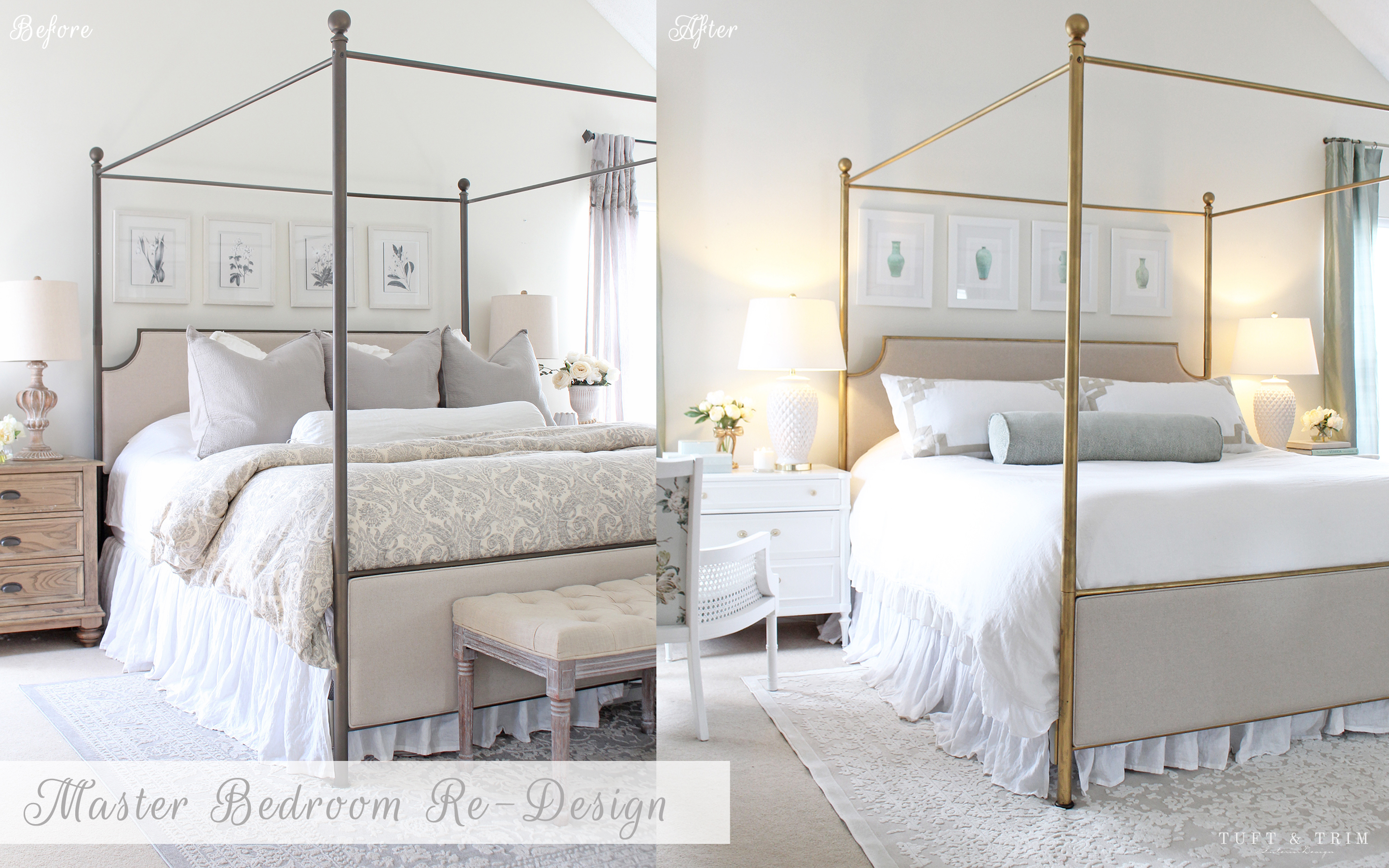
It all started when my husband left for deployment in January. I’d been wanting to change up our room for a while and decided now was the perfect time. If he were there, he’d had thought I was crazy for changing what I finished just over a year ago (and maybe I am). But, as a designer, I’m constantly decorating other peoples homes and sometimes I’m influenced by a project and want to have some fun in my own home.
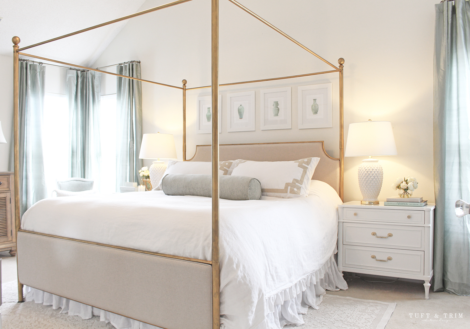
As much as I loved my previous bedroom style, I was starting to get sick of the dark bronze and needed a break from rustic and gray. I tried to be resourceful and used a rug from the other room and gave my bed a facelift. Bold move, I know. One day during my sons nap time I decided, “What the heck, let’s go for it” and layered rub n buff all over my canopy bed. I really had no clue what I was doing, which is why I didn’t make a tutorial on that one… but, it’s pretty easy if you just follow the instructions. Once I was done I was amazed at how much that change alone had impacted the space. I was on a roll….what else could I change?
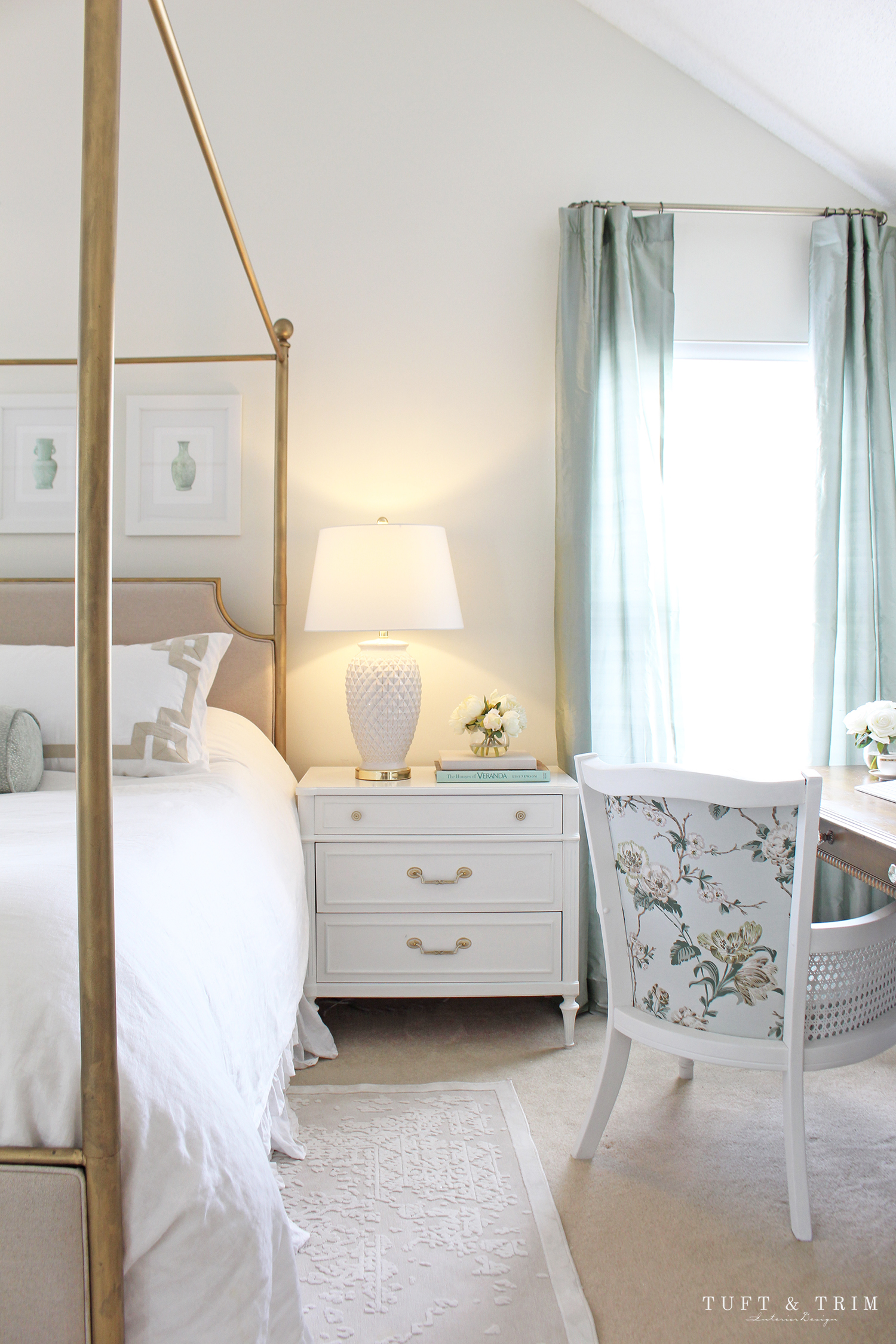
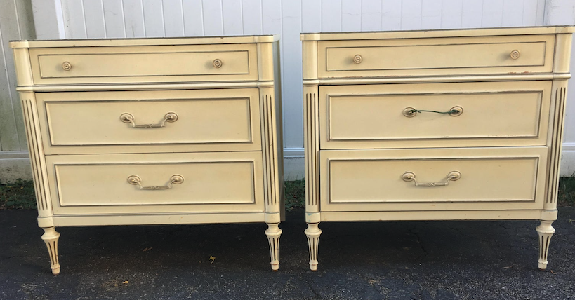
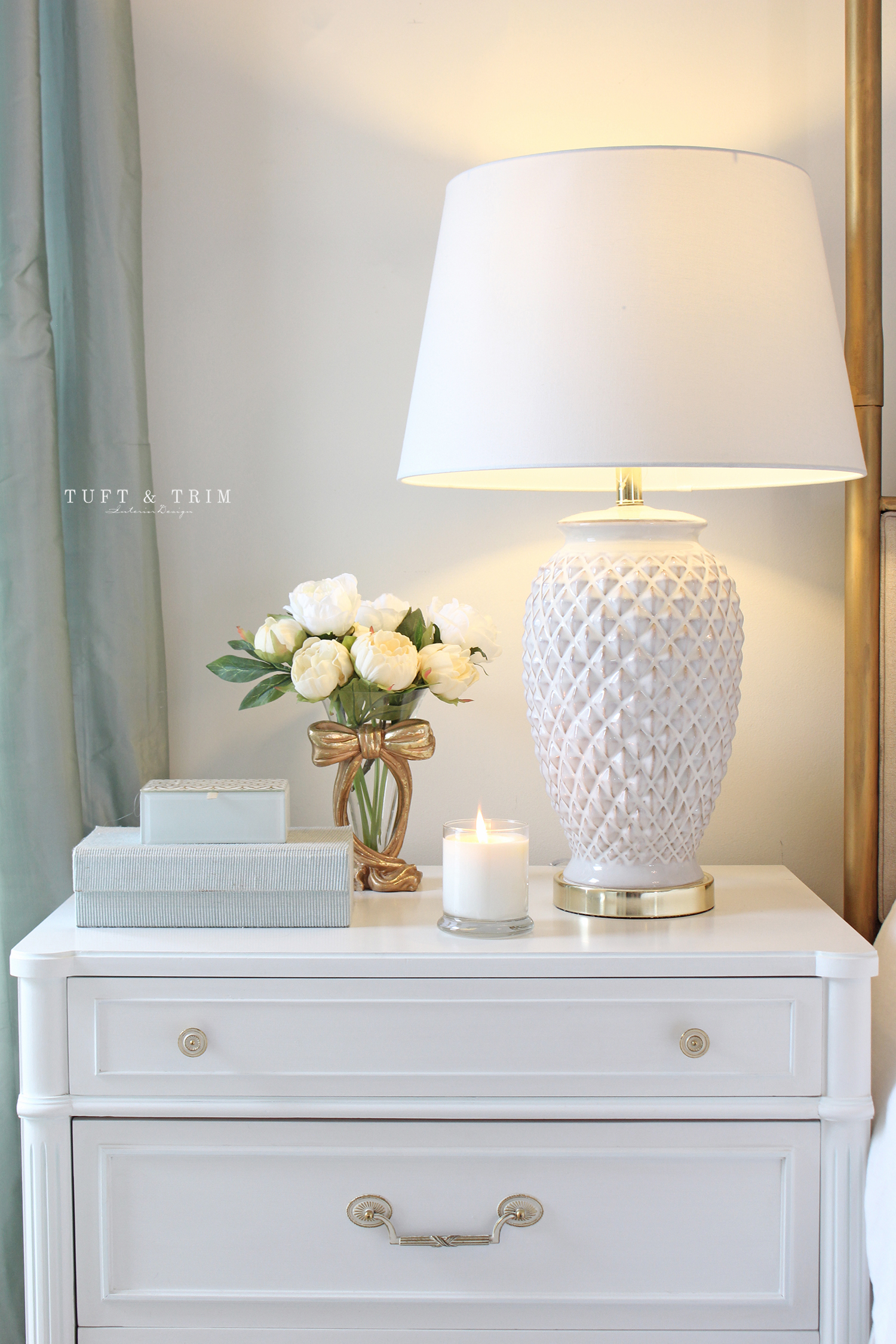
The nightstand. I loved our previous ones and still have them and look forward to using them in another room. I was wanting something lighter with a bit more character, but not super expensive. These gems are vintage Thomasville nightstands from the 70s and I found them on chairish for a steal. They’re great quality, solid wood pieces that just needed a little refresh (as you’ll see below) so I put a fresh coat of paint over them. I still plan on highlighting the trim with gold, but for now I’m pretty happy with them. What do you think??
Although I can’t link these since their vintage, I did find some other similar styles you can check out below. And don’t forget about checking out places like Chairish and your local facebook marketplace. Sometimes you can find the most amazing used pieces at a fraction of the cost!

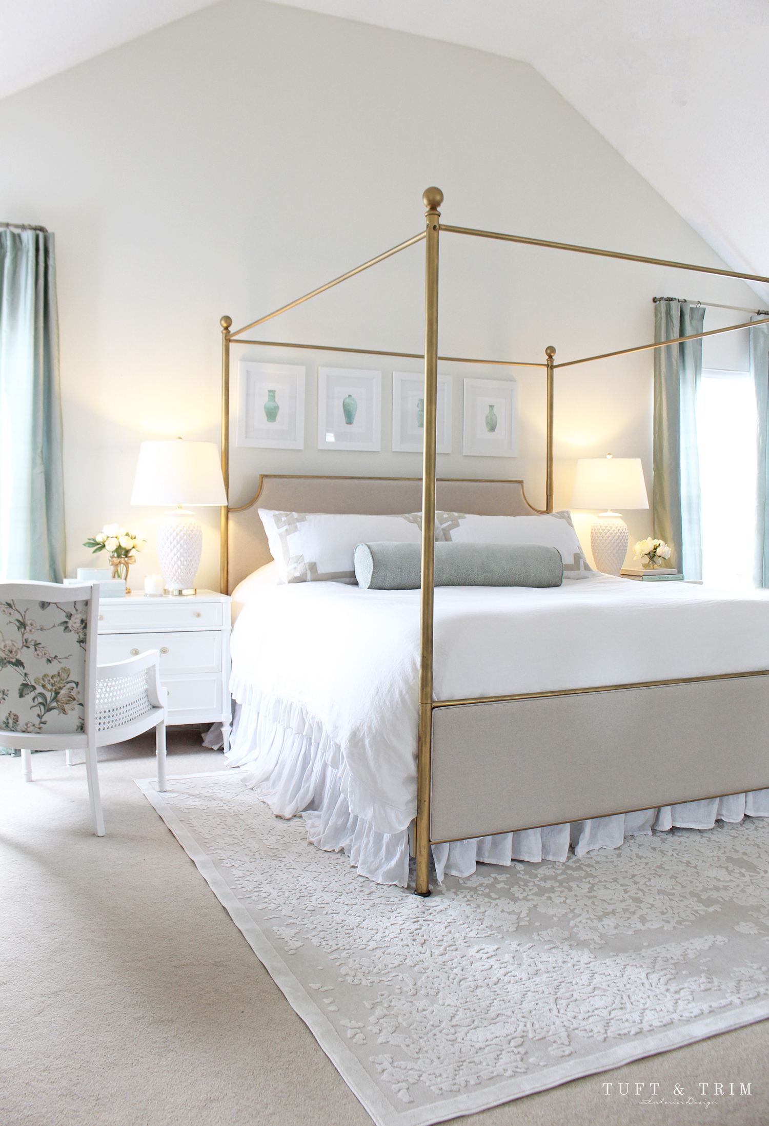
Once I found these nightstands, the wood lamps had to go! I found these white ceramic lamps on overstock and I’m so glad I took a risk and ordered them right away, because they’ve been sold out since. Such a bummer because I was so looking forward to sharing them with you. But, that being said, I’ve tried to find some similar styles for you to browse through below.

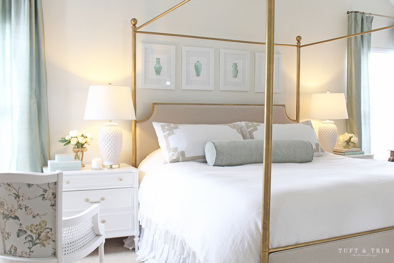
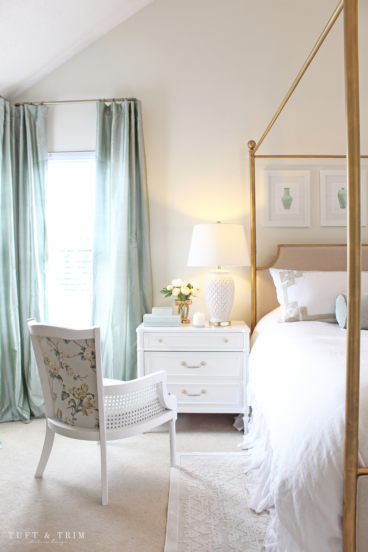
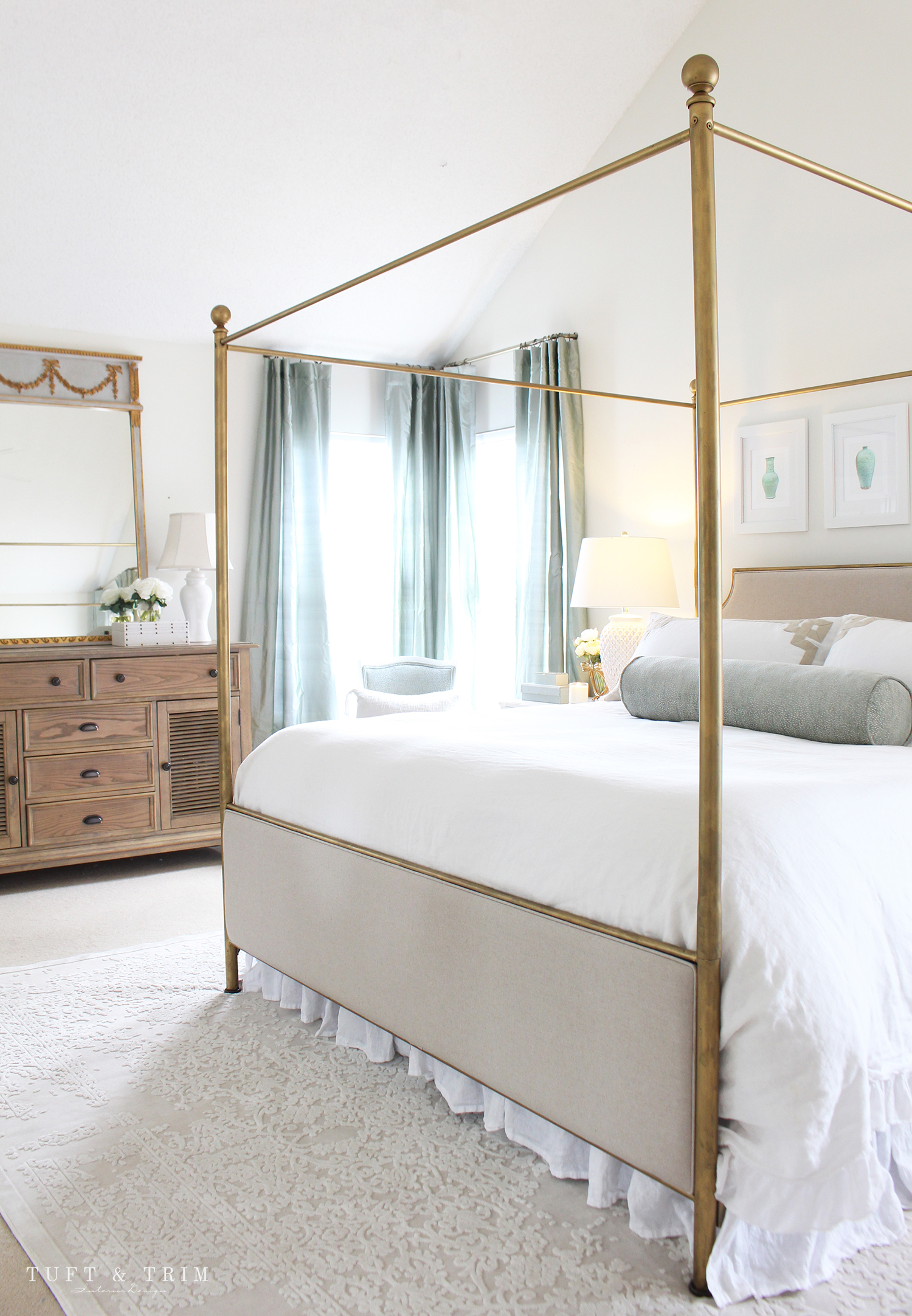
You may recognize this chair from old pictures of my bedroom. It had a gray seat and an unfinished back, so I reupholstered it to match the new space! The back of the chair is Betty Chintz Celadon by Schumacher and the seat and chair front is Menemsha Mineral, also by schumacher. I also used the same upholstery fabric for the bolster pillow on the bed. The floral pattern became the inspiration for the color scheme and I got enough fabric to make euro shams, so that is still in the making.. but I can’t wait to see it all come together! The bordered king shams are also a fun addition, don’t you think?
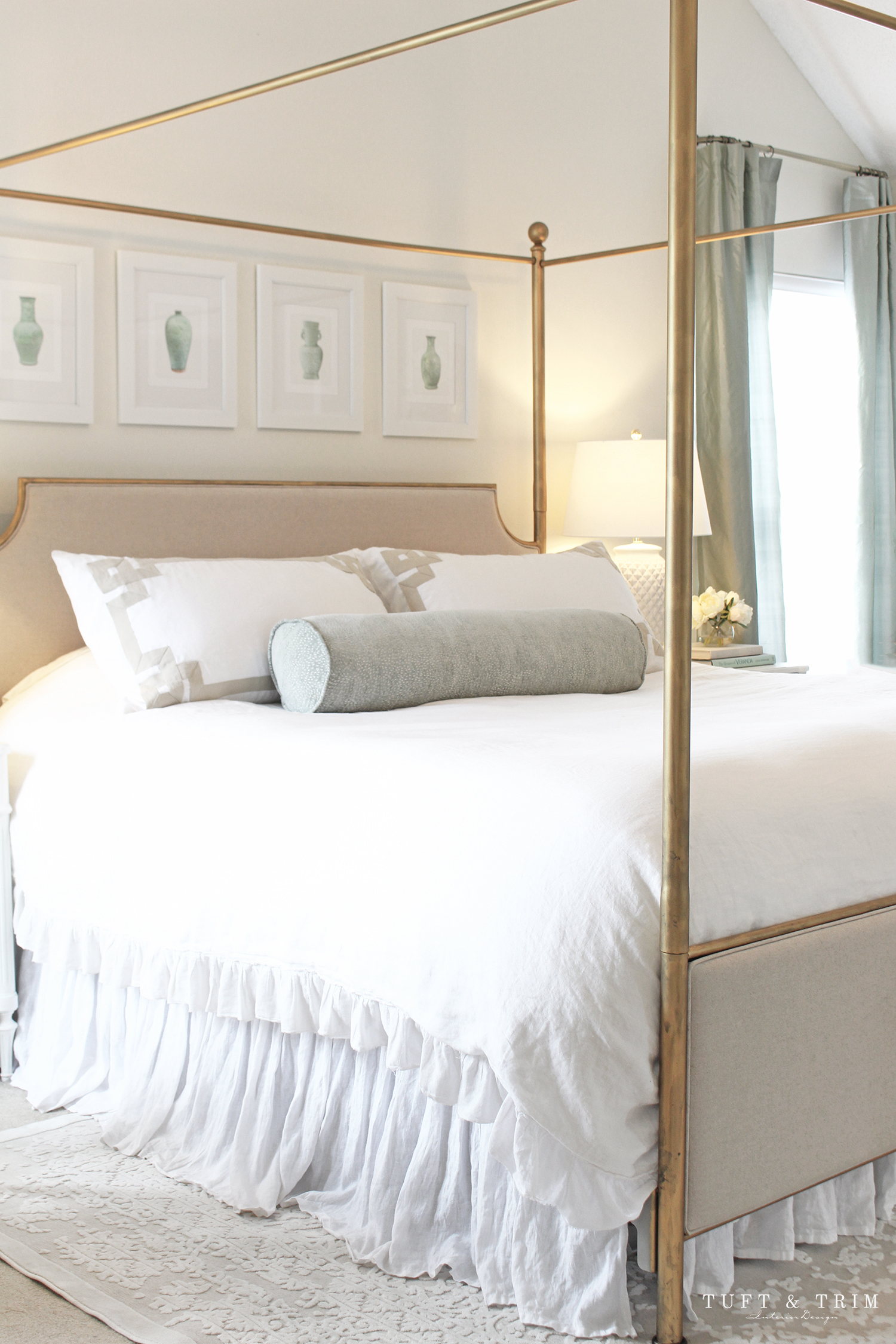
Above the bed I replaced the botanical prints with these beautiful chinoiserie vase prints by Paperwords. They come printed on watercolor paper and matted ready to frame. I love how they bring in the celadon color and coordinate with the new dupioni silk curtains. The curtains were the biggest splurge of the project, but well worth it. I’ve learned that quality drapery really does make a huge impact on the room. These gorgeous silk curtains have a beautiful sheen to them and bring so much elegance to the space.
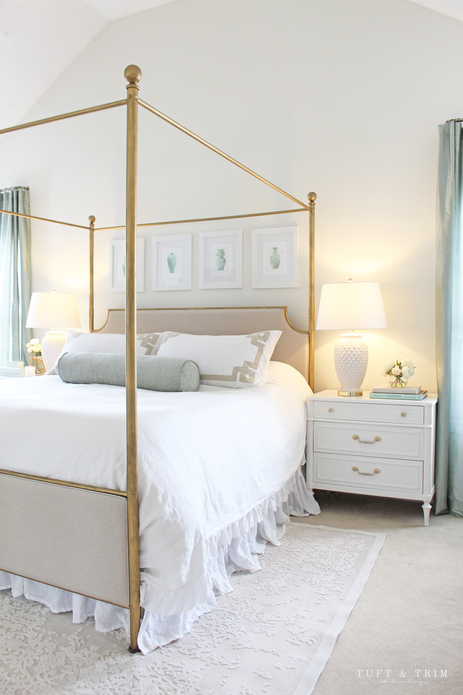
My bedding is the original white ruffled linen from the previous design. You can’t go wrong with white bedding so I’m sharing all my favorites for you to shop below.

I haven’t gotten around to getting a new dresser yet, but plan to update that as soon as I find the right one. You can expect to see another vintage or antique piece for sure, and something that will coordinate with my French Trumeau mirror.
So, what do you think of the updates? I hope you like them. In either case, I’m just happy you’re here and took the time to visit my page. If you missed the first bedroom design, you can take a tour of it here. If you’re looking to update your bedroom and like this look, I’ve rounded up a variety of items for you to browse through below.

Thanks so much for stopping by! If you haven’t already subscribed to my newsletter, feel free to do that below. You can also follow me on social media so you don’t miss out on any more home ideas and inspiration!
Instagram / Facebook / Pinterest


Gorgeous! Very fresh and yet timeless!
Thank you so much, Anna!! So glad you think so! 🙂
XO, Courtney
You did a great job refreshing your master bedroom! Just beautiful!
Hi Kristan,
Thank you so much for your kind comment! So glad you stopped by. 🙂
xx Courtney