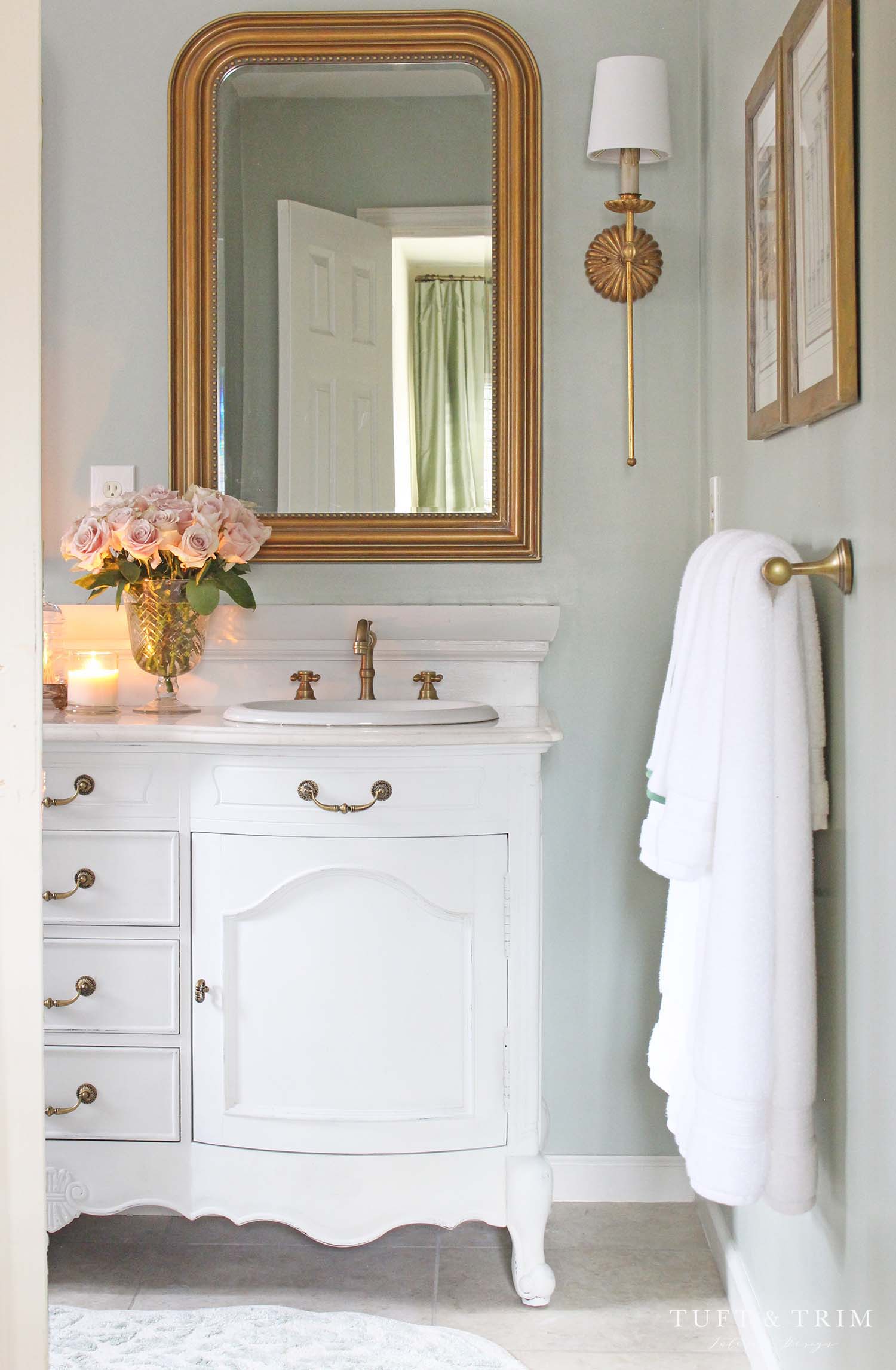
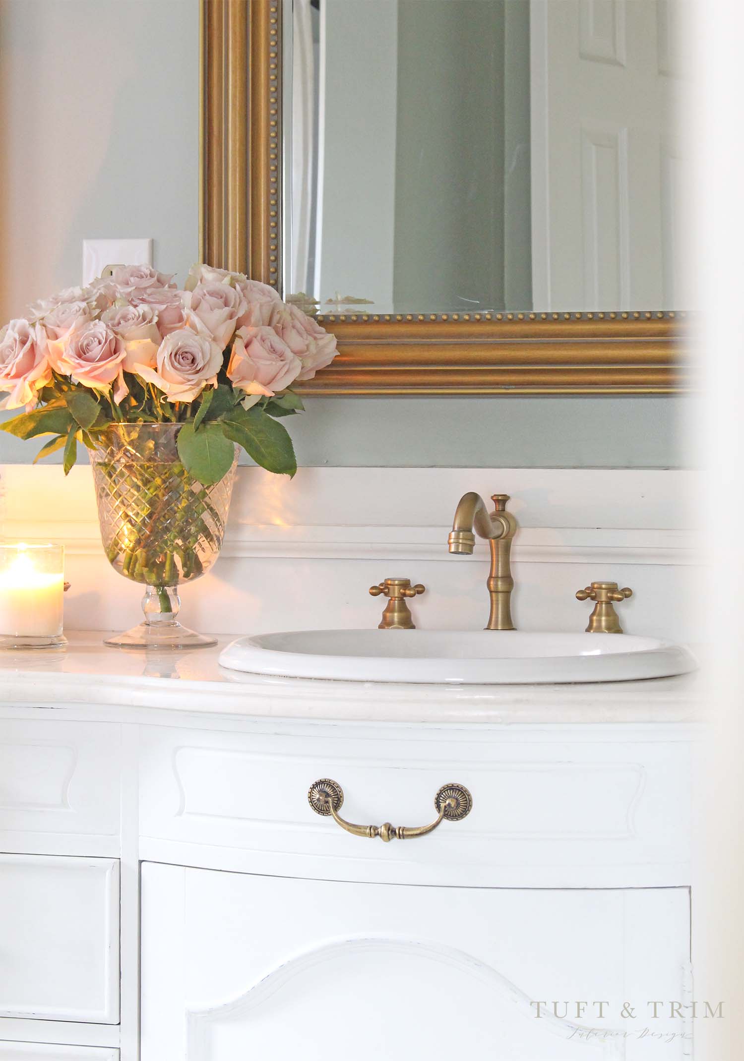
Soothing Sage green paint, warm brass fixtures, and romantic French touches make this tiny bathroom exude with elegance. With just a few cosmetic changes, this bathroom has completely transformed to a sweet little space that can’t help but draw you in.
When I first saw our master bathroom I was not thrilled about the size, but I knew it had potential. I envisioned the vanity painted white with pretty mirrors, gold hardware, and vanity lights that made a statement. Now, nearly a year later, my vision has come to life and I’m so excited to share it with you today. Follow along as I walk you through the design details, before & progress pictures, and all the sources.
*This post contains affiliate links.

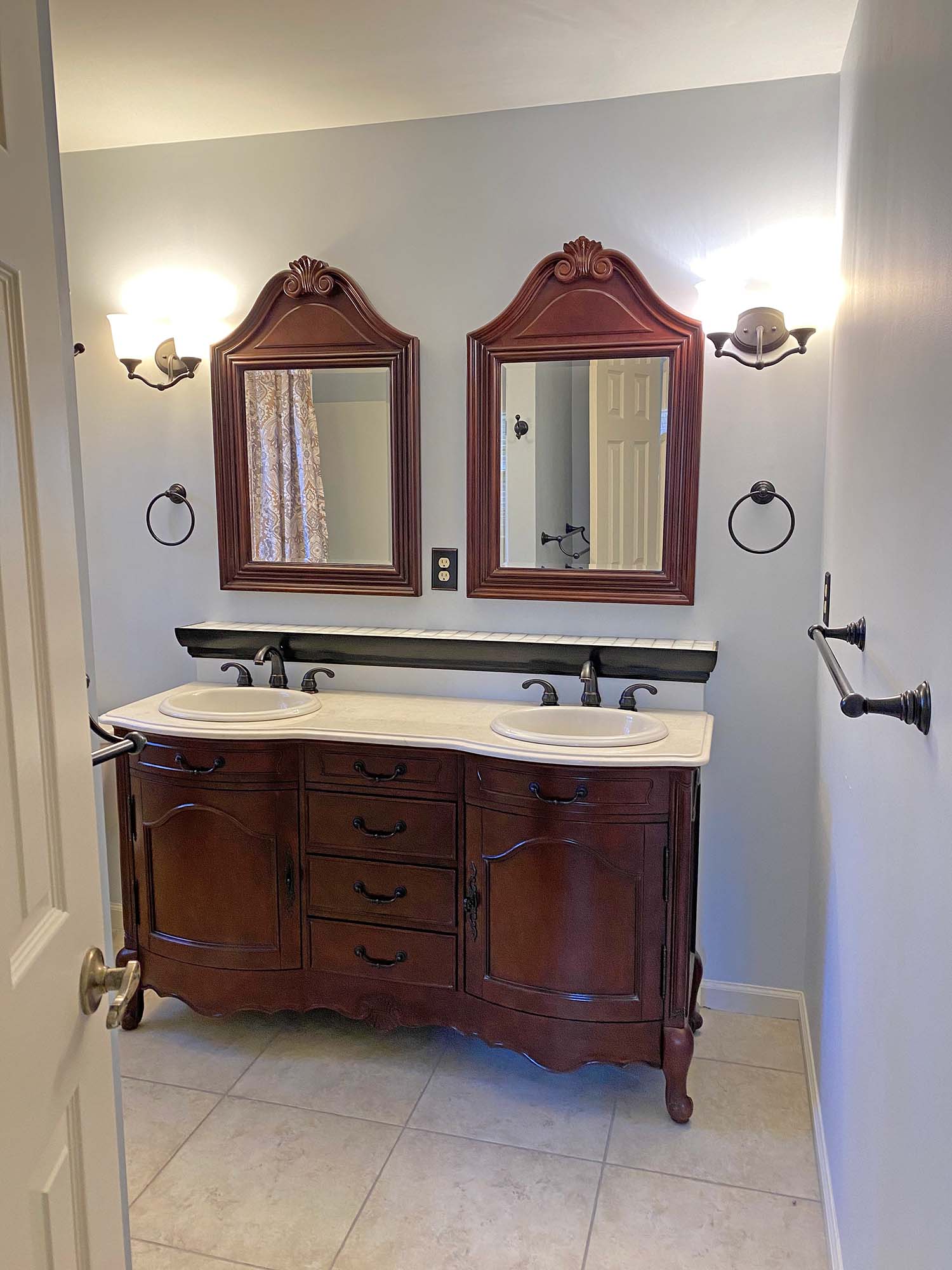
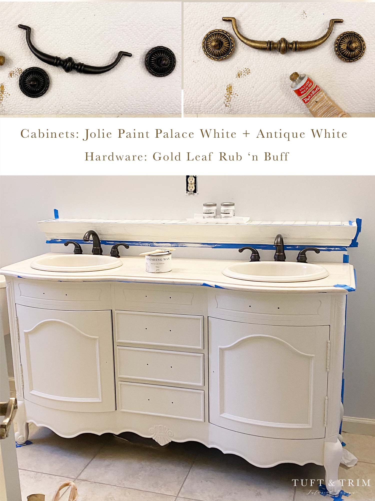
Let’s talk about the before. Not my style. The walls were cluttered with wall hooks and multiple towel racks and the vanity was too dark for my taste. Behind the sinks you’ll notice a ledge, it’s hard not to because the trim is painted BLACK. It’s an awkward shelf to begin with and the black only made it stand out more. Because the space had been recently updated before selling, I didn’t want to do a complete overhaul. However, I wanted to make it our own so we made a few changes that made a BIG difference…..
Before

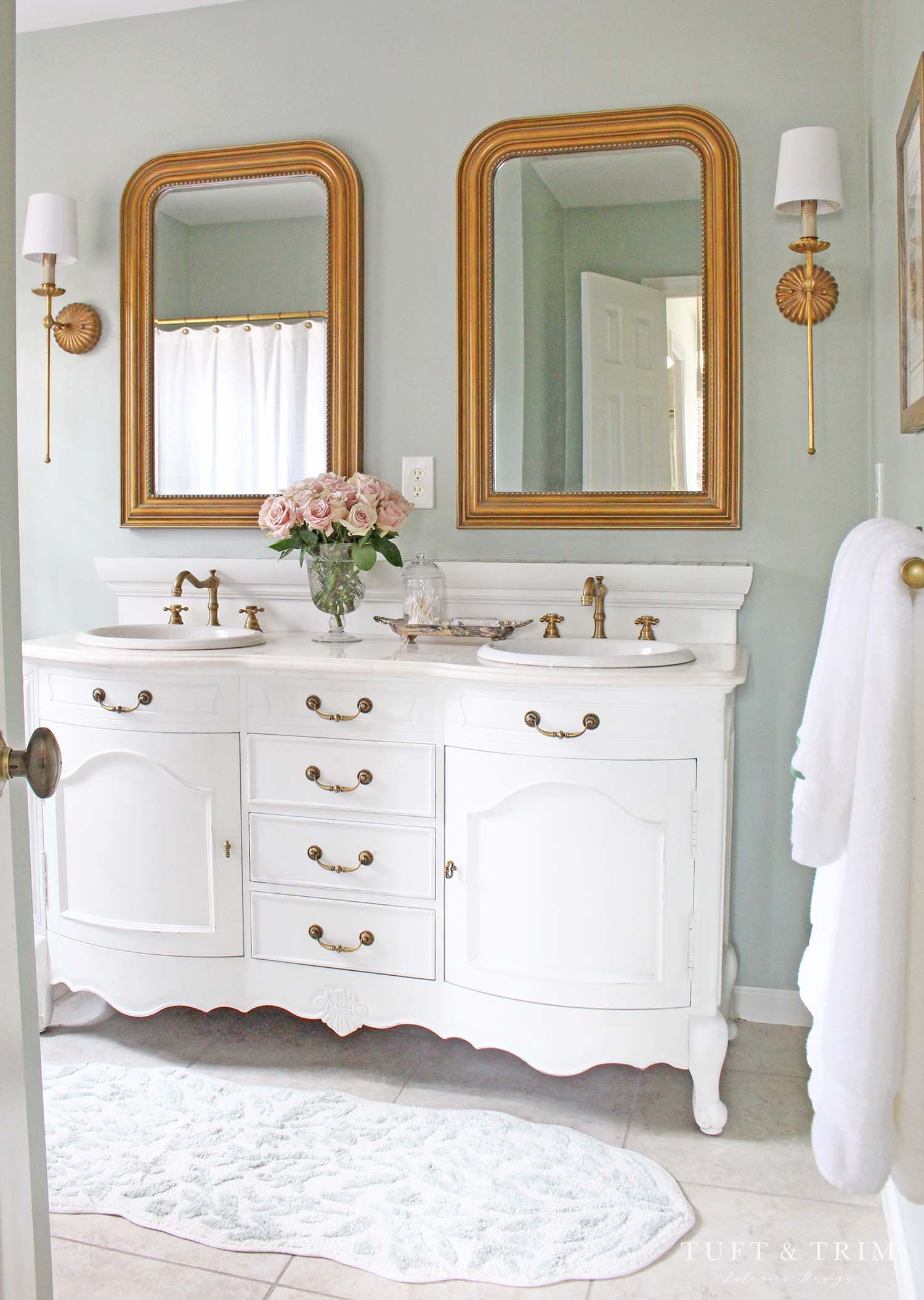
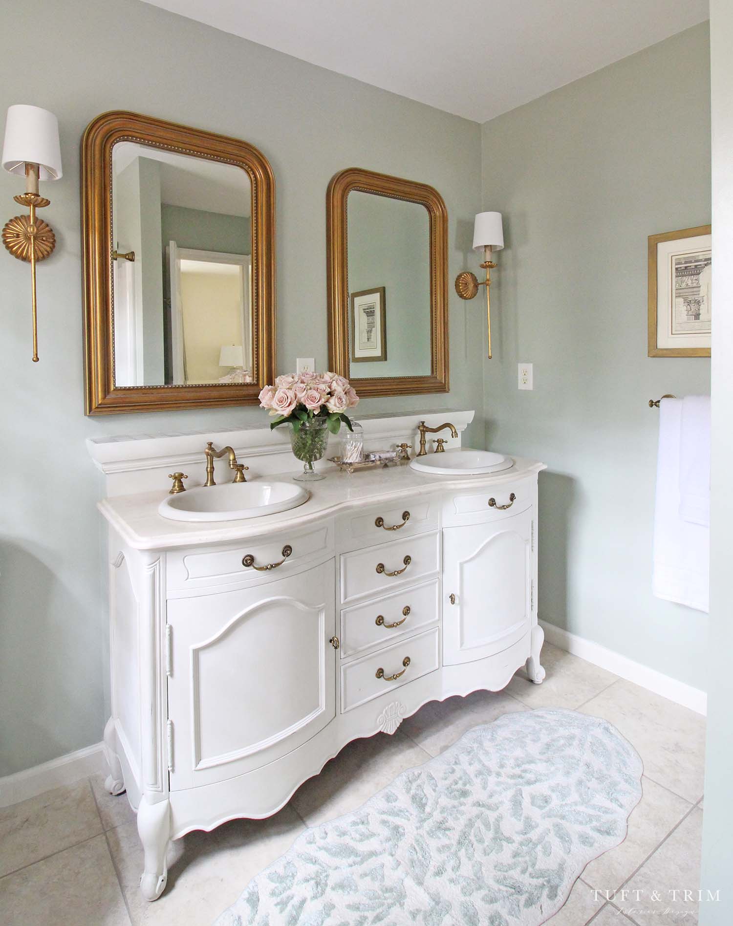
After
 Vanity Makeover
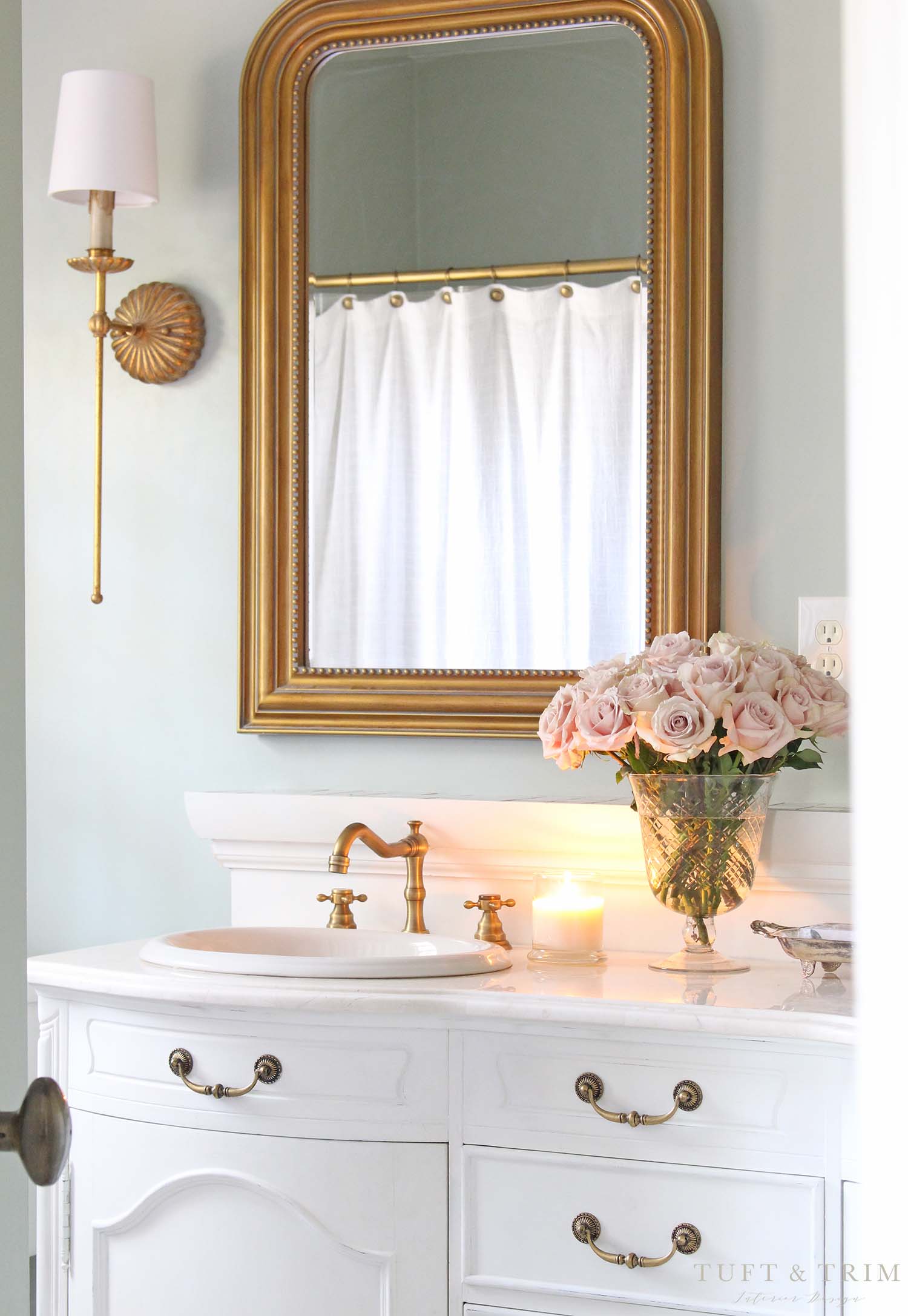
Now that’s better… way more my style. I started by clearing the walls of all the hooks and accessories and painted the vanity with Jolie chalk paint. I mixed their palace white with just a touch of antique white to get a soft, warm white. I lightly sanded down and sealed with their finishing wax and painted all the hardware with Gold Leaf Rub ‘n Buff. If you’ve been following me for a while, you know I use this stuff on just about everything-including our bed! For this project, I just applied with my finger and within minutes all the hardware was done. I also love that theres a dark undertone from the bronze that highlights the details and gives more dimension.
Lighting & Mirrors
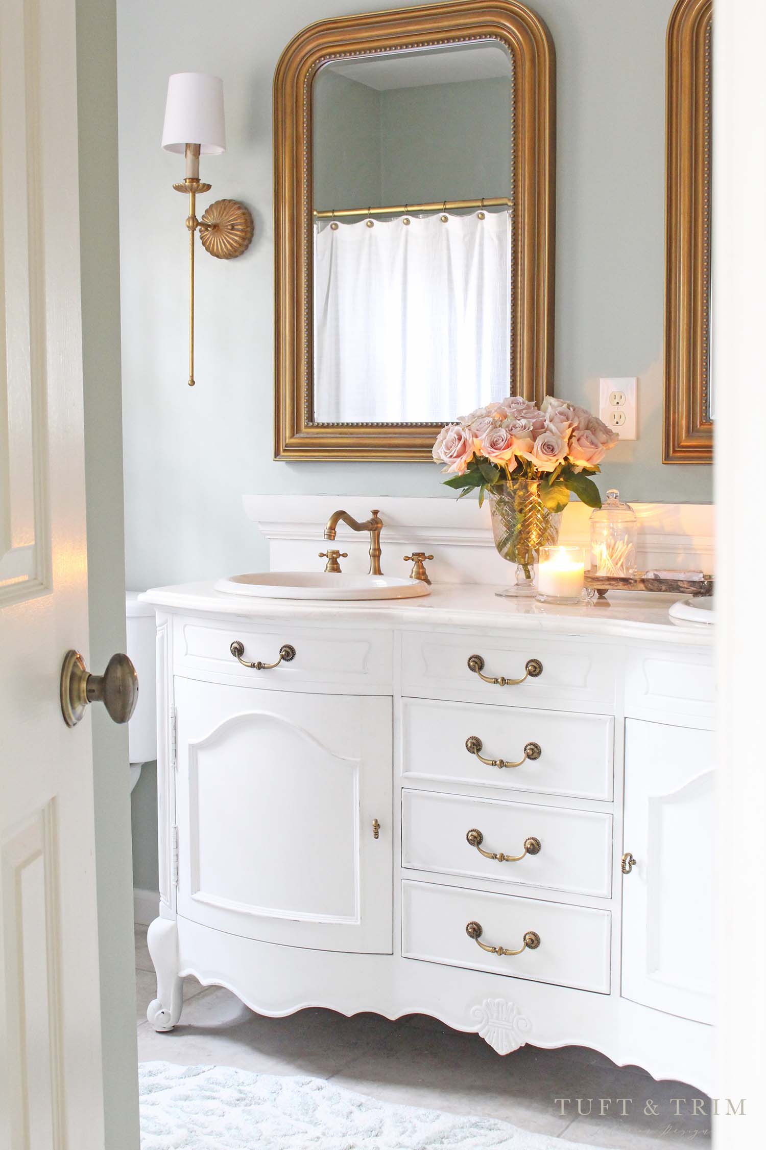
In my opinion, If there’s anywhere to invest, this is it. Most of my budget went to our lighting and mirrors and it really made a difference. We swapped out the builder grade sconces with these Regina Andrews sconces and paired them with the Louis Phillippe mirrors from Ballards. I love the traditional look with a bit of a modern touch in the lighting. Since I took these pictures, we actually added an additional sconce in the center of the mirrors for more balanced lighting.
 Plumbing Fixtures
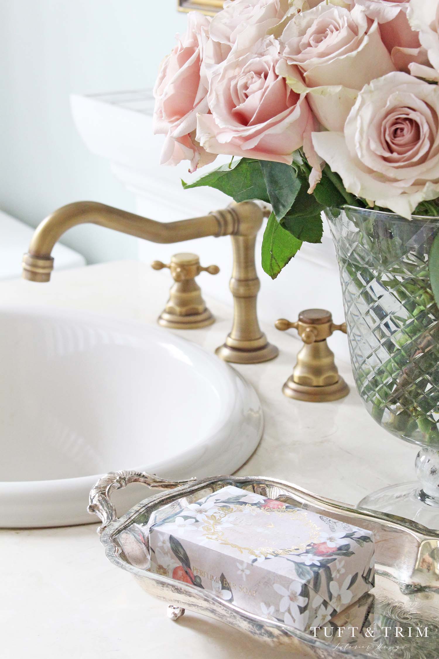
Next, we changed out the bronze faucets to these affordable antique brass faucets. I love the vintage style and how they coordinated with the other brass finishes. While mixing finishes is a popular trend, I personally tend to gravitate towards matching, and instead I try to incorporate other tones in the accessories. Like this antique silver tray I found at a thrift store.
Paint
I went back and fourth on wall color, and in the end, this choice was the winner. It’s a muted sage green called Contented by Sherwin Williams. I picked it to coordinate with my master bedroom color scheme and love how the two flow together. It’s such a beautiful color, I’m now trying to find another room to paint!
You’ll also notice the wall and ledge behind the vanity that was once black is now white. I wanted to make it disappear so I painted it to match the vanity in hopes that it would be overlooked as a backsplash. I think my plan worked because I barely notice it anymore. Do you??

Two bathrooms down, one more to go! If you missed my last bathroom design, you can check out the full renovation tour here. If you’d like to follow along on our never ending journey of updating our home, subscribe to my newsletter and follow me on the social media pages below!
Instagram / Facebook / Pinterest



Leave a Reply