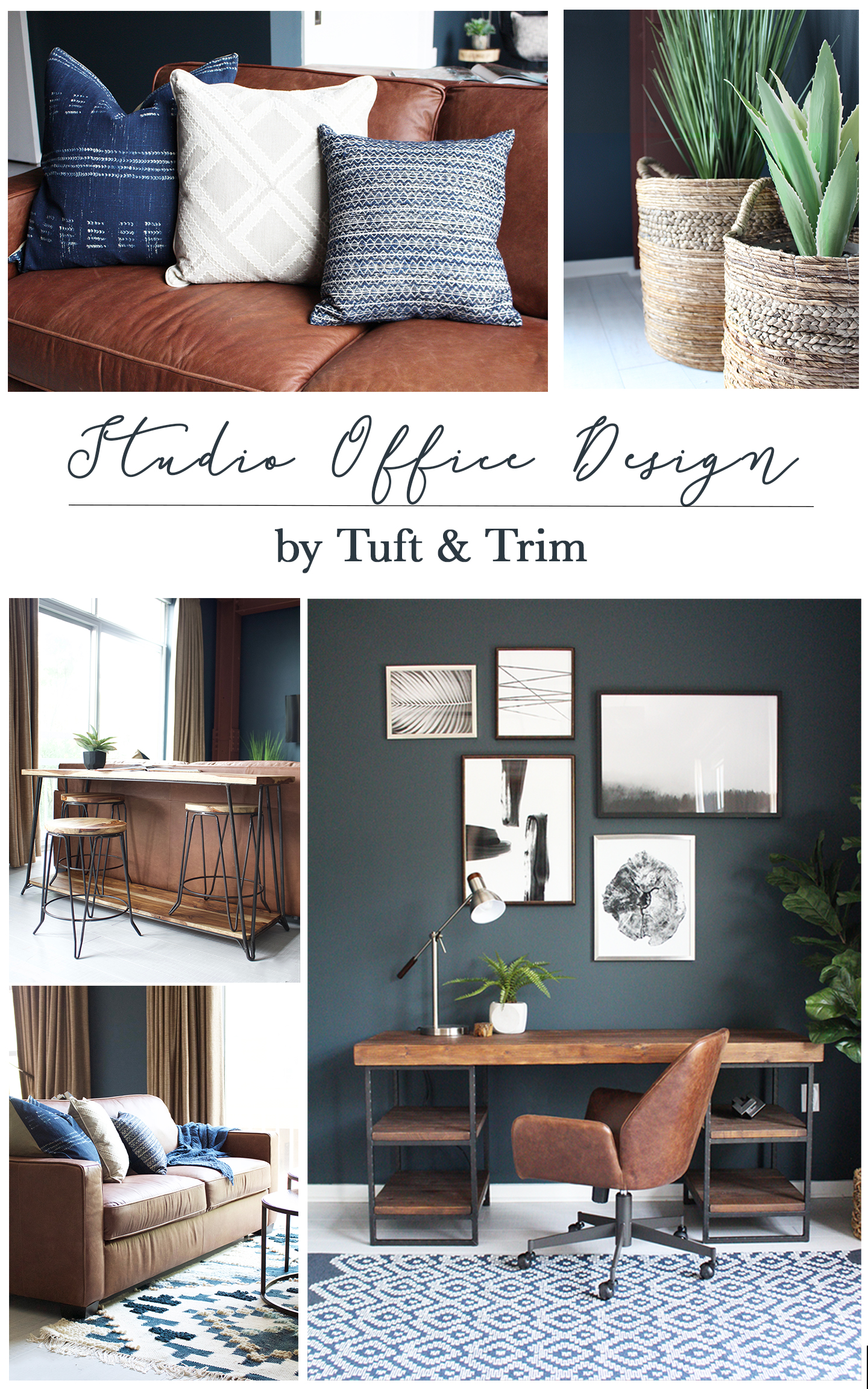
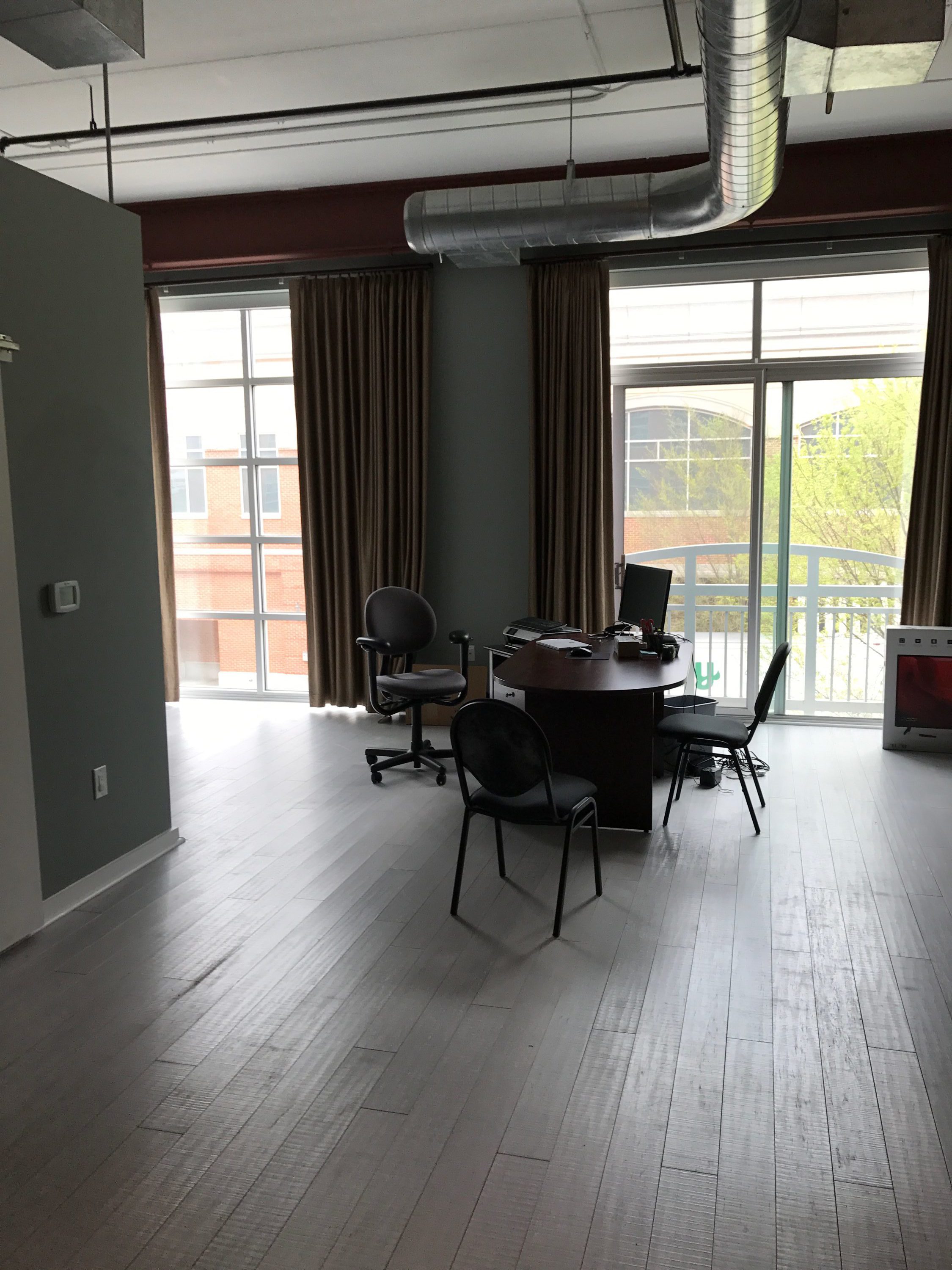
Within less than a month and a half this studio apartment has transformed into a moody industrial office and living space. My client wanted the space to act as an office, but also function as a place to host overnight guests if needed. Without much preference from client, I was given the reigns to design the space however I thought best. Oh the possibilities…
*This post contains affiliate links.

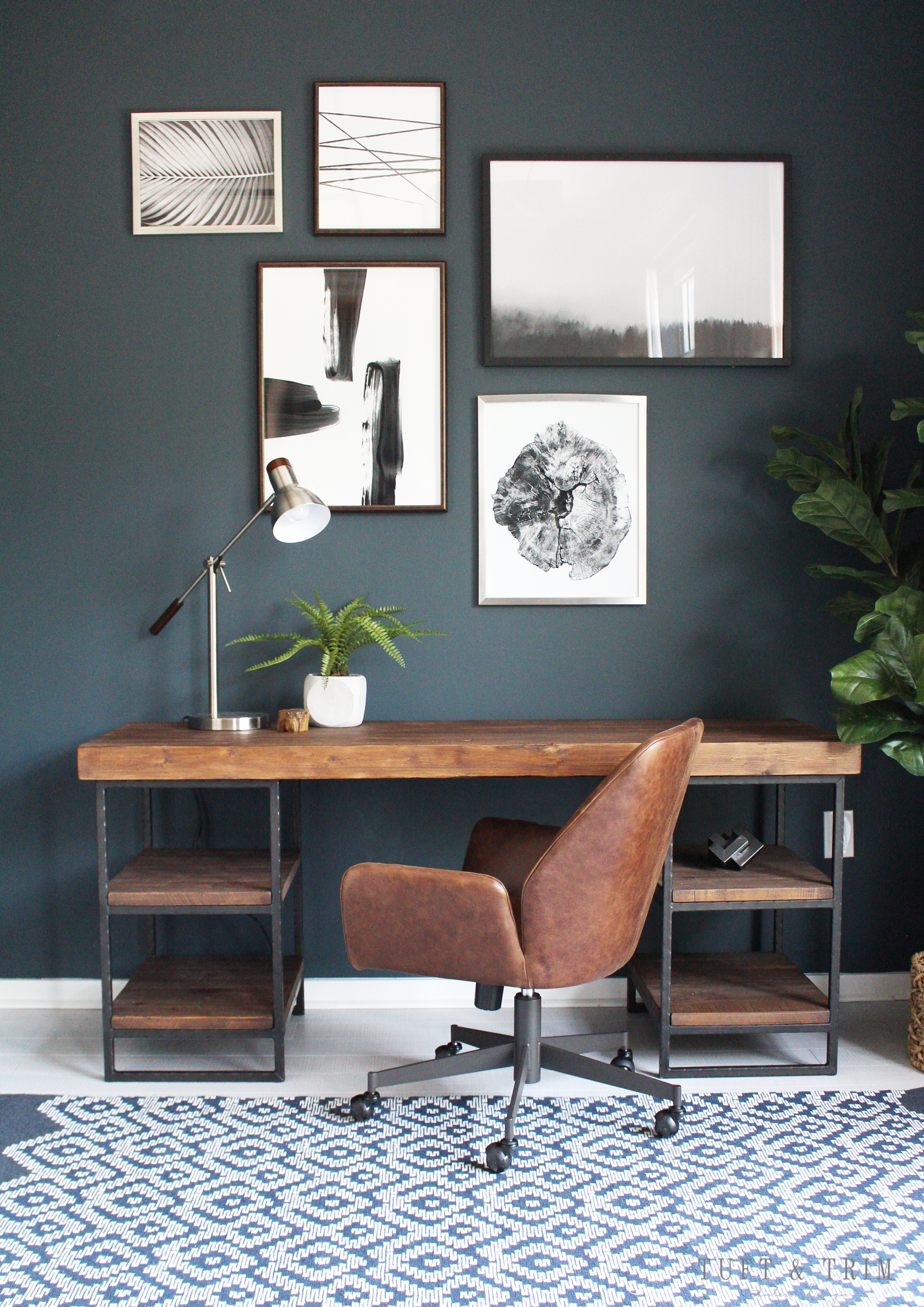
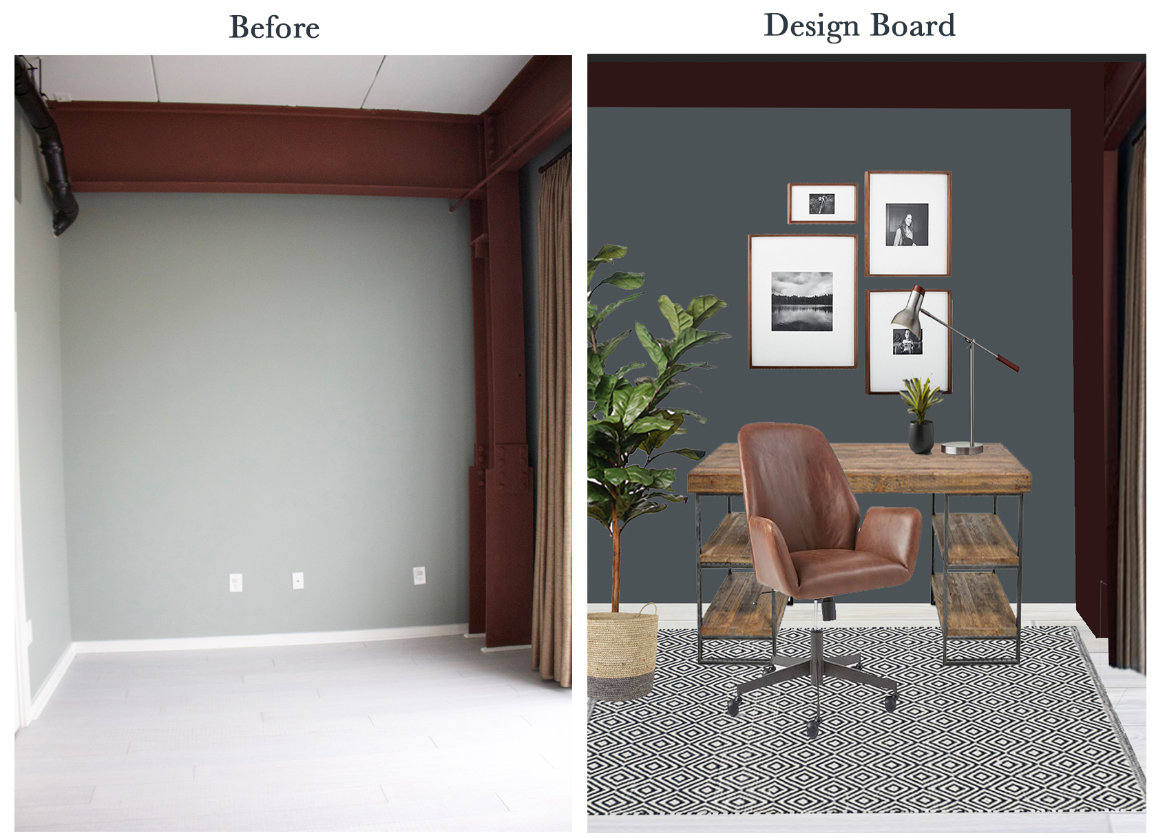
Since there would be mostly men using this space, I went with a bold and masculine color scheme. This dark navy/charcoal wall color is Mt. Etna by Sherwin Williams. I really liked how it complemented the current beam color. In order to stay within budget, I tried to make affordable changes that really made an impact.
I think this wall color did just that, don’t you?
After
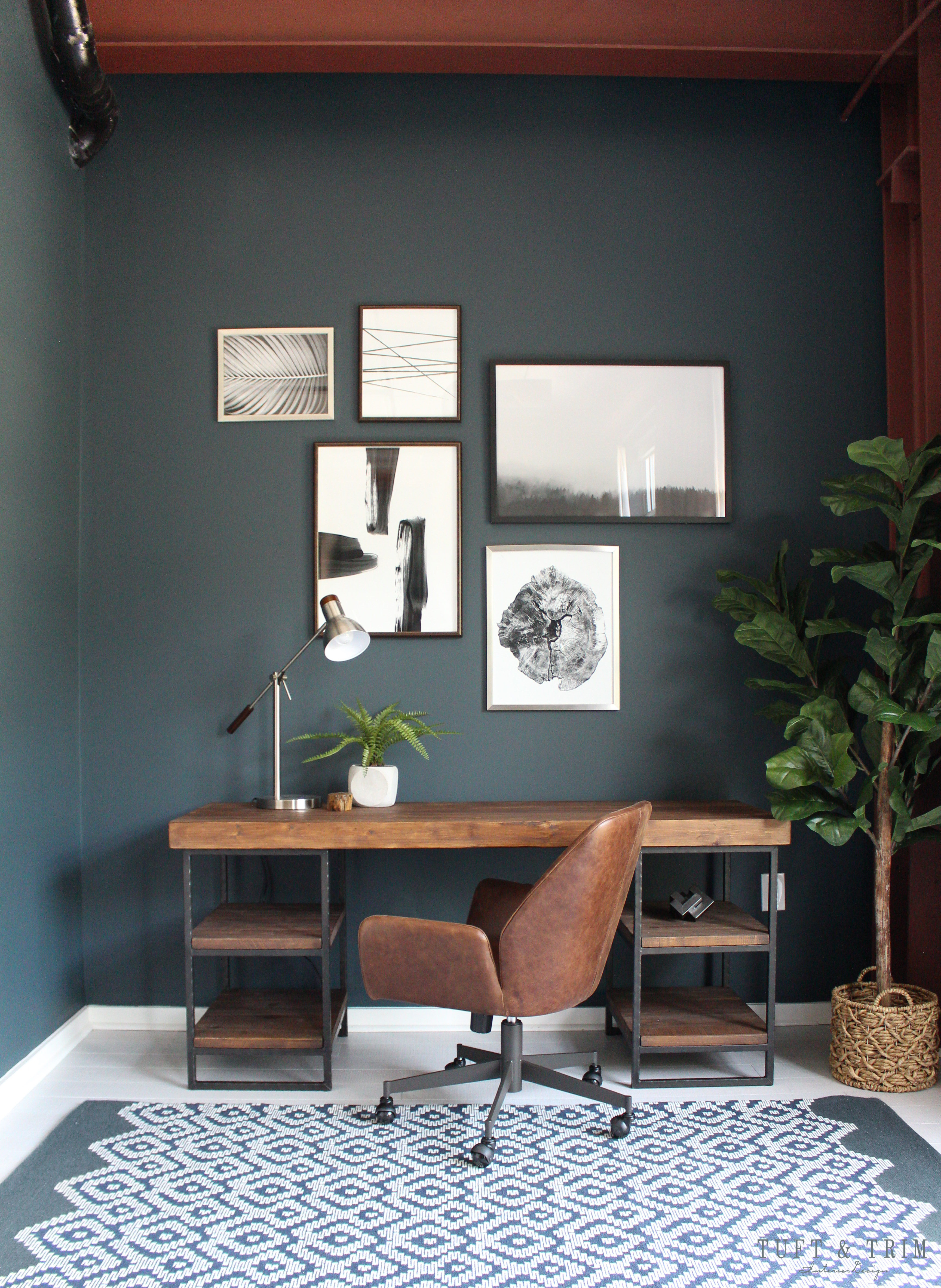
An abstract gallery wall filled with black and white photography and art hangs above the desk. I wanted to do something bold on this wall to create a focal point and draw attention. The reclaimed wood desk with it’s clean lines and vibrant wood tone contrast the dark paint and balances the gallery wall perfectly. And I’m proud to add that I hung it all myself!
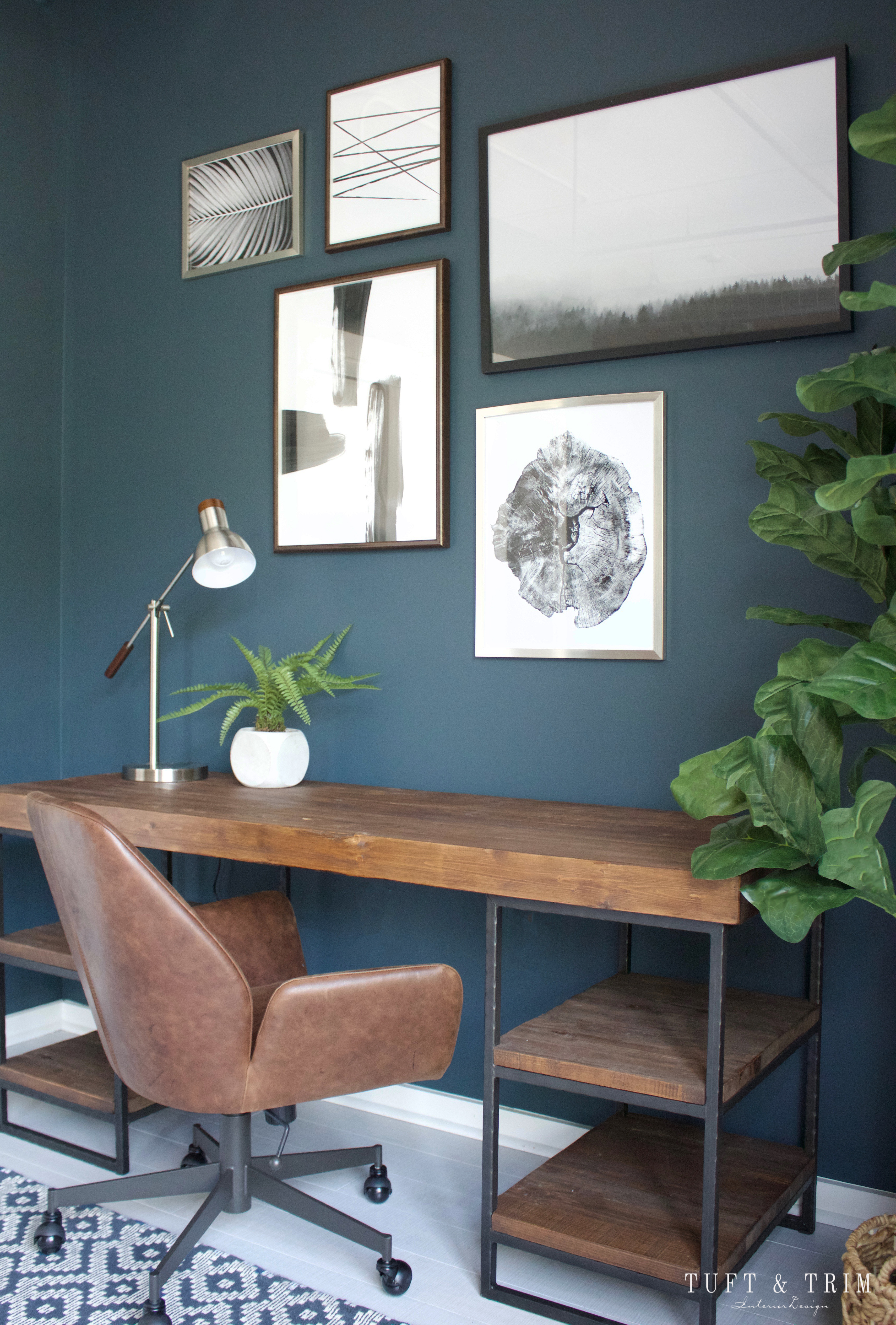
The unique style of this leather chair from West Elm really stood out to me. I found myself wanting to incorporate different styles here and there, starting with this Scandinavian influenced chair. The brushed nickel desk lamp with it’s wood accents adds a touch of mid century modern to the mix.
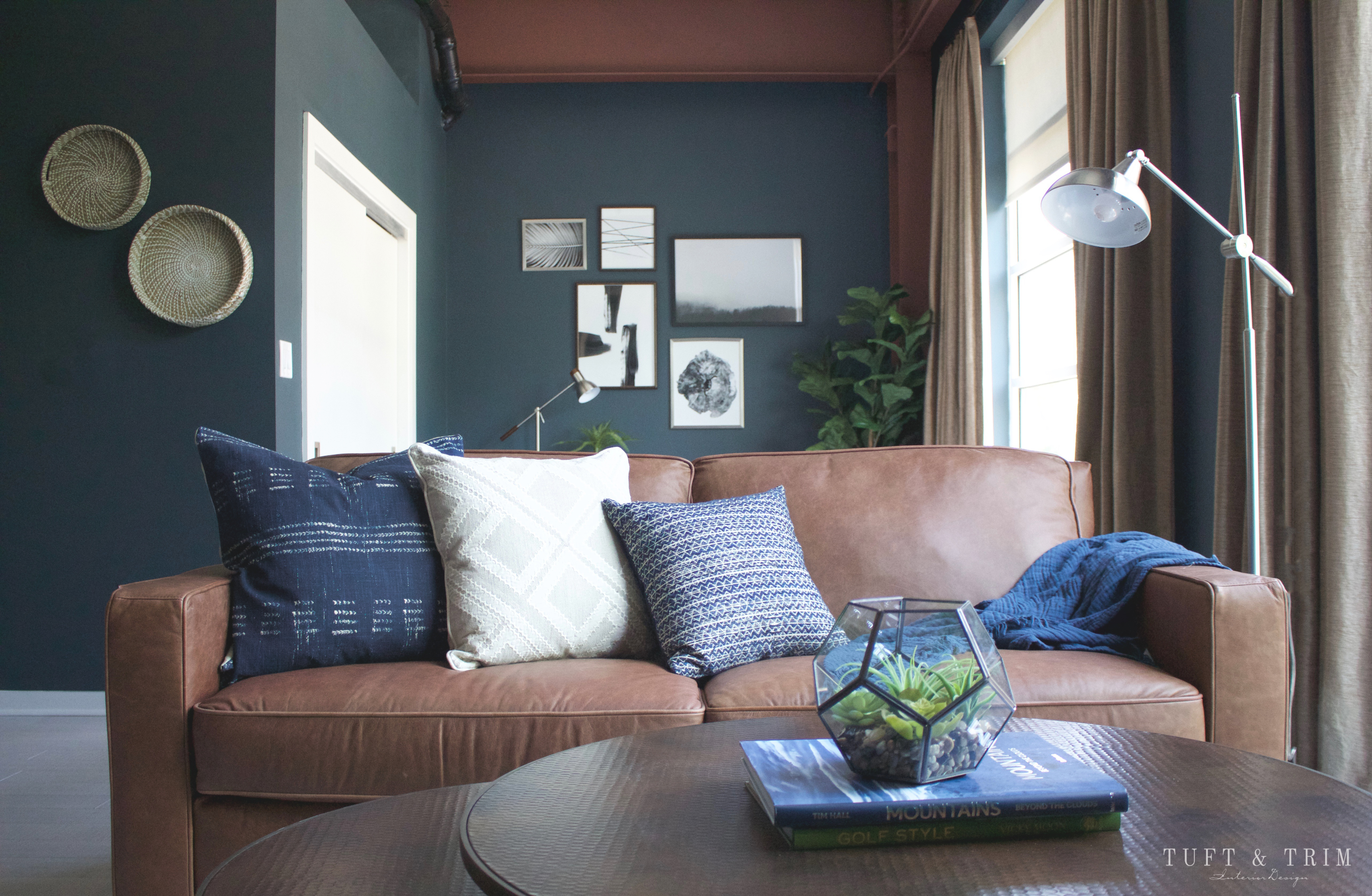
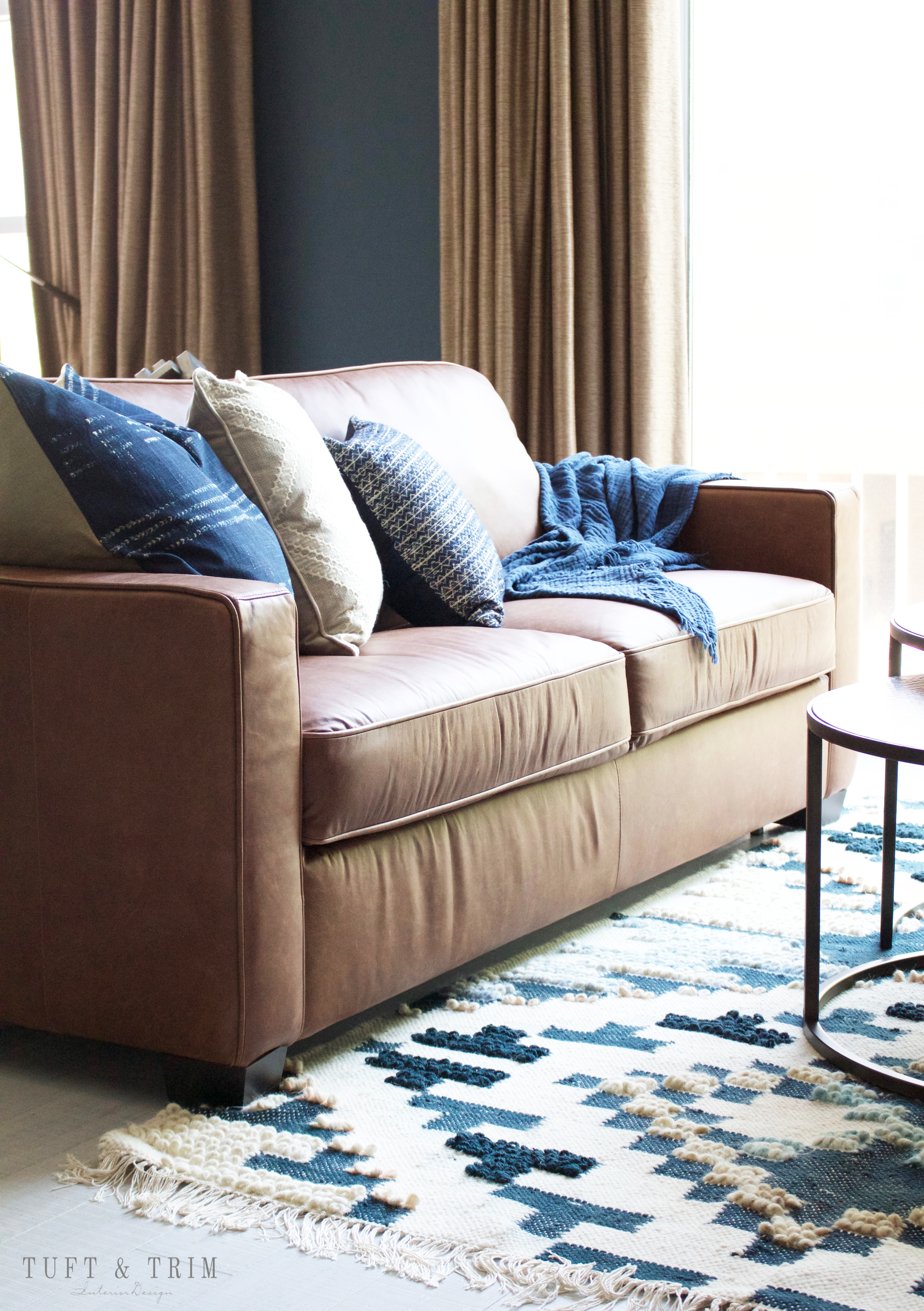
Next, we have the seating area with this leather sleeper sofa facing the tv wall. There wasn’t much opportunity to use textures and patterns so I had fun picking out the pillows and rugs.

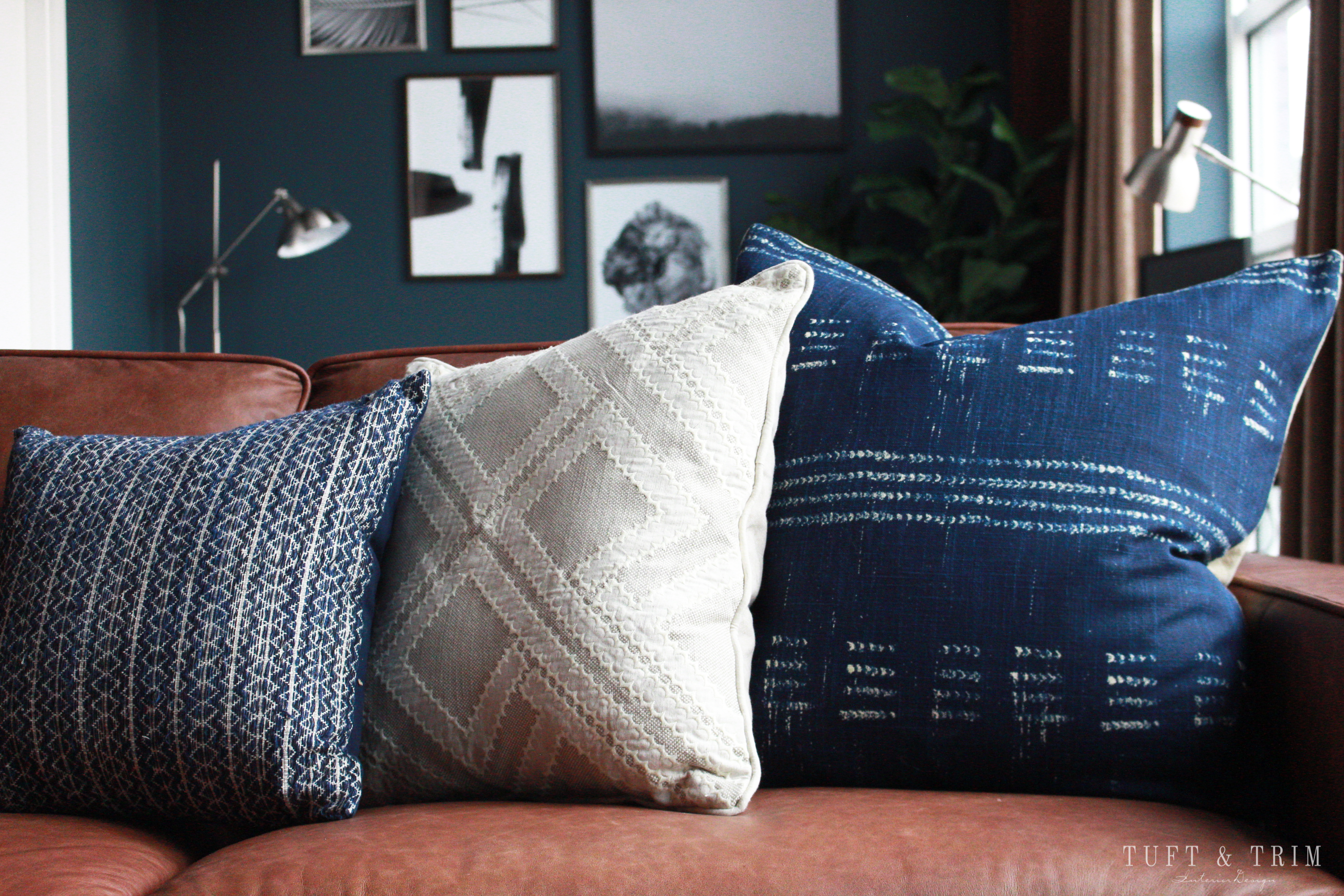
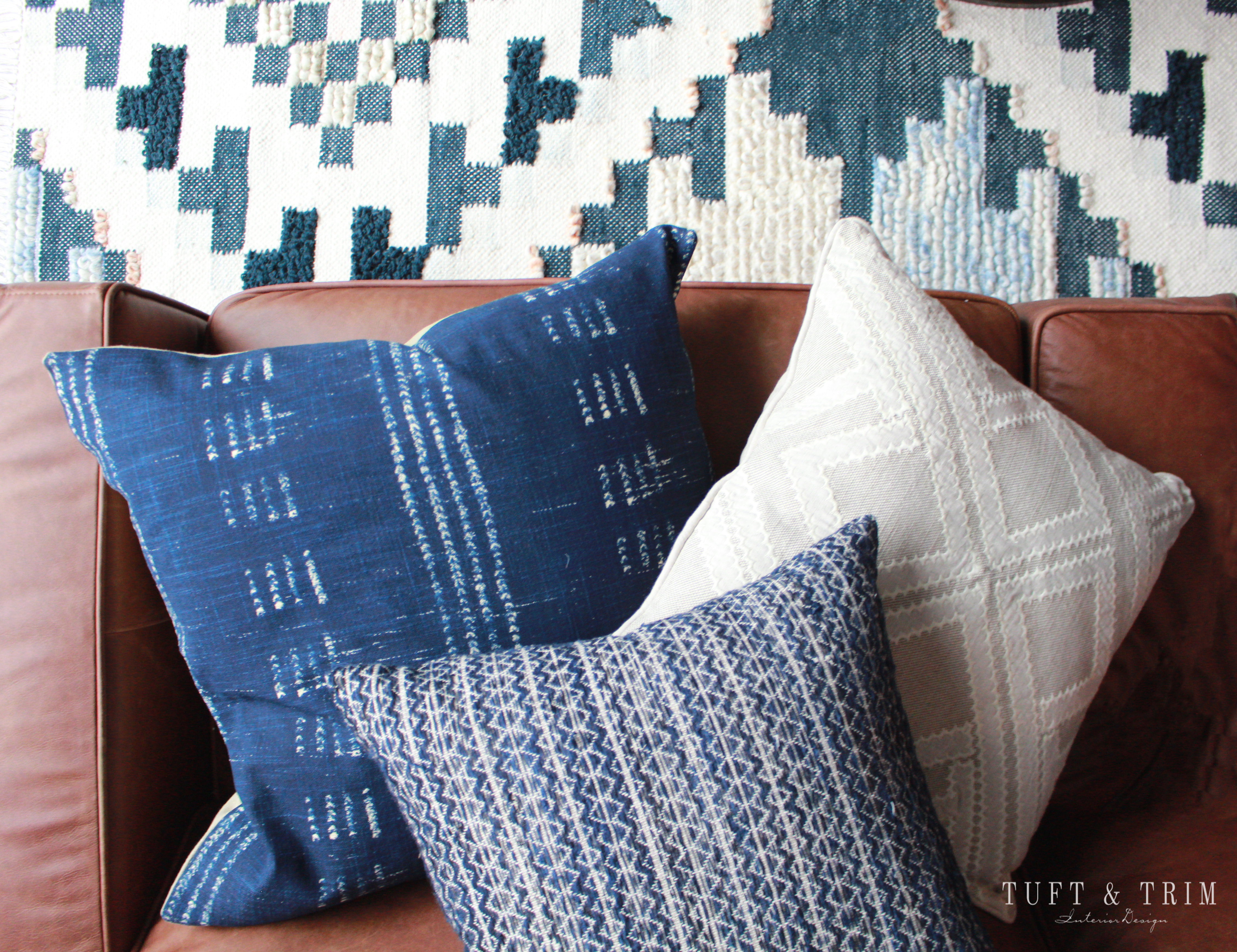
I wanted to find some geometric patterned pillows that brought in the blue from the walls. The dark blue pillows contrast with the leather and the natural tones coordinate with the rug creating a nice blend.
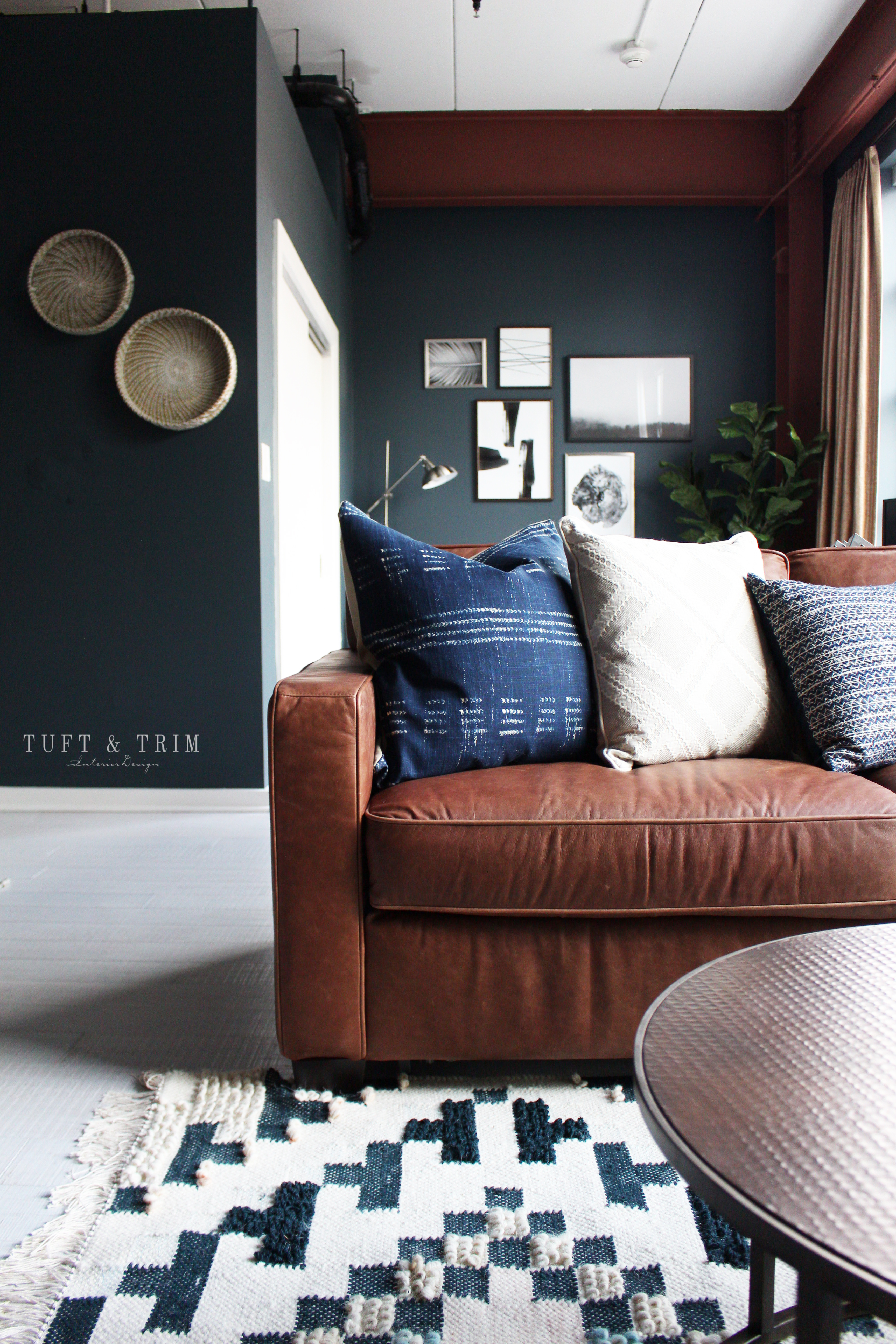
My favorite part of this design is this textural wool patterned rug below the seating area. It has muted blue tones in a checkerboard print with fringe lining each end. The rug was one of the first things I picked for the space and referenced it when making other selections. It really ended up being the focal point of the room.
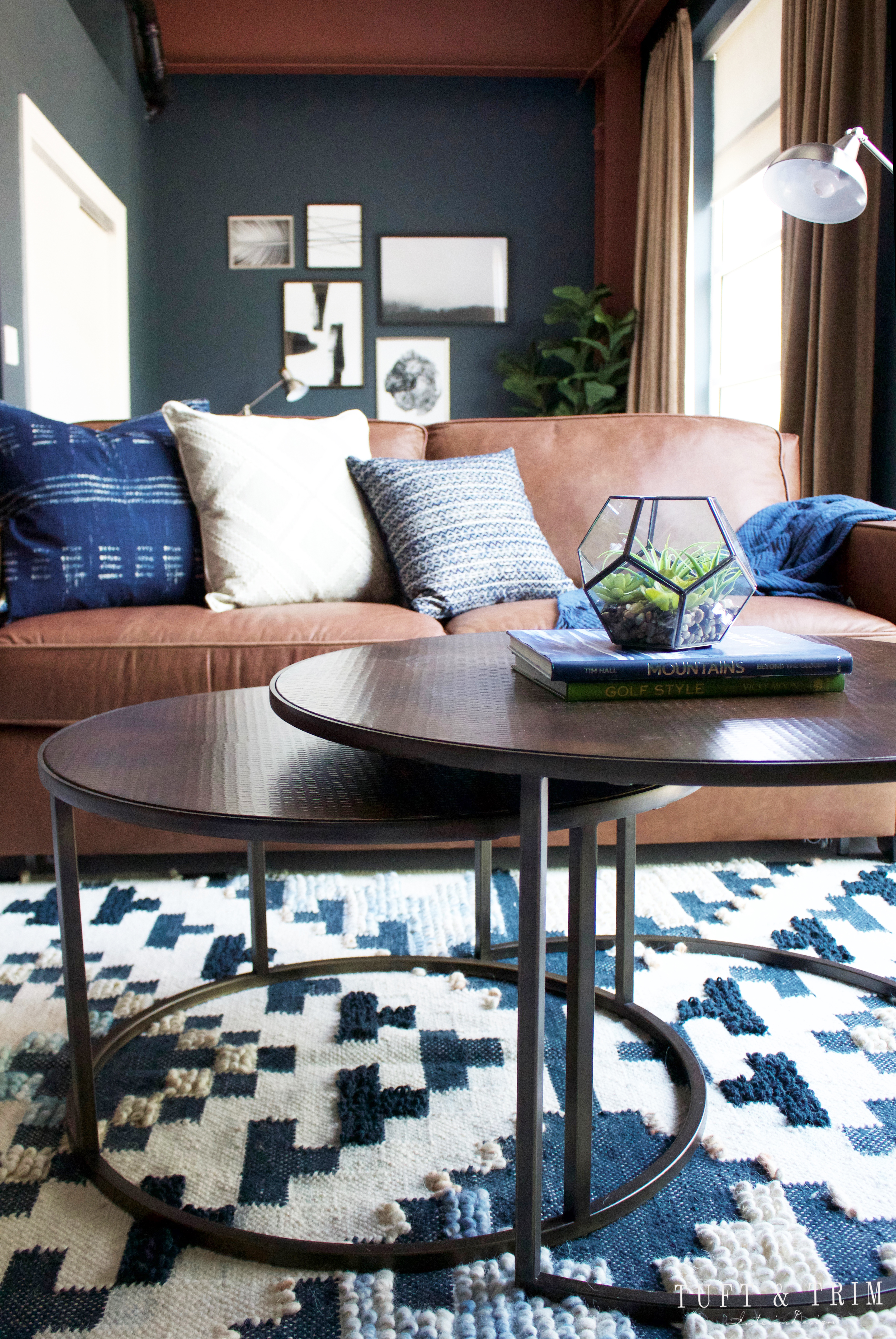
In front of the sofa are round tiered coffee tables with an aged copper top. I didn’t want another wood top since I already have so many wood pieces, and I liked the idea of changing up shapes.
Before
After
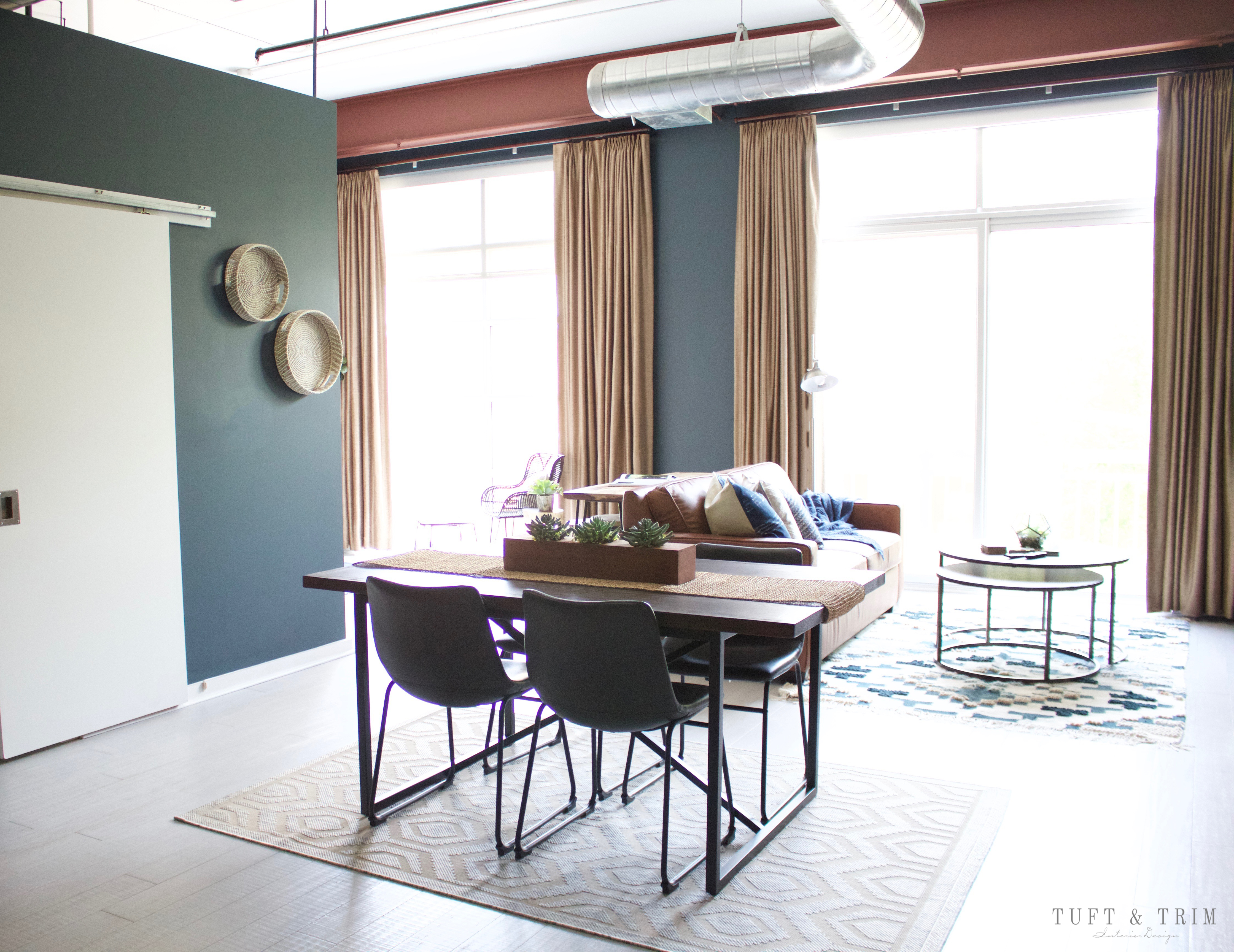
The space isn’t too big but it has an open floor plan with tall ceilings and large windows that bring in a lot of natural light. Because of budget, we left the curtains a golden tan and they ended up blending well with the color scheme. The industrial modern dining table has a wood top and “X” shaped stand with black leather dining chairs tucked under.
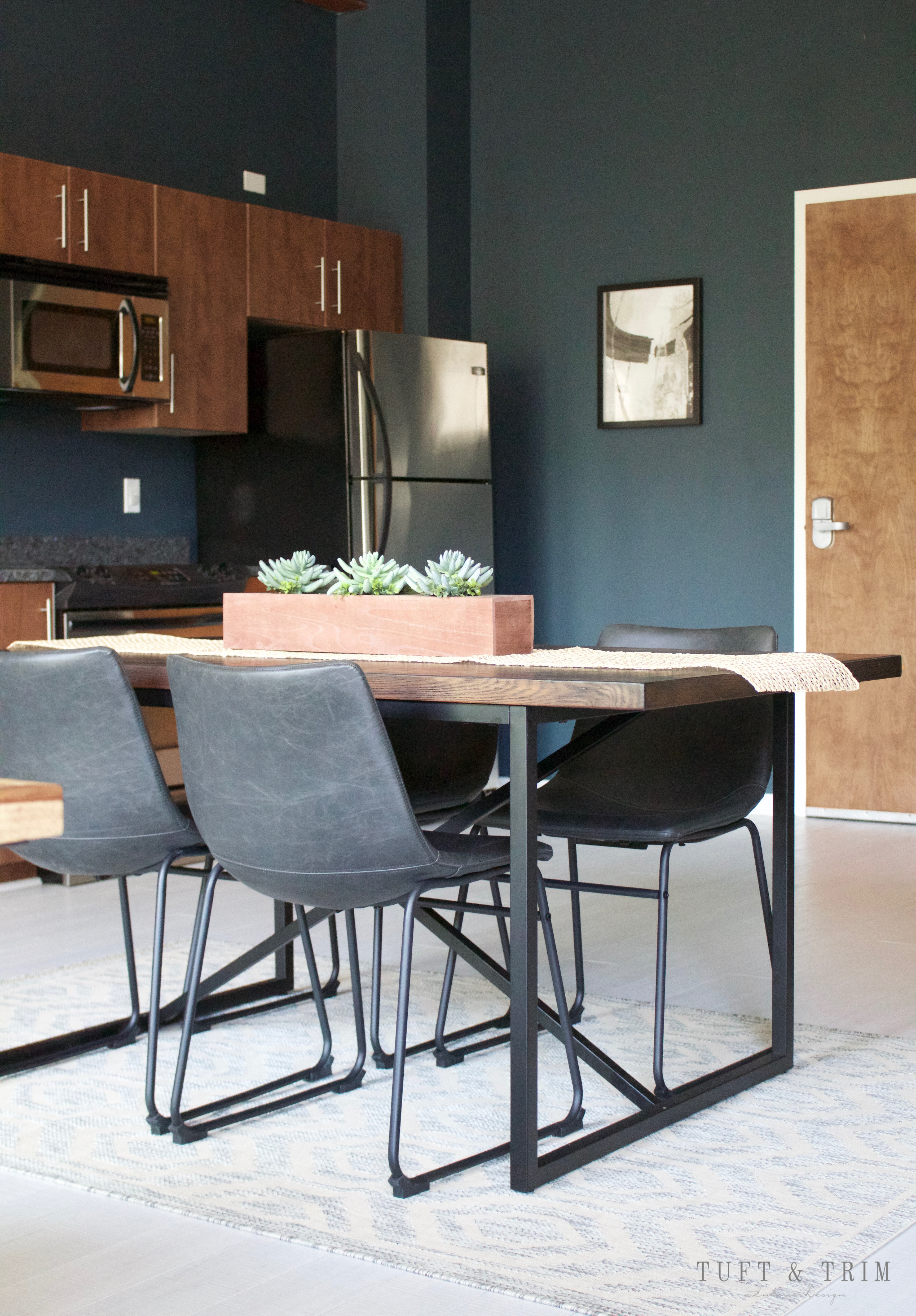
Before
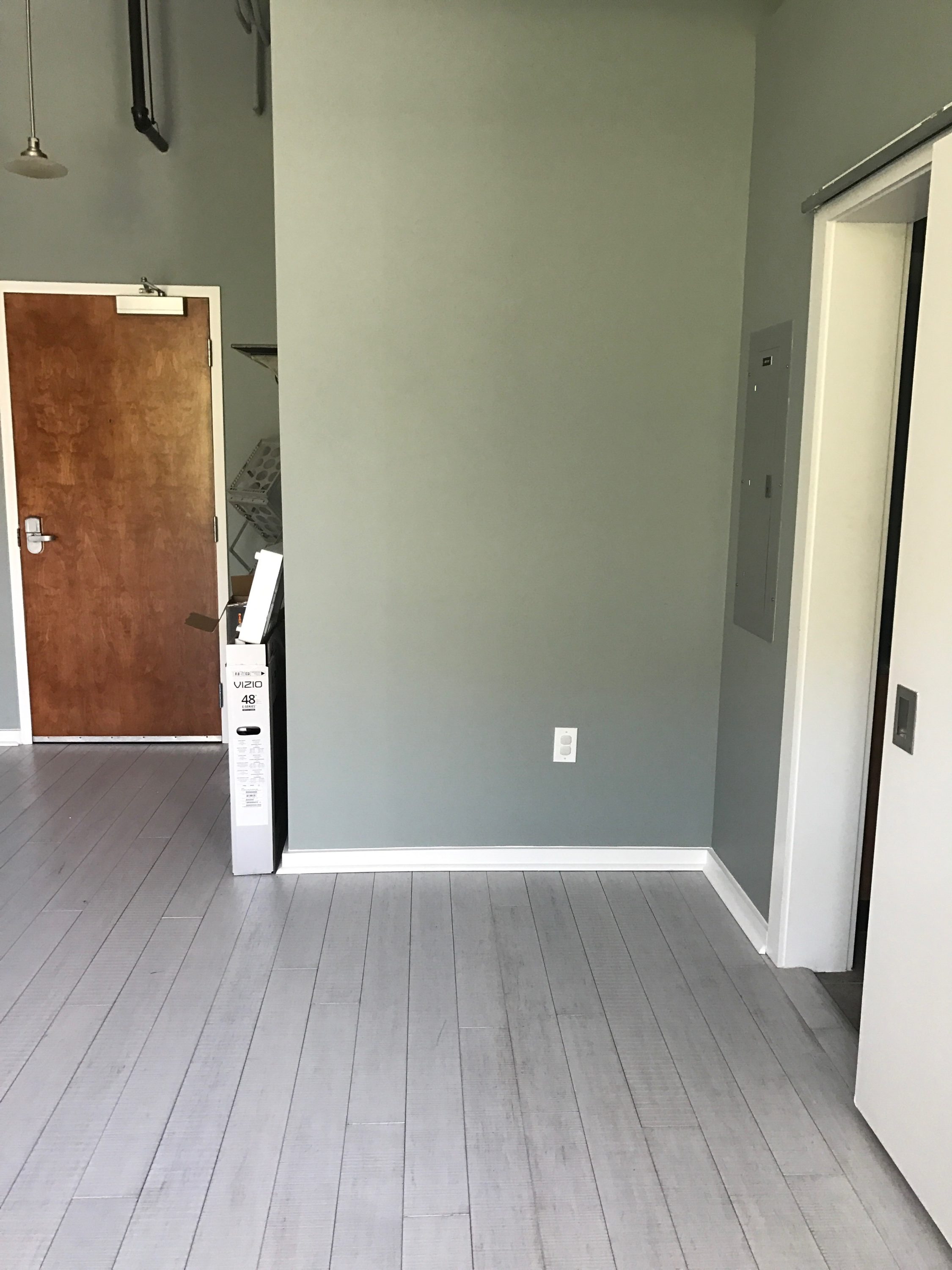
After
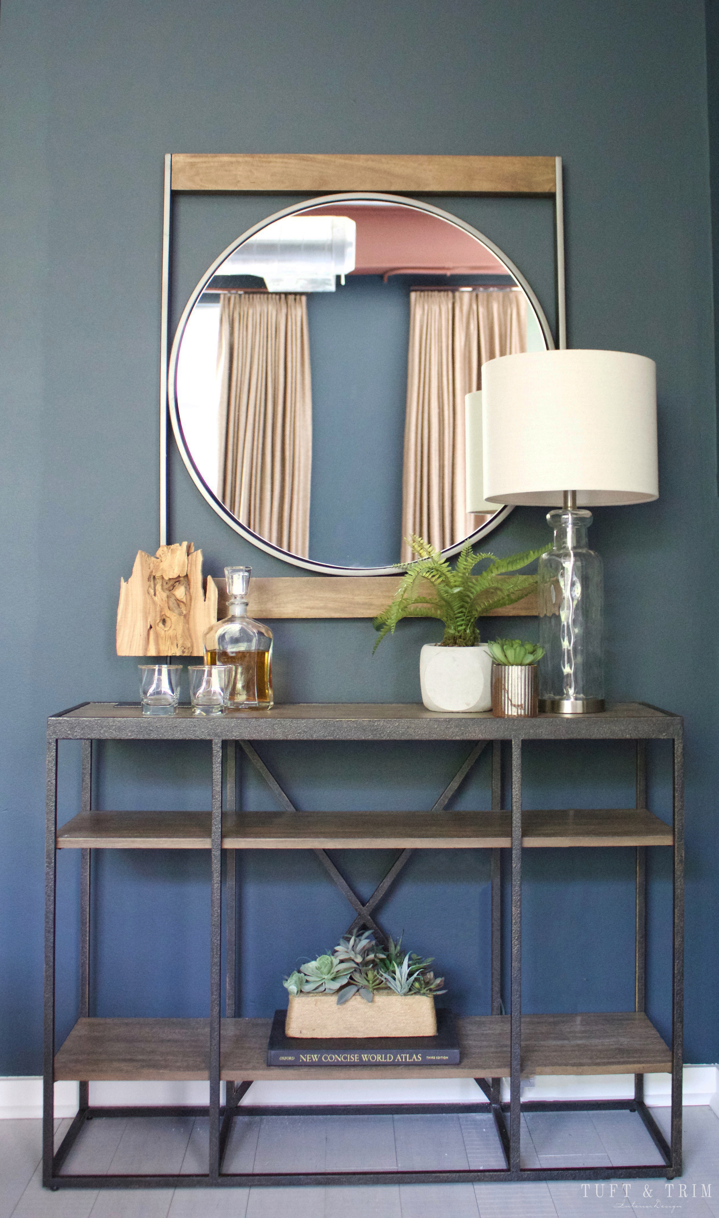
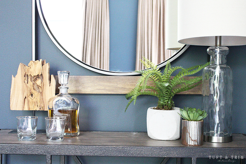
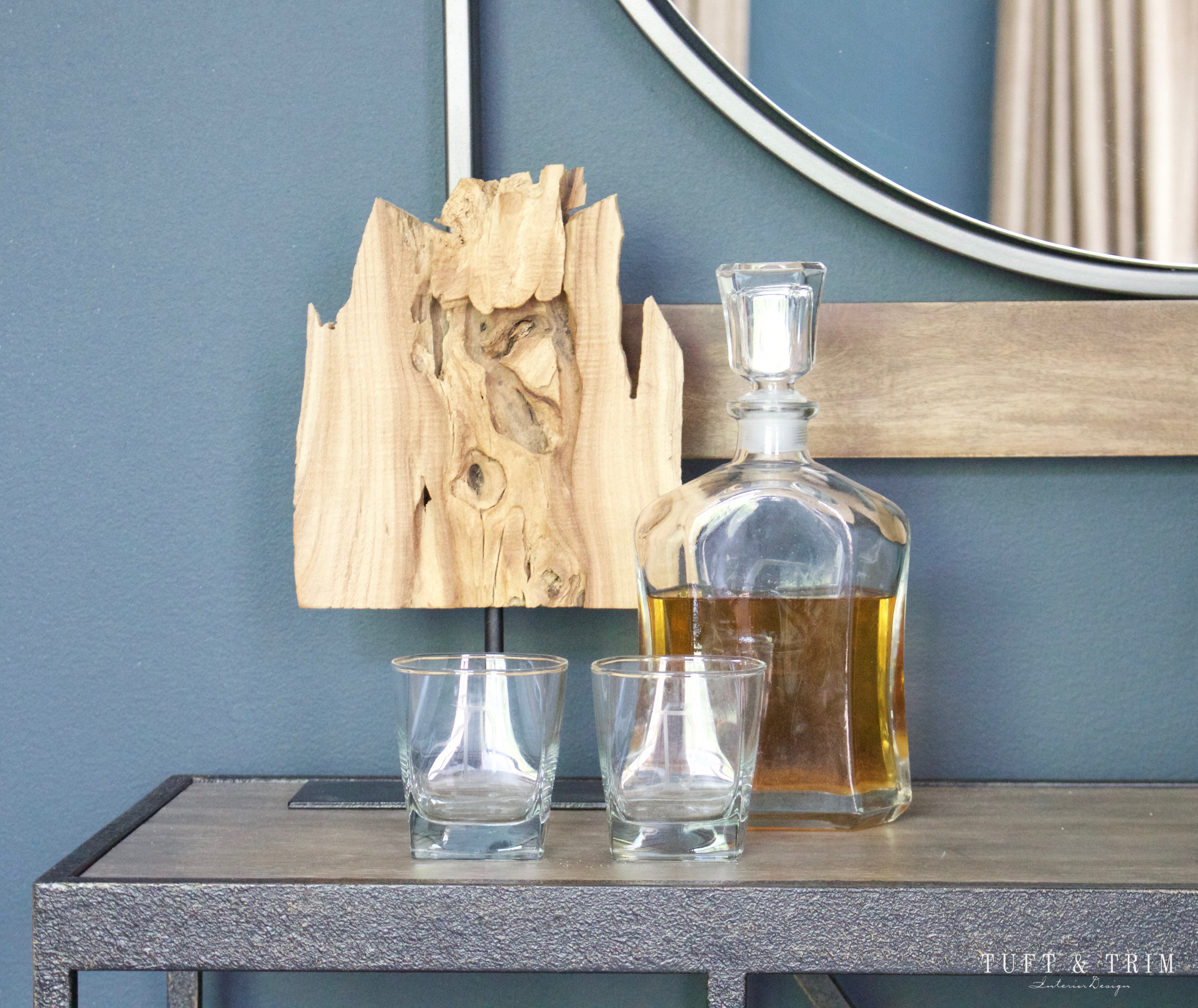
One of my favorite features in this space is this industrial metal and wood mirror from West Elm . It’s round shape within the frame balances perfectly above the console table. I found the console at Home Goods and thought it worked well with the other selections without being too repetitive.
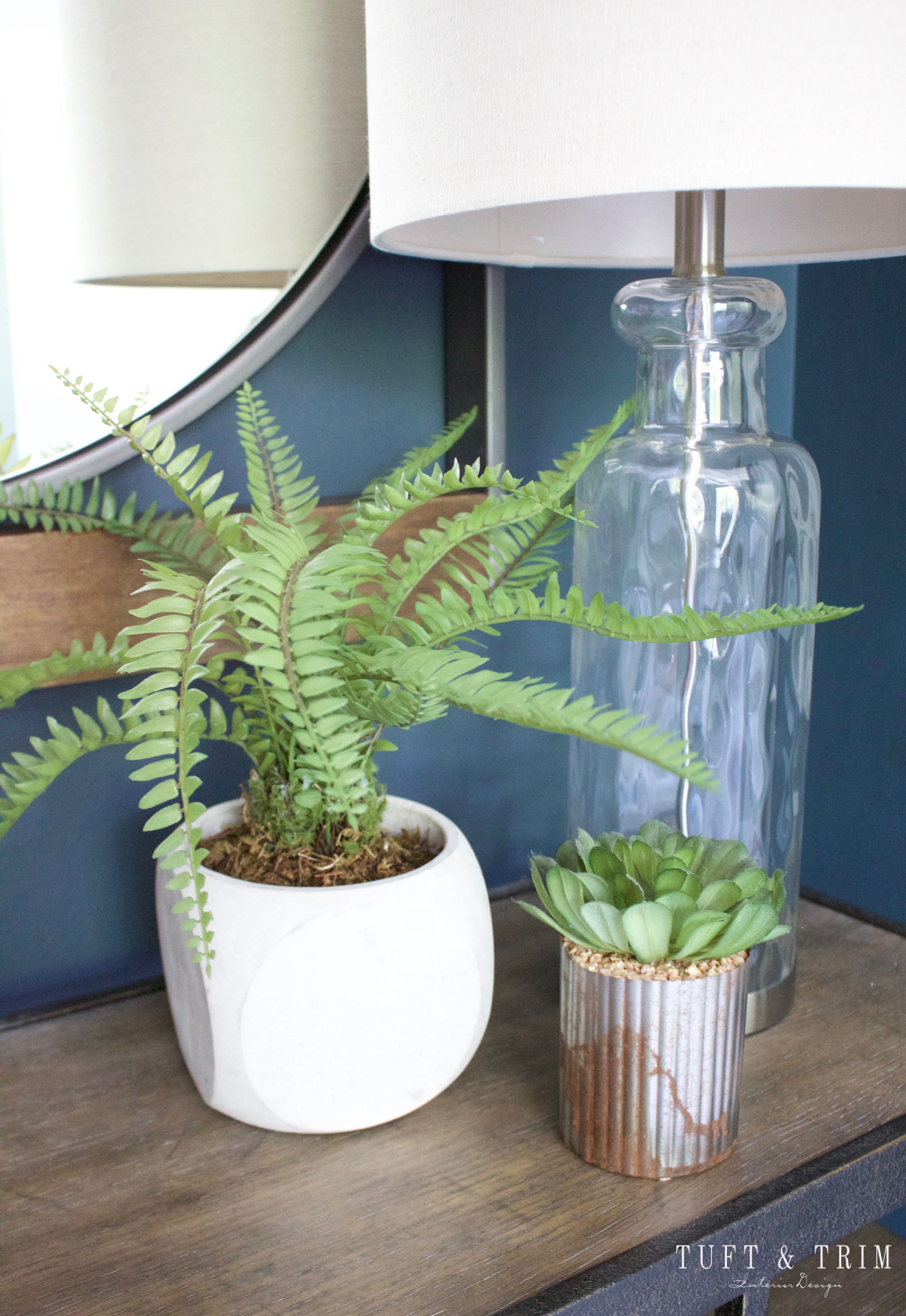
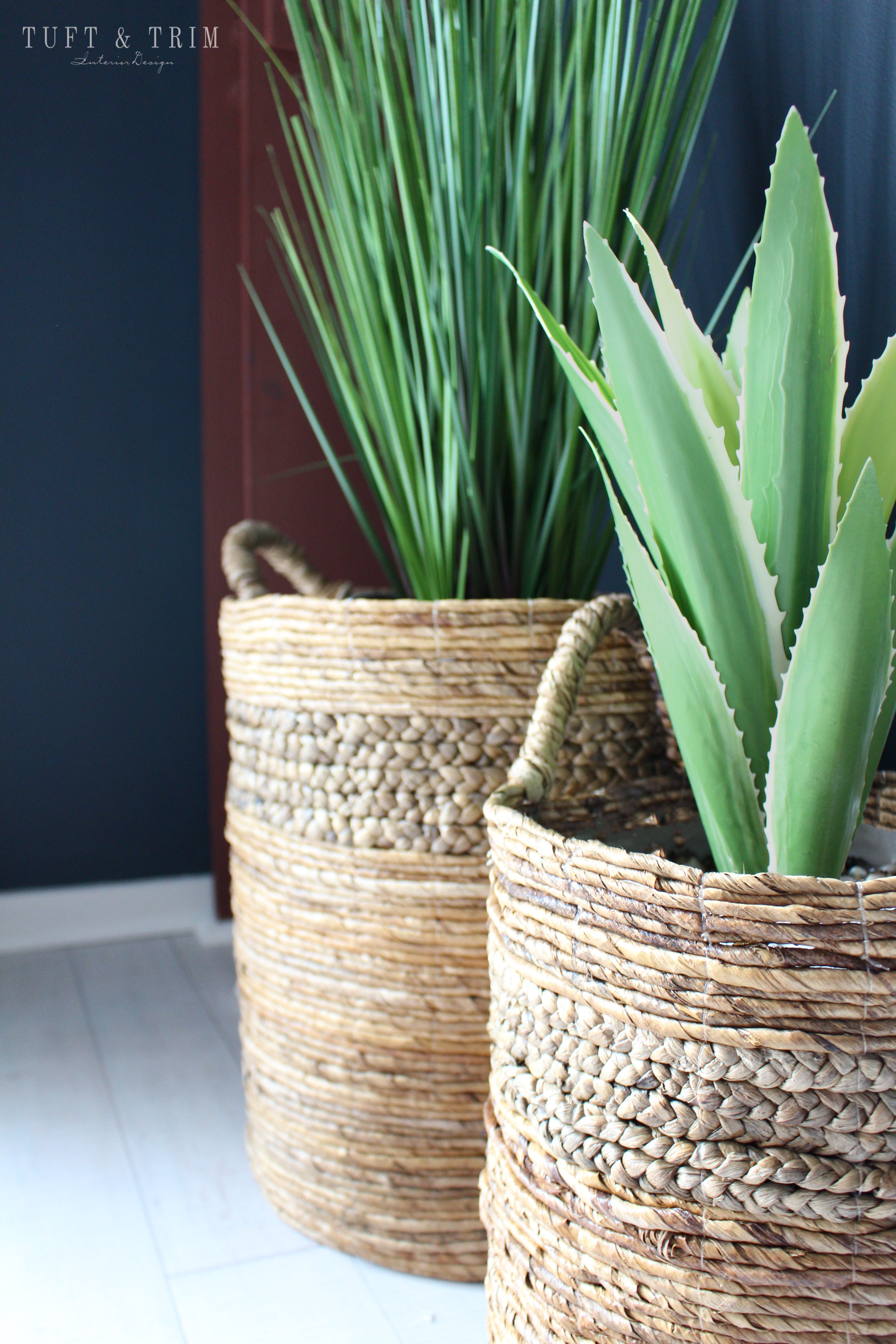
If you haven’t noticed, I am a big fan of succulents. Plants bring so much color and life to a space that it was a must to have them throughout.
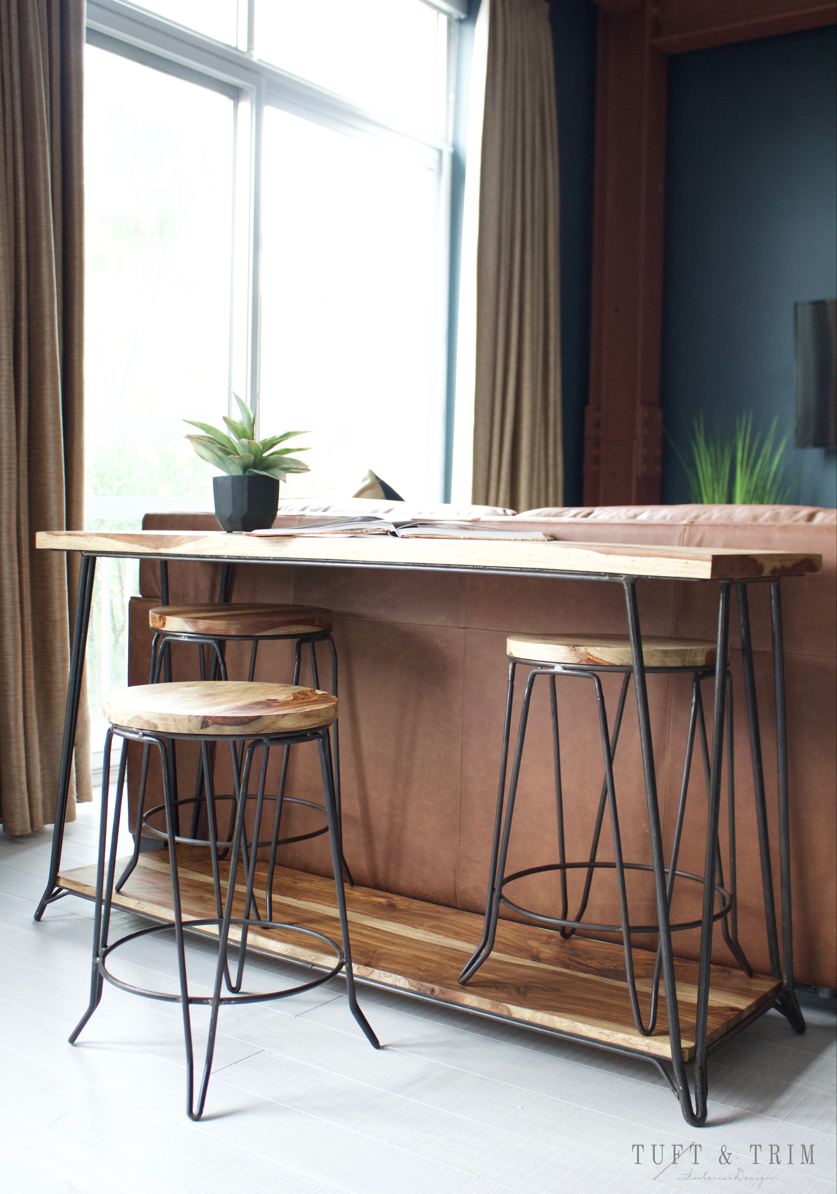
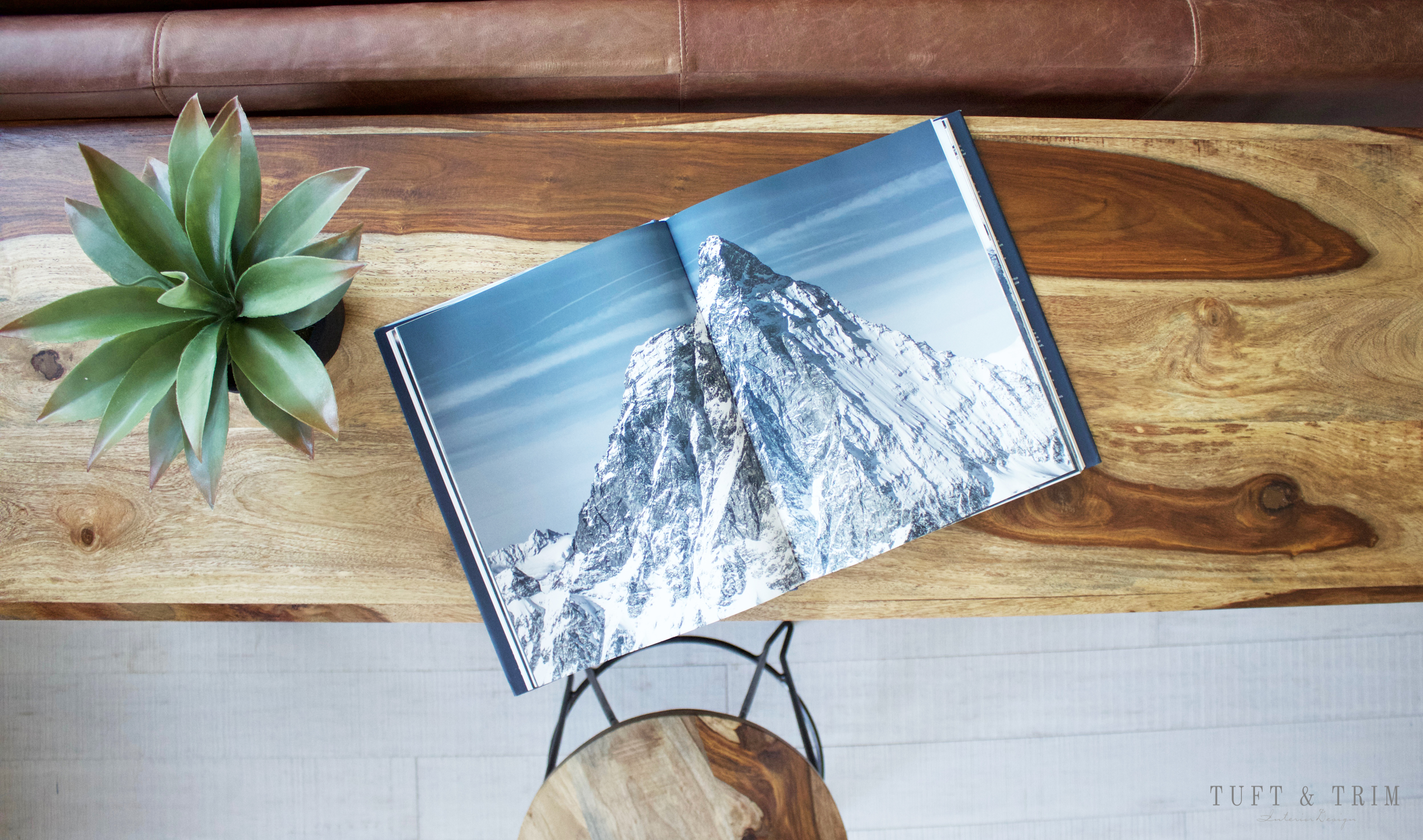
Behind the sofa is a wood bar table that stores matching stools beneath it. Originally, I saw the bar by itself at home goods and thought it would work for my concept and then after circling the store several times, I came across all 3 stools scattered around. Definitely hit the jackpot that day!
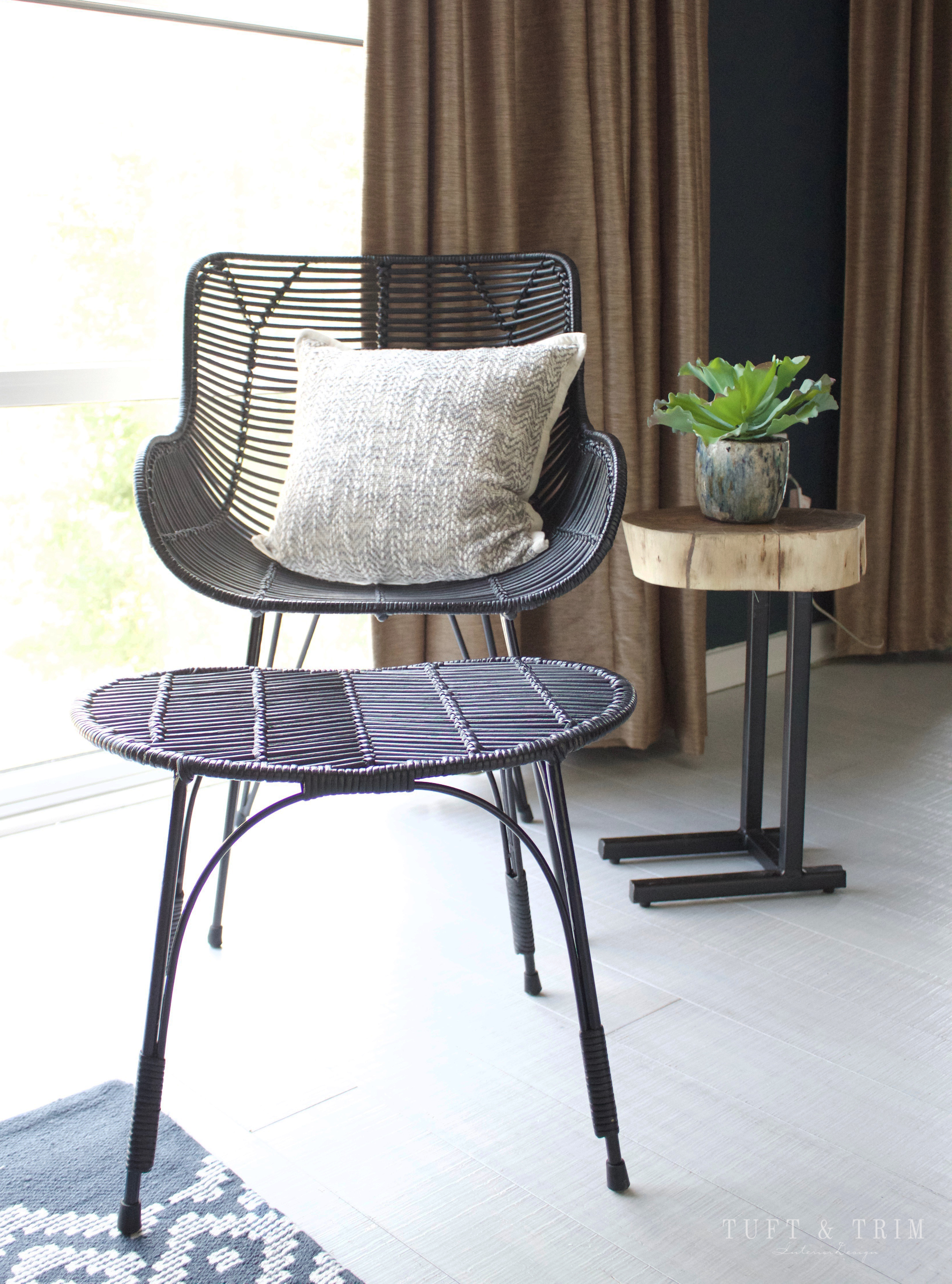
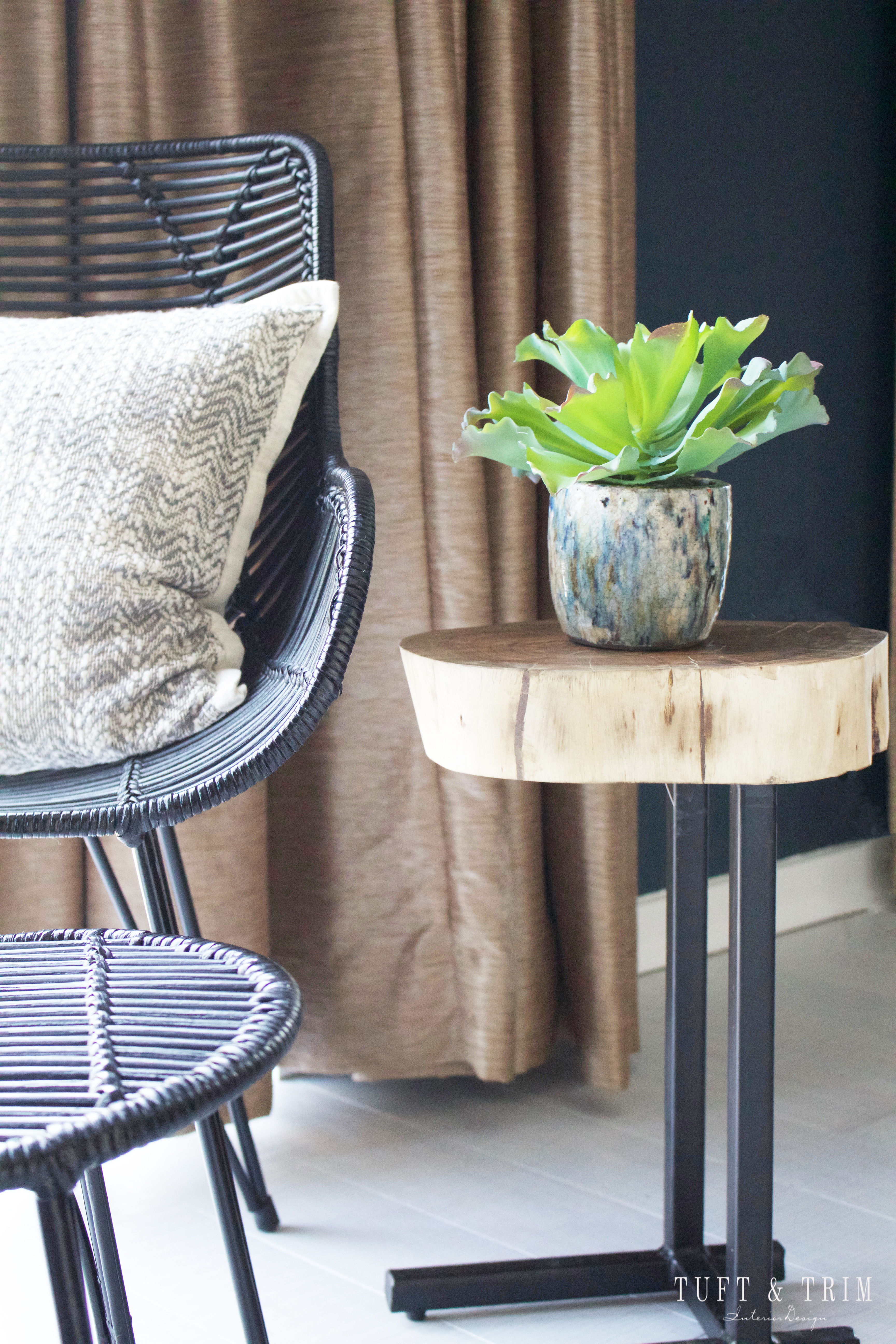
On a last minute shopping trip I found this chair and thought it would be perfect for the office space. It ended up being the perfect style and size for this corner.

This project was so fun for me because it was totally different from my usual design style. But most importantly, my client was beyond thrilled with the final outcome! What do you think?
Thank you so much for stopping by. If your interested in seeing more upcoming design projects, please feel free to subscribe today!
Instagram / Facebook / Pinterest


Hello! I love this post and your style! Would love to paint my husband’s office this color. Mind sharing the details on that? Thanks in advance!
Love this space!! Where is the desk from? The link isn’t working!
Hi Taylor,
Thank you so much for stopping by! I’m so glad you love the space. 🙂 Here is the link to the desk! https://rstyle.me/+CxZcjAc1x39Spril76wbSw
Have a great day!
Courtney
Hi! Are you able to share the sizes of the pictures frames you used above the desk? I love this gallery wall layout!
Hi Megan,
Thank you for stopping by! I don’t remember the sizes unfortunately, but I know one was 20×16 and another 11×14! Sorry that isn’t super helpful!
Hi,
Love the wall colour, could you possibly tell me the brand & name of colour please?
Hi there!
It’s called Mt. Etna by sherwin Williams 🙂